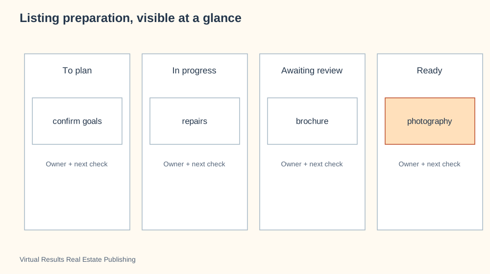
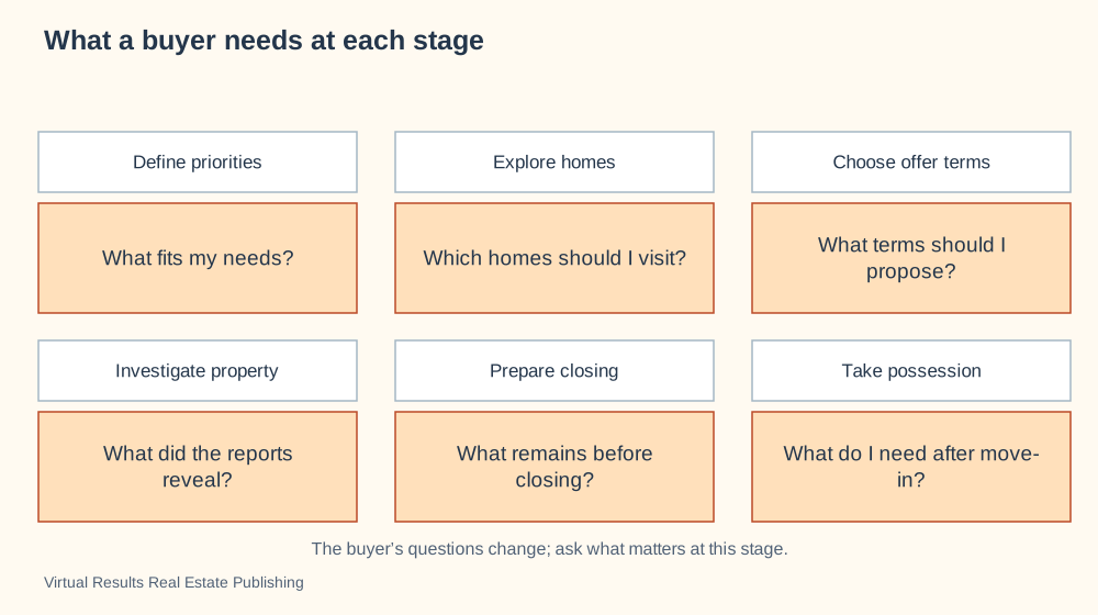
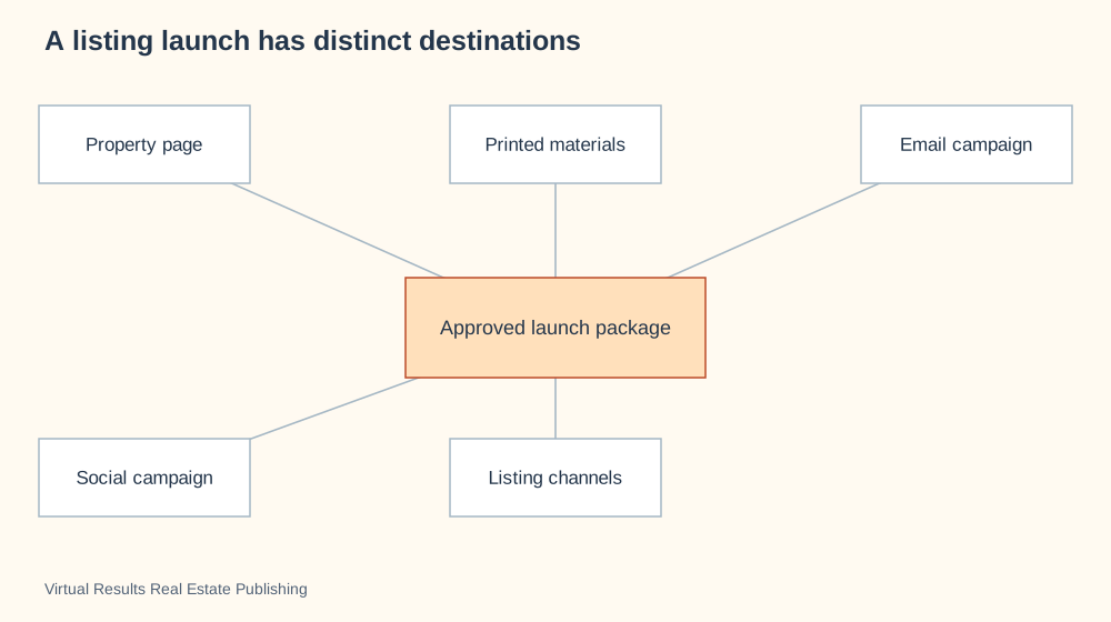
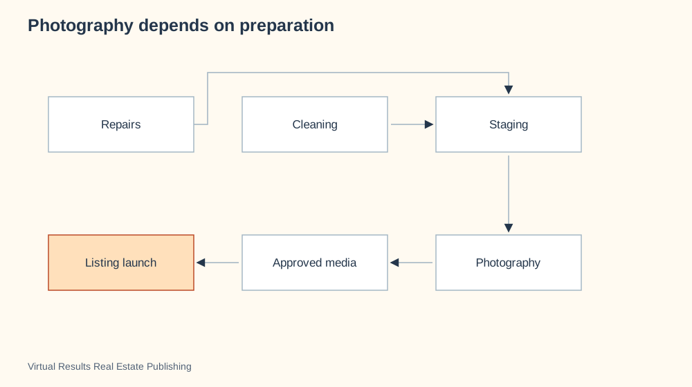
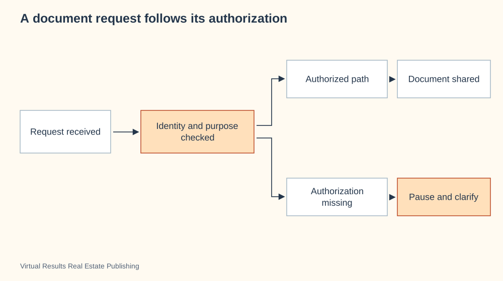
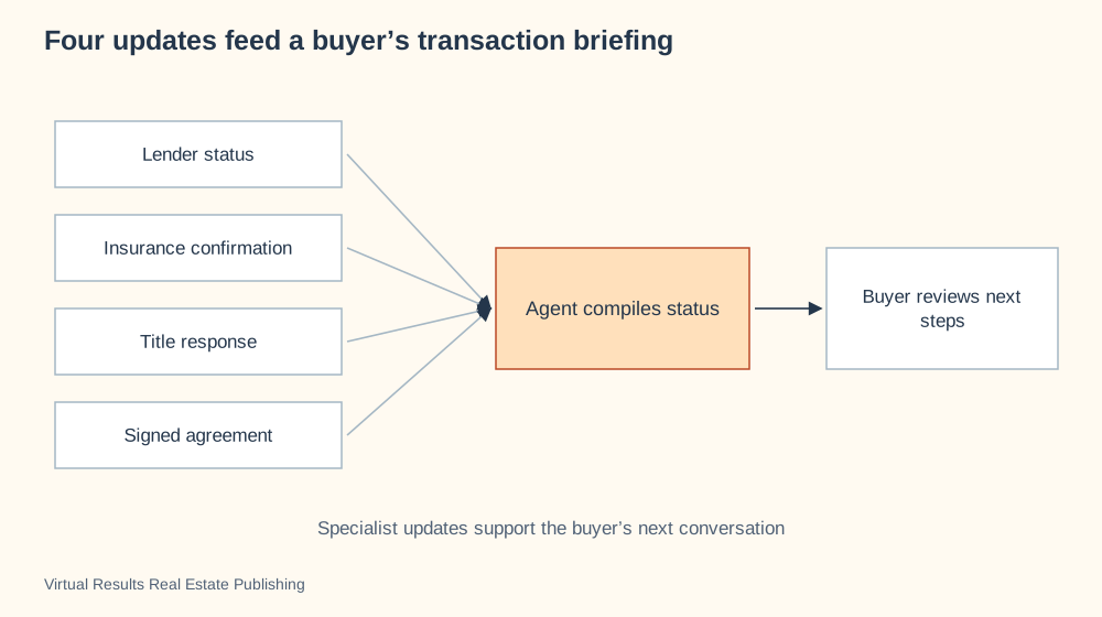
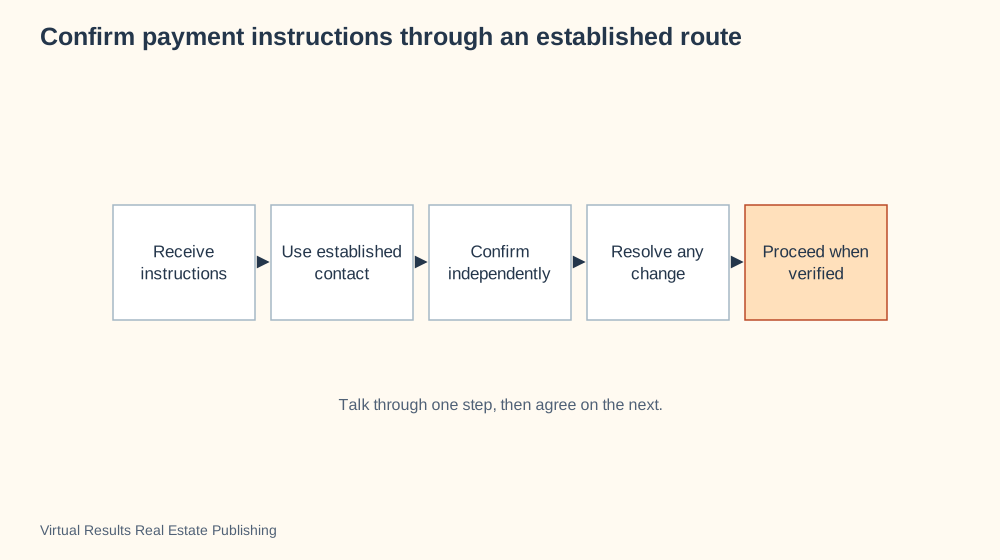
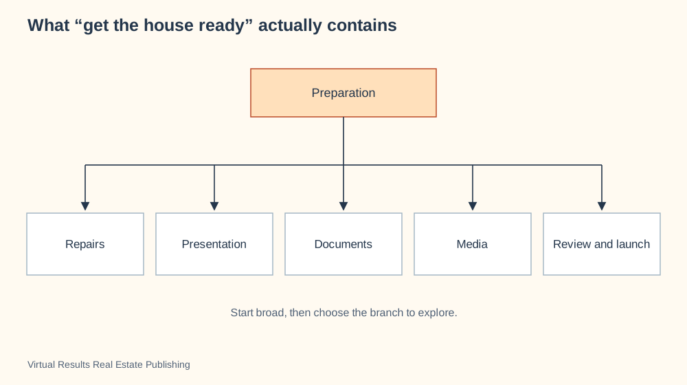
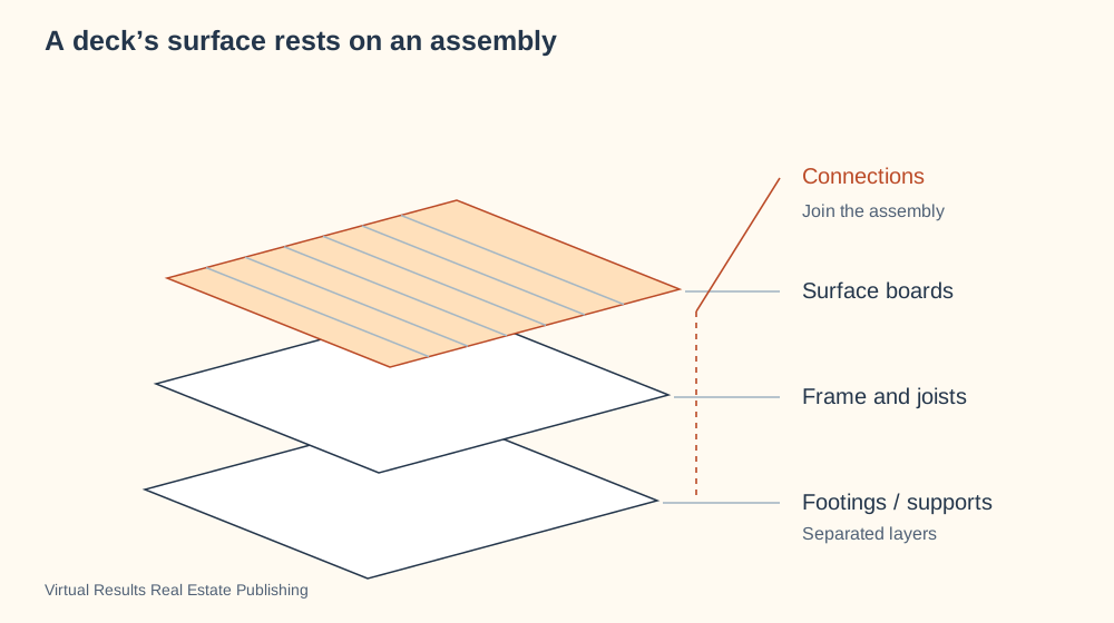
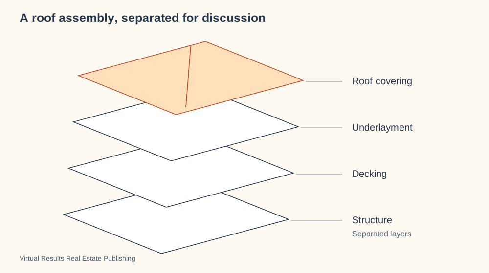
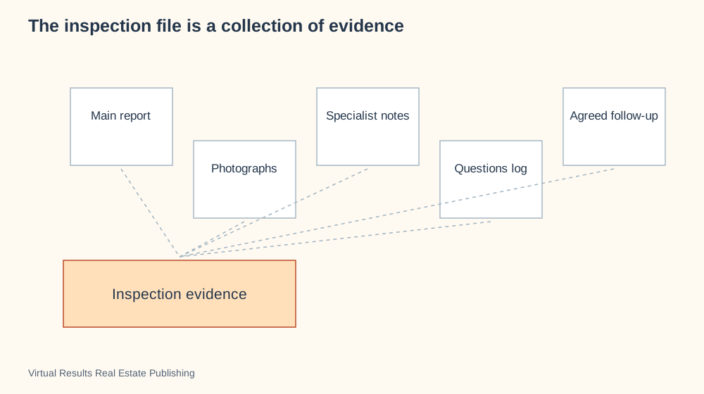
Try this in your next meeting: open one diagram, ask what the client notices first, then follow the picture together. Their question tells you where to go next.
The right picture can change the conversation
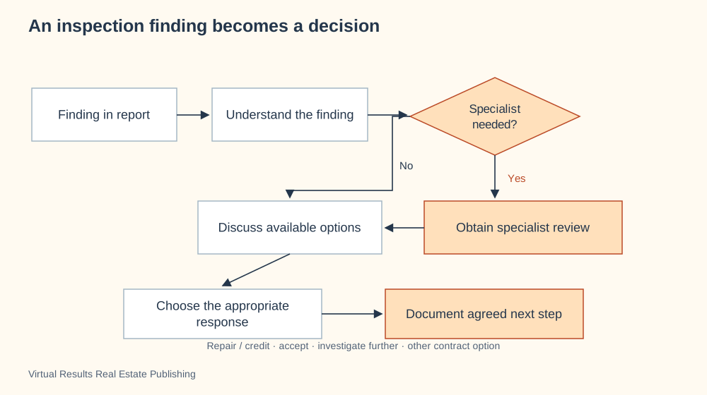
A finding becomes a choice
An inspection raises a question. Follow the branches to see how a specialist review can lead to a next decision.
A client asks, “What happens after the inspection?” You could recite a list of deadlines. Or you could open a diagram, point to the finding, follow the branch to a specialist, and talk through the choices together. The picture gives both of you something to work with. The conversation supplies the property details, priorities and next move.
That is the idea behind this collection: 78 fresh real estate visuals, created for the moments when words alone leave people working too hard. There are maps of people, timelines of a purchase, comparisons of homes, views of hidden building systems and pictures of how everyday spaces connect. Use them in a buyer consultation, listing presentation, property visit or conversation about the next chapter of homeownership.
Learn the possibilities. Create your own.
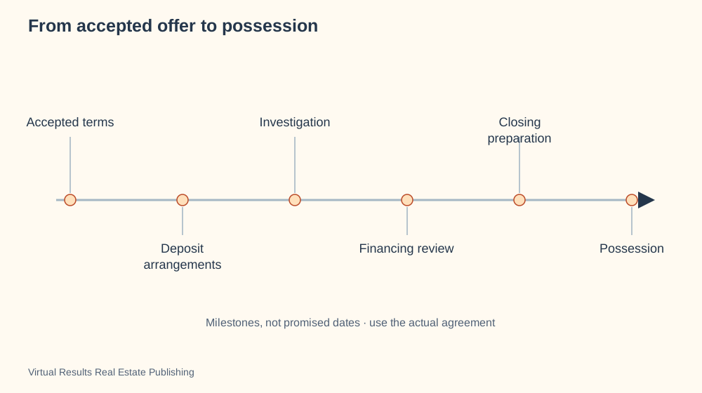
Show what happens next
For a buyer asking what follows an accepted offer, start with milestones.
You are welcome to use these visuals directly. Their lasting value is the range of ideas they open up: knowing when a timeline, relationship map, cutaway, comparison or decision tree will serve your own question best. Treat the collection as a visual vocabulary. Explore the options, learn what each makes visible, and choose the structure that fits your audience and information. The image, graphic or slide you create can look completely different from our example.
Start with the question in front of you
Compare several options
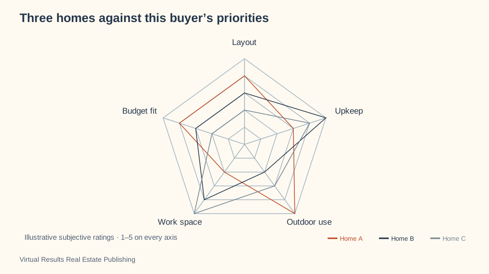
When three homes each have different strengths, put the same questions beside each option.
You do not need to know the name of a diagram to choose one. Start with what your client is asking. “Who handles that?” calls for a picture of responsibilities. “When will that happen?” calls for a timeline. “What if the inspection raises a concern?” calls for branches and choices. “Why does this home feel easier to live in?” calls for a spatial view that makes the connections visible.
The contents menu gives you the technical names and short definitions when you want to learn them. Each example also includes a ready-to-copy AI prompt. Ask ChatGPT, Claude or Codex to rebuild the idea in your colors, with your property details and your client's question at the center. A designer, Canva, PowerPoint or a pencil sketch can take the same idea in another direction.
Walk through an offer together
Follow the conversation
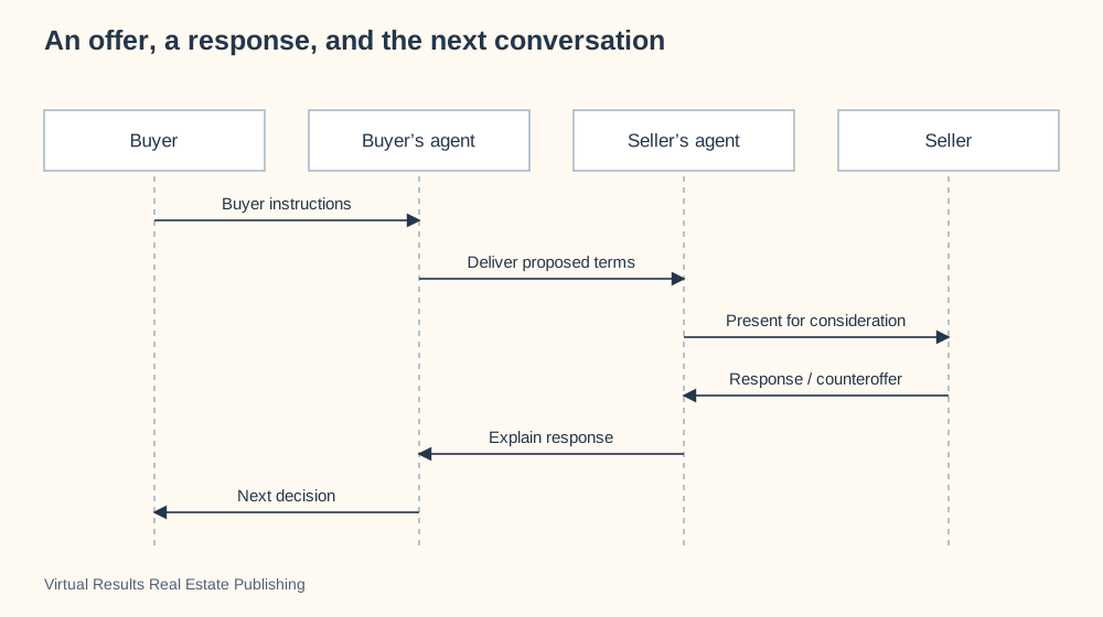
Watch an offer move between participants; notice the distinction between deciding and communicating.
Open “An offer, a response, and the next conversation” during a buyer meeting. Follow the messages between the buyer and the two agents. Ask, “Who decides here, and who communicates the decision?” The sequence makes that distinction easy to see without making the meeting feel like a lecture.
Next, switch to “From accepted offer to possession.” You are explaining the same purchase through a different lens: the milestones ahead. Then open “Who does the next escrow task?” when the question becomes who needs to act. Three pictures, three useful conversations. The sequence explains communication; the timeline explains progression; the swimlane explains responsibility.
Original AI interior illustration · A starting point for noticing spatial connections.
Turn a home visit into a better story
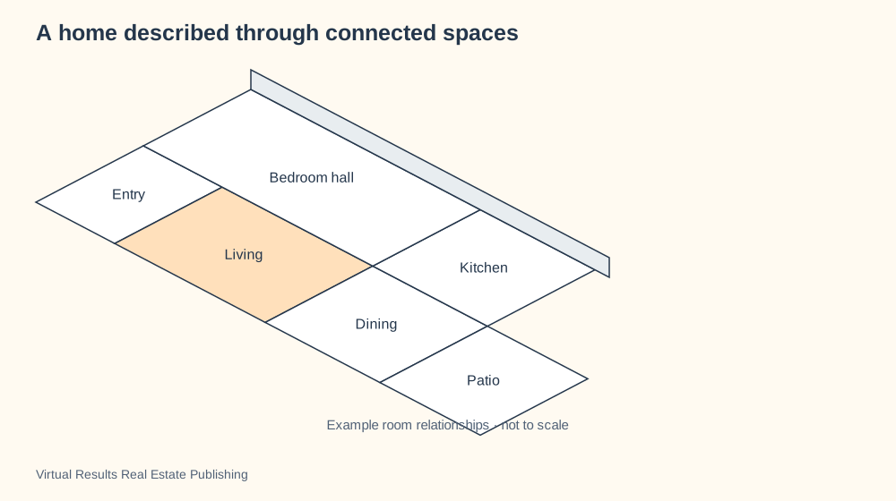
An angled view of connected rooms
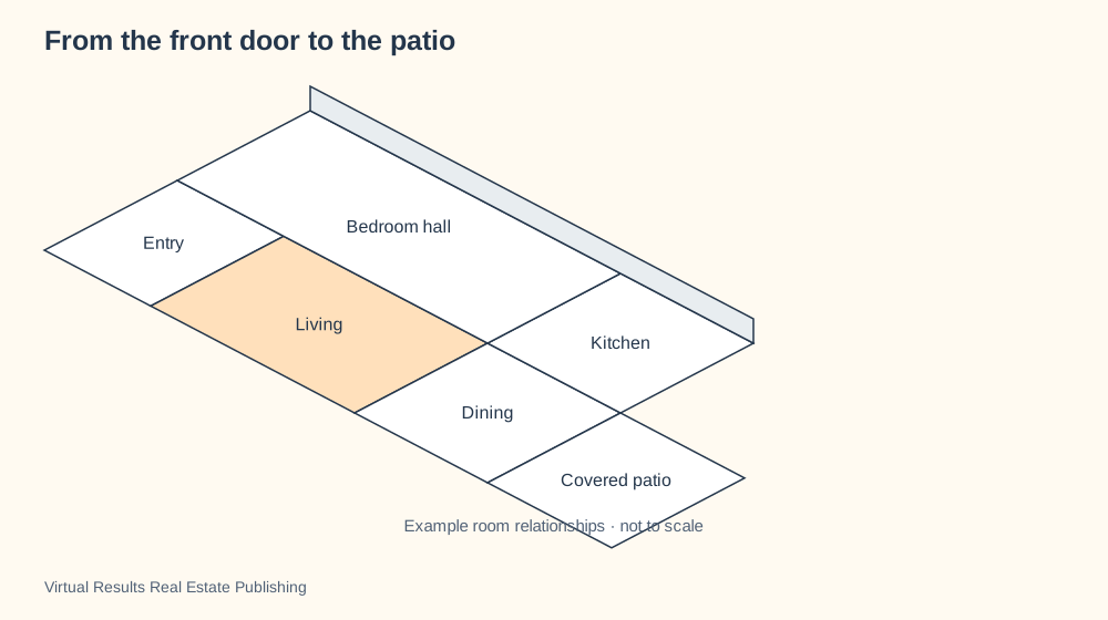
Look down into the home at an angle, with the roof out of the way. You can see the entry, rooms and route outdoors together. Designers call this an axonometric view.
At the front door, notice where your eye travels. Can you see the dining area? Is the kitchen beside it? Where does the route meet the patio? Those observations can become a simple spatial picture and a much stronger description: “The kitchen and dining area sit side by side, with the patio door a few steps from the table.”
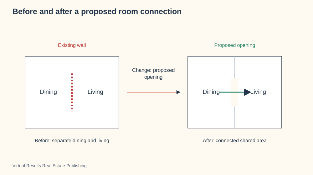
An angled view of the rooms lets you talk through that relationship with a client who is remembering several homes at once. A floor plan answers a different question about arrangement. A before-and-after picture can explore a change. Choose the view that explains what you actually noticed, then invite the client to say how they would use the space.
Make the important questions easier to ask
Follow a hidden system
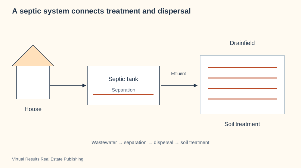
Trace how a septic system connects treatment with dispersal, then use the picture to frame the questions about this property.
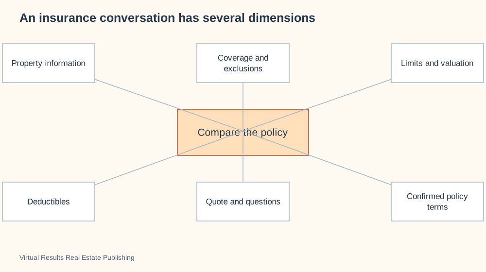
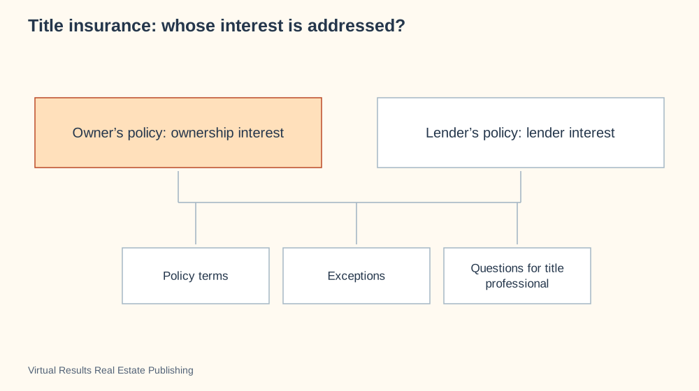
A drawing that opens up the wall to show its layers starts a conversation about the layers behind the finish. A septic-system diagram connects treatment with dispersal. An insurance visual separates the home, belongings and liability questions that can otherwise blur together. A title visual gives a client a place to begin asking about ownership history and policy coverage.
For a deeper conversation, open the full guides linked below. They combine a substantial visual with a readable explanation and the source material behind it. Keep the page open during the meeting, follow the picture together and capture the question your client wants answered next.
Make it yours in a few minutes
Your data, your comparison
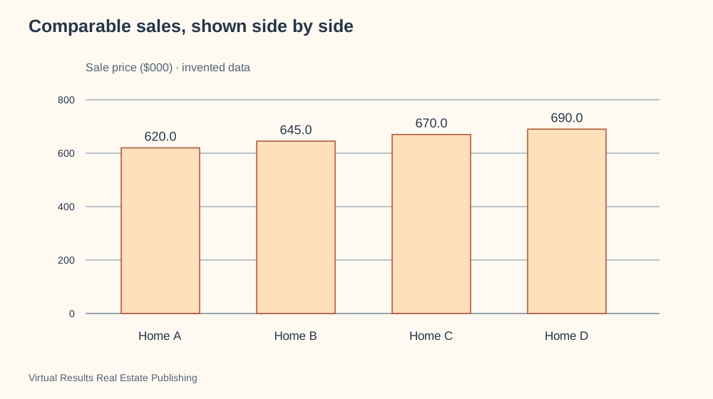
Replace the example with your comparable sales and tell the assistant which difference matters most.
Choose a diagram, copy its customization prompt and give your AI assistant the real question you want to explain. Ask it to offer two or three design directions before creating the result. You can change the colors, wording, shapes, level of detail and presentation format. Each prompt includes an option for a PowerPoint slide with speaker notes so you can turn the visual into a guided conversation.
Pro tip: add a clear headline at the top of your image, graphic or PowerPoint slide. For an escrow diagram, try “The People and Steps Behind Your Home Purchase.” For a room-layout graphic, try “From the Front Door to the Patio.” Make the main relationship easy to see, then explain the extra details underneath.
Save the good ones and come back with a client
A useful return visit
Bookmark a home-life cycle for a conversation about the next stage of ownership.
Use “Copy link” beside any diagram to copy its direct address. Bookmark the page in your browser, keep it in your client-meeting notes, or add it to the resources your team uses most. “Browse one at a time” turns the library into a focused presentation; Library overview takes you back to this overview.
Give us some love: use and adapt our original visuals, and link to this collection so others can explore it too. Copy the ready-made credit below, or write your own.
A home purchase: compare three different visualizations
These three examples explain different parts of the same home purchase. Compare what each visualization makes clear, what it leaves out, and when to use it.
Conversation sequence visualization
Question it answers: Who communicates with whom when an offer is made?
Pros: Shows the order of messages between the buyer, agents and seller. Useful for explaining offers, responses and handoffs.
Cons: Does not show how long the purchase takes or all the work happening between messages.
Choose by purpose: use a conversation sequence to explain communication, a milestone timeline to explain progression, and a responsibility diagram to explain who does the work.
A credit you can copy
Add this below your image, graphic, slide or article. Use our wording or make it your own.
<p>Visualization inspiration: <a href="https://virtualresults.com/real-estate-visualization-library/">Virtual Results Real Estate Publishing</a>.</p>
Use this credit as written, or adapt its wording.
What are you trying to explain?
Describe your question in your own words. This quick chooser matches common themes to useful visual structures—no account or AI app needed.
Try:
Suggestions come from simple topic matching in your browser. Your question stays on this page; this chooser does not call an AI service.
Bring your question. Find your visual.
Copy a prompt below into ChatGPT, Claude, Codex or another browsing assistant. Replace the bracketed words with your needs. Let it explore the examples, compare options and help you create something of your own.
Public resource address: https://virtualresults.com/real-estate-visualization-library/ Copy a prompt below and ask a browsing assistant to explore this resource with you.
Choose the right visual
“I want to explain [my topic] to [my audience]. Help me choose the best visualization.”
Copy this complete prompt
Visit https://virtualresults.com/real-estate-visualization-library/ and use the visualization ideas in this Virtual Results Real Estate Publishing resource to help me explain [topic] to [audience]. Ask what I want them to understand and what information I have. Recommend three suitable visualization types, explain the strengths and tradeoffs of each, and link to the relevant examples. Help me choose one and create an original visual for my needs. If you cannot access the page, ask me to paste the relevant content before claiming to have reviewed it.
Explore two directions
“Show me two different ways to make this idea clear. Help me decide which works best.”
Copy this complete prompt
Review https://virtualresults.com/real-estate-visualization-library/. I want to demonstrate [process, comparison, relationship or place]. Suggest two different visual approaches inspired by this library. Show a rough layout for each, explain what each emphasizes and leaves out, and ask me which fits my goal. Then help me develop my own version with my details, colors and wording. Include a small credit and link to Virtual Results Real Estate Publishing. If the page is unavailable, ask me for its content.
Bring a client into the conversation
“Let’s look at a few ways to picture your question. Which view makes it click?”
Copy this complete prompt
Use https://virtualresults.com/real-estate-visualization-library/ to help me and my real estate agent talk through [my question]. Explain the topic in plain language, find two useful visualization examples and give me three questions to discuss with my agent. Link to the relevant examples so we can look at them together. Ask for the property or transaction details you need. If you cannot open the resource, ask me to paste it.
Invite a client to explore with you
Send this invitation before a meeting or open the resource together during your conversation.
Here’s a resource with lots of ways to picture real estate questions. Take a look at https://virtualresults.com/real-estate-visualization-library/ and bring the example that interests you. We’ll use it to talk through your situation and choose the view that helps you most.
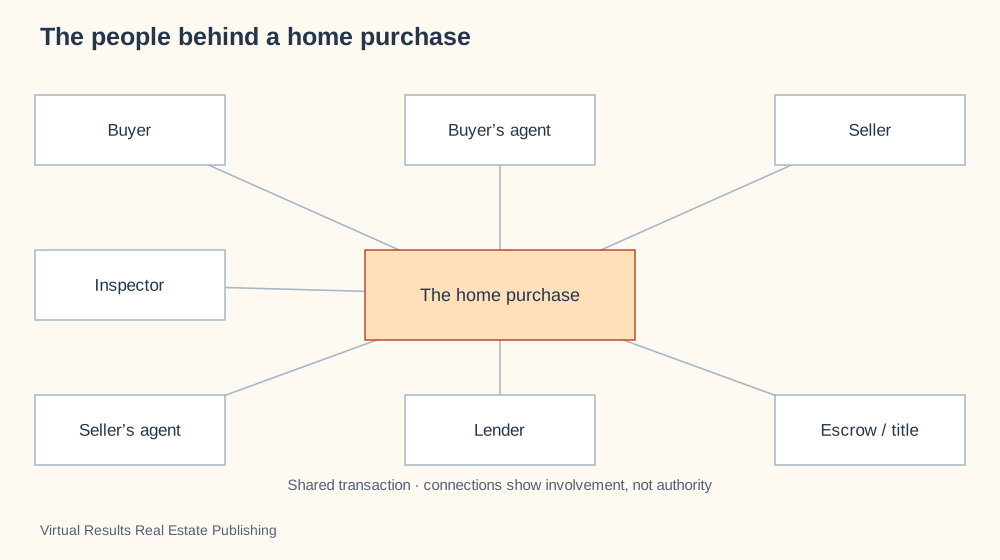
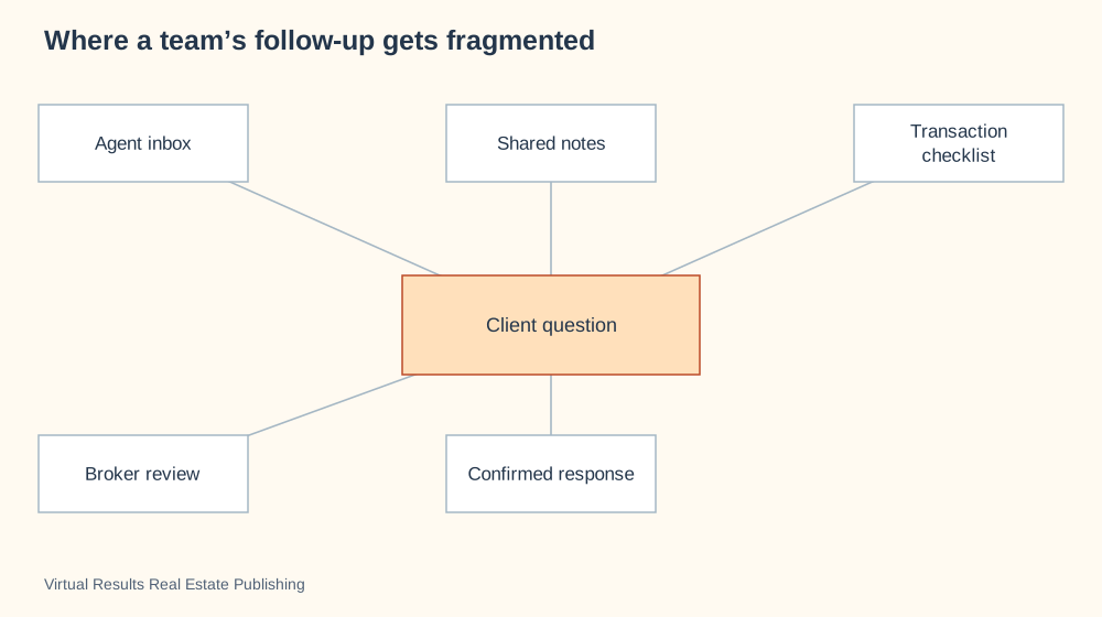
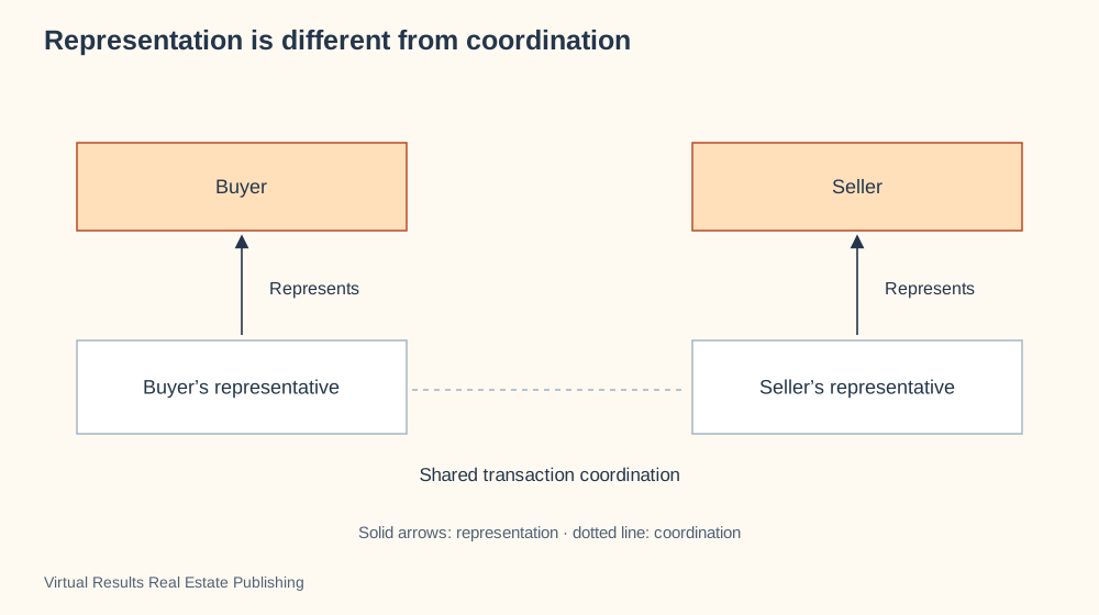
A relationship map shows people around a shared transaction. The purchase sits in the center because it is their common involvement, not a person with authority over everyone else. Use a representation diagram to explain whom an agent represents, or responsibility lanes to assign work.
Swipe to explore the full picture on a small screen.
Relationship map · Shows who or what connects, without forcing everything into a sequence.
The home purchase is the shared subject at the center; the buyer, seller and professionals appear around it. The lines show involvement in the transaction, not who leads, represents or reports to whom.
Use this as a participant overview. Switch to the representation diagram for client relationships, or to the responsibility diagram for who owns a particular task.
Choose your colors, add your details and ask your assistant to walk you through the options. You can also request a PowerPoint slide.
Create a new visualization using this specific format: Relationship map. My subject: [describe what I want to explain]. My audience: [who will read it]. My information: [paste the facts or ask me for them].
STRUCTURE REQUIRED: Use a nondirectional relationship map. Put the shared subject, not a support professional, at the center; place participants around it. Lines mean involvement, not authority or representation.
REFERENCE EXAMPLE: The people behind a home purchase. [insert the link below]. The reference demonstrates the format; do not automatically reuse its subject or labels. Open the reference or ask me to upload its image if you cannot access it. Do not claim to have reviewed an inaccessible reference.
BEFORE DRAWING: propose a labeled rough layout that follows the required structure. Explain what positions, lines, arrows, sizes and colors mean, and check that they convey my intended message. Ask for missing information. Offer color and detail choices without changing the diagram type. If this type is unsuitable for my topic, explain why and propose a better type before proceeding.
DELIVER: a clear graphic with a descriptive headline, readable labels and a short explanation. Offer editable SVG, PowerPoint or browser animation when supported by your tools. Keep example numbers labeled. Include a small credit and link to Virtual Results Real Estate Publishing.
CHECK: verify the resulting layout matches the required format and does not imply false importance, authority, sequence, causation or quantities.
Journeys and teamwork · 2 of 78
An inspection finding becomes a decision
Why this visualization?
A decision flowchart separates an inspection finding from the choices that follow. Its branch asks whether specialist review is needed before the buyer discusses a response. Use a timeline when the main question is the inspection deadline rather than the decision.
Swipe to explore the full picture on a small screen.
Decision tree · Branches from a question into different next steps.
An inspection finding starts a conversation rather than prescribing a single response. Understand the condition before discussing transaction options.
Highlight the unresolved question and the person qualified to answer it; keep deadlines tied to the actual contract.
Choose your colors, add your details and ask your assistant to walk you through the options. You can also request a PowerPoint slide.
Create a new visualization using this specific format: Decision tree. My subject: [describe what I want to explain]. My audience: [who will read it]. My information: [paste the facts or ask me for them].
STRUCTURE REQUIRED: Use a branching decision flowchart: action rectangles, question diamonds, labeled Yes/No branches, and clearly labeled outcomes. Do not draw a radial mind map.
REFERENCE EXAMPLE: An inspection finding becomes a decision. [insert the link below]. The reference demonstrates the format; do not automatically reuse its subject or labels. Open the reference or ask me to upload its image if you cannot access it. Do not claim to have reviewed an inaccessible reference.
BEFORE DRAWING: propose a labeled rough layout that follows the required structure. Explain what positions, lines, arrows, sizes and colors mean, and check that they convey my intended message. Ask for missing information. Offer color and detail choices without changing the diagram type. If this type is unsuitable for my topic, explain why and propose a better type before proceeding.
DELIVER: a clear graphic with a descriptive headline, readable labels and a short explanation. Offer editable SVG, PowerPoint or browser animation when supported by your tools. Keep example numbers labeled. Include a small credit and link to Virtual Results Real Estate Publishing.
CHECK: verify the resulting layout matches the required format and does not imply false importance, authority, sequence, causation or quantities.
People and agreements · 3 of 78
An offer, a response, and the next conversation
Why this visualization?
A conversation sequence shows who sends an offer, who considers it, and how a response returns to the buyer. Separate vertical tracks keep communication distinct from the client’s decision. Use a milestone timeline for the whole purchase rather than one exchange.
Swipe to explore the full picture on a small screen.
Sequence diagram · Shows messages between people in the order they happen.
A sequence makes the offer conversation visible: instructions, delivery, review and response. A counteroffer returns for consideration rather than becoming automatic acceptance.
Use the message labels to distinguish communicating terms from deciding whether to agree.
Choose your colors, add your details and ask your assistant to walk you through the options. You can also request a PowerPoint slide.
Create a new visualization using this specific format: Sequence diagram. My subject: [describe what I want to explain]. My audience: [who will read it]. My information: [paste the facts or ask me for them].
STRUCTURE REQUIRED: Use a UML-style sequence diagram: participants in columns across the top, vertical lifelines, horizontal message arrows in chronological rows descending downward. Each arrow names the message and actual sender/receiver. Do not use a radial map or a single row of stage boxes.
REFERENCE EXAMPLE: An offer, a response, and the next conversation. [insert the link below]. The reference demonstrates the format; do not automatically reuse its subject or labels. Open the reference or ask me to upload its image if you cannot access it. Do not claim to have reviewed an inaccessible reference.
BEFORE DRAWING: propose a labeled rough layout that follows the required structure. Explain what positions, lines, arrows, sizes and colors mean, and check that they convey my intended message. Ask for missing information. Offer color and detail choices without changing the diagram type. If this type is unsuitable for my topic, explain why and propose a better type before proceeding.
DELIVER: a clear graphic with a descriptive headline, readable labels and a short explanation. Offer editable SVG, PowerPoint or browser animation when supported by your tools. Keep example numbers labeled. Include a small credit and link to Virtual Results Real Estate Publishing.
CHECK: verify the resulting layout matches the required format and does not imply false importance, authority, sequence, causation or quantities.
Journeys and teamwork · 4 of 78
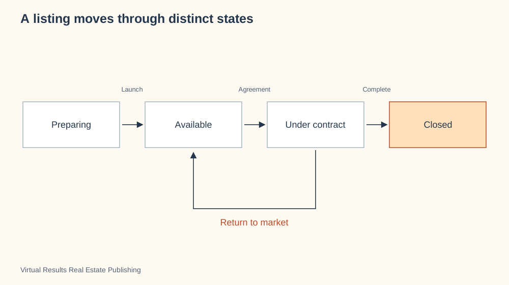
A listing moves through distinct states
Why this visualization?
A state diagram shows the difference between preparing, available, under contract and closed. The return arrow matters: a contract can end without a closing. Use a preparation schedule to show the tasks needed to reach each state.
Swipe to explore the full picture on a small screen.
State diagram · Shows statuses and the events that move something between them.
A listing has different communication needs before launch, during exposure and after an agreement. A return-to-market path acknowledges that an agreement does not guarantee a closing.
Match the state labels to the local listing system and explain the difference between market status and contractual rights.
Choose your colors, add your details and ask your assistant to walk you through the options. You can also request a PowerPoint slide.
Create a new visualization using this specific format: State diagram. My subject: [describe what I want to explain]. My audience: [who will read it]. My information: [paste the facts or ask me for them].
STRUCTURE REQUIRED: Use a state-transition diagram with four main status boxes arranged left to right and labeled transition arrows. Include a separate return arrow from Under contract to Available when needed. Boxes are statuses, not people; no mind map.
REFERENCE EXAMPLE: A listing moves through distinct states. [insert the link below]. The reference demonstrates the format; do not automatically reuse its subject or labels. Open the reference or ask me to upload its image if you cannot access it. Do not claim to have reviewed an inaccessible reference.
BEFORE DRAWING: propose a labeled rough layout that follows the required structure. Explain what positions, lines, arrows, sizes and colors mean, and check that they convey my intended message. Ask for missing information. Offer color and detail choices without changing the diagram type. If this type is unsuitable for my topic, explain why and propose a better type before proceeding.
DELIVER: a clear graphic with a descriptive headline, readable labels and a short explanation. Offer editable SVG, PowerPoint or browser animation when supported by your tools. Keep example numbers labeled. Include a small credit and link to Virtual Results Real Estate Publishing.
CHECK: verify the resulting layout matches the required format and does not imply false importance, authority, sequence, causation or quantities.
Journeys and teamwork · 5 of 78
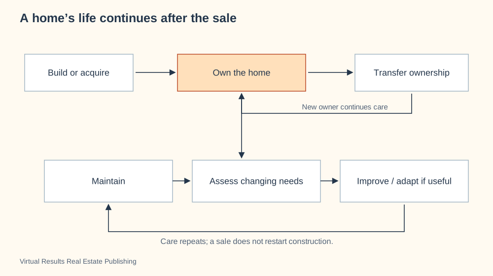
A home’s life continues after the sale
Why this visualization?
A lifecycle diagram distinguishes the home’s initial creation from recurring ownership and care. Maintenance can repeat, improvement is optional, and a transfer introduces a new owner rather than another construction project. Use a timeline for dated work on one particular home.
Swipe to explore the full picture on a small screen.
Ownership and care lifecycle · Separates initial construction, changing ownership and recurring care.
A home is an ongoing system of ownership and care. Maintenance and improvement happen across years, while sale is one transition in a longer story.
Build homeowner education around the entire lifecycle instead of ending the relationship at closing.
Choose your colors, add your details and ask your assistant to walk you through the options. You can also request a PowerPoint slide.
Create a new visualization using this specific format: Ownership and care lifecycle. My subject: [describe what I want to explain]. My audience: [who will read it]. My information: [paste the facts or ask me for them].
STRUCTURE REQUIRED: Use an ownership-and-care lifecycle diagram with a separate Build or acquire entry. Ownership can transfer to a new owner. Draw a distinct recurring maintenance/assessment/improvement loop; do not route transfer back into construction. Arrowheads must remain visible beyond box edges.
REFERENCE EXAMPLE: A home’s life continues after the sale. [insert the link below]. The reference demonstrates the format; do not automatically reuse its subject or labels. Open the reference or ask me to upload its image if you cannot access it. Do not claim to have reviewed an inaccessible reference.
BEFORE DRAWING: propose a labeled rough layout that follows the required structure. Explain what positions, lines, arrows, sizes and colors mean, and check that they convey my intended message. Ask for missing information. Offer color and detail choices without changing the diagram type. If this type is unsuitable for my topic, explain why and propose a better type before proceeding.
DELIVER: a clear graphic with a descriptive headline, readable labels and a short explanation. Offer editable SVG, PowerPoint or browser animation when supported by your tools. Keep example numbers labeled. Include a small credit and link to Virtual Results Real Estate Publishing.
CHECK: verify the resulting layout matches the required format and does not imply false importance, authority, sequence, causation or quantities.
Journeys and teamwork · 6 of 78
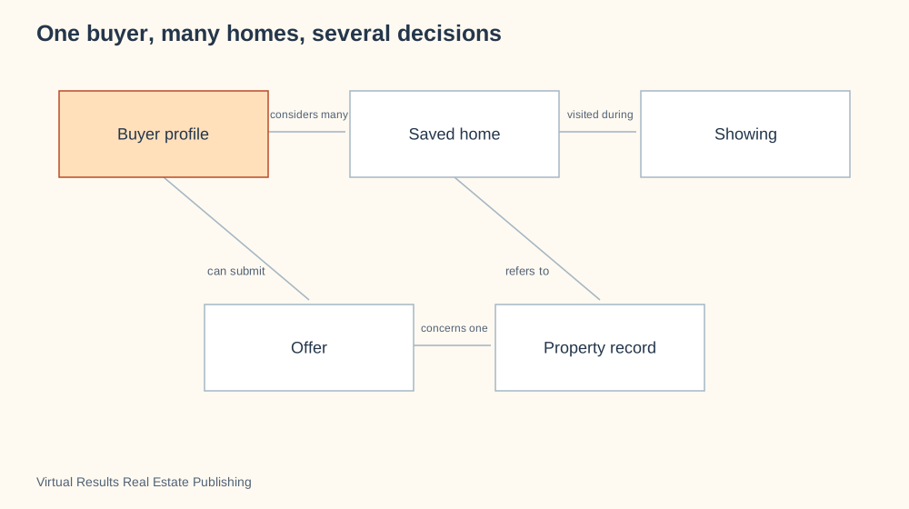
One buyer, many homes, several decisions
Why this visualization?
A relationship diagram keeps the buyer, saved homes, visits and offers as different records. It helps explain why several visits or offers can concern the same property without making every saved home a commitment. Use a buyer journey to explain the experience over time.
Swipe to explore the full picture on a small screen.
Entity relationship diagram · Connects records and shows how one relates to many others.
A buyer may consider several properties and revisit the same one. Separating homes, appointments and offers keeps the history of decisions understandable.
Use the connections to discuss search progress without equating a saved listing with a commitment.
Choose your colors, add your details and ask your assistant to walk you through the options. You can also request a PowerPoint slide.
Create a new visualization using this specific format: Entity relationship diagram. My subject: [describe what I want to explain]. My audience: [who will read it]. My information: [paste the facts or ask me for them].
STRUCTURE REQUIRED: Use an entity-relationship diagram with one box per record type, labeled associations and one-to-many meaning where known. Do not confuse records with transaction authority.
REFERENCE EXAMPLE: One buyer, many homes, several decisions. [insert the link below]. The reference demonstrates the format; do not automatically reuse its subject or labels. Open the reference or ask me to upload its image if you cannot access it. Do not claim to have reviewed an inaccessible reference.
BEFORE DRAWING: propose a labeled rough layout that follows the required structure. Explain what positions, lines, arrows, sizes and colors mean, and check that they convey my intended message. Ask for missing information. Offer color and detail choices without changing the diagram type. If this type is unsuitable for my topic, explain why and propose a better type before proceeding.
DELIVER: a clear graphic with a descriptive headline, readable labels and a short explanation. Offer editable SVG, PowerPoint or browser animation when supported by your tools. Keep example numbers labeled. Include a small credit and link to Virtual Results Real Estate Publishing.
CHECK: verify the resulting layout matches the required format and does not imply false importance, authority, sequence, causation or quantities.
Journeys and teamwork · 7 of 78
From accepted offer to possession
Why this visualization?
A milestone timeline puts the main purchase events in a readable order. It helps a buyer locate the current stage without filling the page with every task. Use responsibility lanes to identify who handles each item, or a schedule to show overlapping work.
Swipe to explore the full picture on a small screen.
Timeline · Places milestones along a progression so you can discuss what comes next.
Milestones explain the shape of a transaction. Several activities can overlap and the actual agreement determines dates and obligations.
Add the confirmed dates to a client-specific version and identify dependencies that could change the plan.
Choose your colors, add your details and ask your assistant to walk you through the options. You can also request a PowerPoint slide.
Create a new visualization using this specific format: Timeline. My subject: [describe what I want to explain]. My audience: [who will read it]. My information: [paste the facts or ask me for them].
STRUCTURE REQUIRED: Use a milestone timeline: a horizontal left-to-right line with ordered markers and labels above/below it. Use proportional spacing only when dates are known; otherwise say order only. Do not use a circular loop or radial mind map.
REFERENCE EXAMPLE: From accepted offer to possession. [insert the link below]. The reference demonstrates the format; do not automatically reuse its subject or labels. Open the reference or ask me to upload its image if you cannot access it. Do not claim to have reviewed an inaccessible reference.
BEFORE DRAWING: propose a labeled rough layout that follows the required structure. Explain what positions, lines, arrows, sizes and colors mean, and check that they convey my intended message. Ask for missing information. Offer color and detail choices without changing the diagram type. If this type is unsuitable for my topic, explain why and propose a better type before proceeding.
DELIVER: a clear graphic with a descriptive headline, readable labels and a short explanation. Offer editable SVG, PowerPoint or browser animation when supported by your tools. Keep example numbers labeled. Include a small credit and link to Virtual Results Real Estate Publishing.
CHECK: verify the resulting layout matches the required format and does not imply false importance, authority, sequence, causation or quantities.
Journeys and teamwork · 8 of 78
Responsibilities during escrow
Why this visualization?
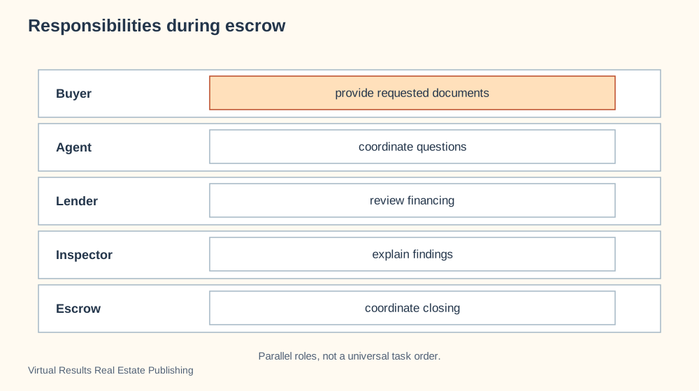
A responsibility-lane diagram gives each participant a separate row. It makes the buyer’s document task, lender’s financing work and inspector’s findings distinct without suggesting a universal order. Use a timeline when dates and sequence are the real question.
Swipe to explore the full picture on a small screen.
Swimlane diagram · Separates a process into the people or teams responsible for it.
Each lane names a participant and a responsibility. Parallel placement avoids suggesting that inspection waits for financing or that one professional controls the others.
Locate a task, name its owner, and confirm the actual deadline.
Choose your colors, add your details and ask your assistant to walk you through the options. You can also request a PowerPoint slide.
Create a new visualization using this specific format: Swimlane diagram. My subject: [describe what I want to explain]. My audience: [who will read it]. My information: [paste the facts or ask me for them].
STRUCTURE REQUIRED: Use a responsibility-lane diagram: one horizontal lane per participant with its task inside. Without confirmed timing, align task boxes in one column; horizontal position must not imply chronological order. Add a left-to-right time axis and handoff arrows only when the user supplies a real ordered workflow.
REFERENCE EXAMPLE: Responsibilities during escrow. [insert the link below]. The reference demonstrates the format; do not automatically reuse its subject or labels. Open the reference or ask me to upload its image if you cannot access it. Do not claim to have reviewed an inaccessible reference.
BEFORE DRAWING: propose a labeled rough layout that follows the required structure. Explain what positions, lines, arrows, sizes and colors mean, and check that they convey my intended message. Ask for missing information. Offer color and detail choices without changing the diagram type. If this type is unsuitable for my topic, explain why and propose a better type before proceeding.
DELIVER: a clear graphic with a descriptive headline, readable labels and a short explanation. Offer editable SVG, PowerPoint or browser animation when supported by your tools. Keep example numbers labeled. Include a small credit and link to Virtual Results Real Estate Publishing.
CHECK: verify the resulting layout matches the required format and does not imply false importance, authority, sequence, causation or quantities.
Journeys and teamwork · 9 of 78
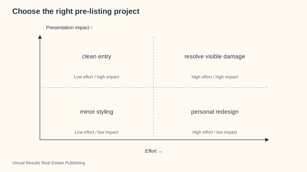
Choose the right pre-listing project
Why this visualization?
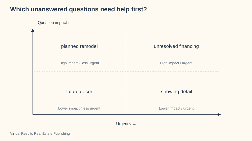
An effort-versus-impact matrix compares possible pre-listing projects on two separate questions. A small clean-up and a major repair can both help presentation while demanding very different effort. Use an estimate table when actual cost or expected return must be compared.
Swipe to explore the full picture on a small screen.
Quadrant chart · Compares choices on two dimensions, such as effort and impact.
The useful question is which project helps presentation enough to justify its effort. The placements are a discussion framework, not predicted resale returns.
Move the projects according to the actual property, available time and specialist estimates.
Choose your colors, add your details and ask your assistant to walk you through the options. You can also request a PowerPoint slide.
Create a new visualization using this specific format: Quadrant chart. My subject: [describe what I want to explain]. My audience: [who will read it]. My information: [paste the facts or ask me for them].
STRUCTURE REQUIRED: Use a two-axis quadrant chart with explicit axis labels and low-to-high directions. Place examples according to both dimensions and label their rationale.
REFERENCE EXAMPLE: Choose the right pre-listing project. [insert the link below]. The reference demonstrates the format; do not automatically reuse its subject or labels. Open the reference or ask me to upload its image if you cannot access it. Do not claim to have reviewed an inaccessible reference.
BEFORE DRAWING: propose a labeled rough layout that follows the required structure. Explain what positions, lines, arrows, sizes and colors mean, and check that they convey my intended message. Ask for missing information. Offer color and detail choices without changing the diagram type. If this type is unsuitable for my topic, explain why and propose a better type before proceeding.
DELIVER: a clear graphic with a descriptive headline, readable labels and a short explanation. Offer editable SVG, PowerPoint or browser animation when supported by your tools. Keep example numbers labeled. Include a small credit and link to Virtual Results Real Estate Publishing.
CHECK: verify the resulting layout matches the required format and does not imply false importance, authority, sequence, causation or quantities.
Homes and places · 10 of 78
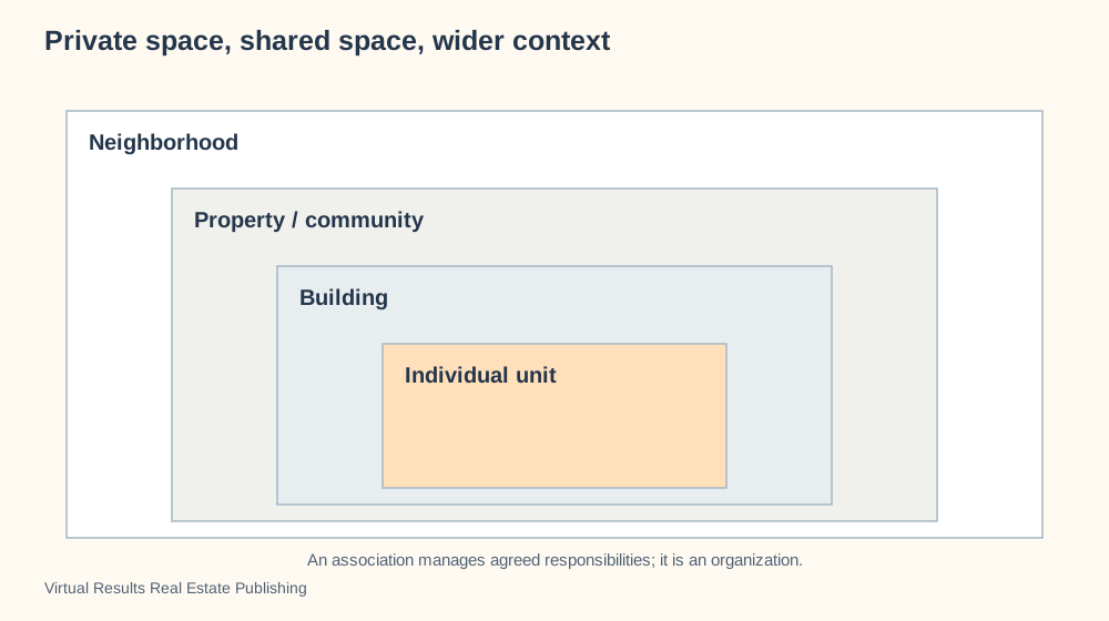
Private space, shared space, wider context
Why this visualization?
A nested diagram shows a unit within its building, property and neighborhood. Containment is the lesson: a buyer can separate the private space from its wider surroundings. Use a responsibility map for an association’s duties, because an organization is not another geographic boundary.
Swipe to explore the full picture on a small screen.
Nested diagram · Shows something inside a larger context.
A unit sits within a building, property and neighborhood. An association is an organization with responsibilities, rather than another geographic layer.
Pair the spatial explanation with governing documents to identify what is private, shared or subject to agreement.
Choose your colors, add your details and ask your assistant to walk you through the options. You can also request a PowerPoint slide.
Create a new visualization using this specific format: Nested diagram. My subject: [describe what I want to explain]. My audience: [who will read it]. My information: [paste the facts or ask me for them].
STRUCTURE REQUIRED: Use nested physical/context containers, largest outside and smallest inside. Put organizations outside geographic containers as connected callouts, not enclosing places.
REFERENCE EXAMPLE: Private space, shared space, wider context. [insert the link below]. The reference demonstrates the format; do not automatically reuse its subject or labels. Open the reference or ask me to upload its image if you cannot access it. Do not claim to have reviewed an inaccessible reference.
BEFORE DRAWING: propose a labeled rough layout that follows the required structure. Explain what positions, lines, arrows, sizes and colors mean, and check that they convey my intended message. Ask for missing information. Offer color and detail choices without changing the diagram type. If this type is unsuitable for my topic, explain why and propose a better type before proceeding.
DELIVER: a clear graphic with a descriptive headline, readable labels and a short explanation. Offer editable SVG, PowerPoint or browser animation when supported by your tools. Keep example numbers labeled. Include a small credit and link to Virtual Results Real Estate Publishing.
CHECK: verify the resulting layout matches the required format and does not imply false importance, authority, sequence, causation or quantities.
Journeys and teamwork · 11 of 78
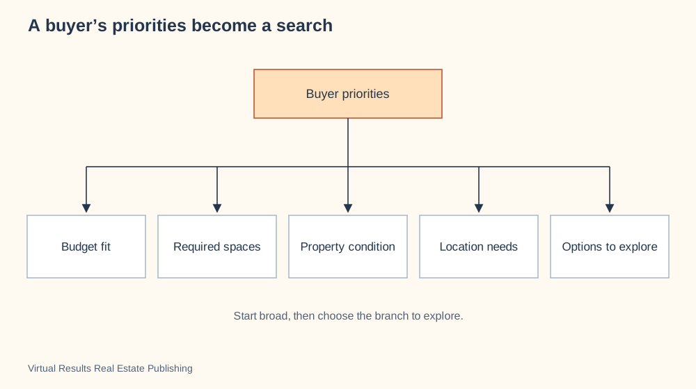
A buyer’s priorities become a search
Why this visualization?
A branching diagram breaks buyer priorities into distinct search criteria. The shared root reminds everyone that budget, rooms, condition and location come from this buyer’s needs. Use a comparison chart after there are specific homes to evaluate.
Swipe to explore the full picture on a small screen.
Hierarchy tree · Breaks a broad idea into smaller groups or choices.
A useful search begins with priorities and branches into choices. The tree keeps must-haves visible while leaving room to learn from actual visits.
Let the buyer define the branches rather than imposing assumptions about the household.
Choose your colors, add your details and ask your assistant to walk you through the options. You can also request a PowerPoint slide.
Create a new visualization using this specific format: Hierarchy tree. My subject: [describe what I want to explain]. My audience: [who will read it]. My information: [paste the facts or ask me for them].
STRUCTURE REQUIRED: Use a top-down hierarchy tree with a broad subject above and grouped subtopics below. Connections mean decomposition, not mandatory sequence.
REFERENCE EXAMPLE: A buyer’s priorities become a search. [insert the link below]. The reference demonstrates the format; do not automatically reuse its subject or labels. Open the reference or ask me to upload its image if you cannot access it. Do not claim to have reviewed an inaccessible reference.
BEFORE DRAWING: propose a labeled rough layout that follows the required structure. Explain what positions, lines, arrows, sizes and colors mean, and check that they convey my intended message. Ask for missing information. Offer color and detail choices without changing the diagram type. If this type is unsuitable for my topic, explain why and propose a better type before proceeding.
DELIVER: a clear graphic with a descriptive headline, readable labels and a short explanation. Offer editable SVG, PowerPoint or browser animation when supported by your tools. Keep example numbers labeled. Include a small credit and link to Virtual Results Real Estate Publishing.
CHECK: verify the resulting layout matches the required format and does not imply false importance, authority, sequence, causation or quantities.
People and agreements · 12 of 78
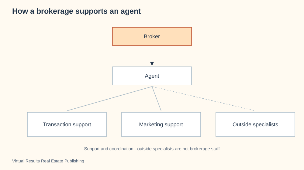
How a brokerage supports an agent
Why this visualization?
An organization-and-support chart separates broker supervision from agent support and outside specialists. The different connections help explain why a marketing helper and an independent inspector have different relationships to the brokerage. Use a transaction responsibility map for the work on a particular sale.
Swipe to explore the full picture on a small screen.
Organization chart · Shows roles, reporting and support relationships.
Support, supervision and outside expertise do different jobs. This view helps a client understand whom to contact without confusing a service vendor with brokerage staff.
Replace the example roles with the brokerage’s actual arrangements and approved responsibility descriptions.
Choose your colors, add your details and ask your assistant to walk you through the options. You can also request a PowerPoint slide.
Create a new visualization using this specific format: Organization chart. My subject: [describe what I want to explain]. My audience: [who will read it]. My information: [paste the facts or ask me for them].
STRUCTURE REQUIRED: Use an organization/support chart with verified supervision relationships and separate support roles. Distinguish outside vendors; do not imply an agent supervises every professional.
REFERENCE EXAMPLE: How a brokerage supports an agent. [insert the link below]. The reference demonstrates the format; do not automatically reuse its subject or labels. Open the reference or ask me to upload its image if you cannot access it. Do not claim to have reviewed an inaccessible reference.
BEFORE DRAWING: propose a labeled rough layout that follows the required structure. Explain what positions, lines, arrows, sizes and colors mean, and check that they convey my intended message. Ask for missing information. Offer color and detail choices without changing the diagram type. If this type is unsuitable for my topic, explain why and propose a better type before proceeding.
DELIVER: a clear graphic with a descriptive headline, readable labels and a short explanation. Offer editable SVG, PowerPoint or browser animation when supported by your tools. Keep example numbers labeled. Include a small credit and link to Virtual Results Real Estate Publishing.
CHECK: verify the resulting layout matches the required format and does not imply false importance, authority, sequence, causation or quantities.
Homes and places · 13 of 78
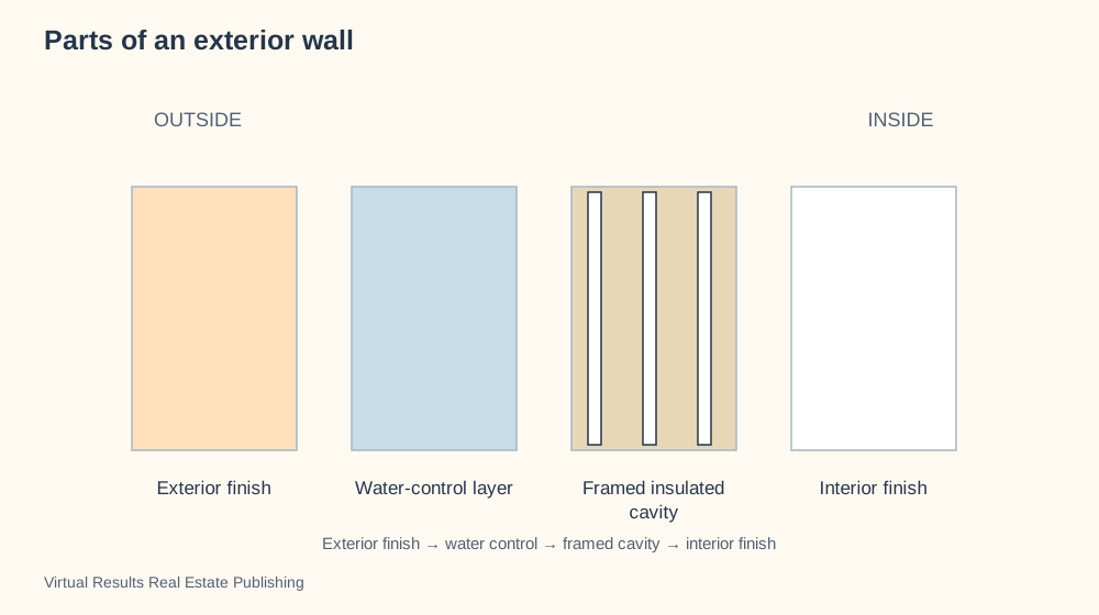
Parts of an exterior wall
Why this visualization?
A wall-section diagram shows outside-to-inside parts that a surface photograph hides. Distinct materials make the weather barrier, framed cavity and interior finish easier to discuss. Use an inspection photograph to address the condition of a real wall.
Swipe to explore the full picture on a small screen.
Layer diagram · Reveals the parts hidden behind a surface.
The visible surface is only one part of a building assembly. These conceptual layers invite better questions about moisture, comfort and the details that an inspector can observe.
Use an assembly verified for the actual building type; layer order and materials vary.
Choose your colors, add your details and ask your assistant to walk you through the options. You can also request a PowerPoint slide.
Create a new visualization using this specific format: Layer diagram. My subject: [describe what I want to explain]. My audience: [who will read it]. My information: [paste the facts or ask me for them].
STRUCTURE REQUIRED: Use a layer diagram with separately labeled aligned bands. Explain whether bands represent physical assembly or supporting information; do not imply an unsupported rank or mandatory chronology.
REFERENCE EXAMPLE: Parts of an exterior wall. [insert the link below]. The reference demonstrates the format; do not automatically reuse its subject or labels. Open the reference or ask me to upload its image if you cannot access it. Do not claim to have reviewed an inaccessible reference.
BEFORE DRAWING: propose a labeled rough layout that follows the required structure. Explain what positions, lines, arrows, sizes and colors mean, and check that they convey my intended message. Ask for missing information. Offer color and detail choices without changing the diagram type. If this type is unsuitable for my topic, explain why and propose a better type before proceeding.
DELIVER: a clear graphic with a descriptive headline, readable labels and a short explanation. Offer editable SVG, PowerPoint or browser animation when supported by your tools. Keep example numbers labeled. Include a small credit and link to Virtual Results Real Estate Publishing.
CHECK: verify the resulting layout matches the required format and does not imply false importance, authority, sequence, causation or quantities.
Journeys and teamwork · 14 of 78
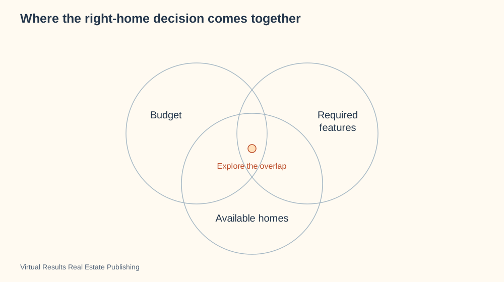
Where the right-home decision comes together
Why this visualization?
An overlap diagram asks which available homes satisfy both budget and required features. Its intersection is useful because a home can meet one requirement while missing another. Use a ranked comparison when the buyer needs to weigh tradeoffs among specific homes.
Swipe to explore the full picture on a small screen.
Venn diagram · Shows the overlap between sets of requirements or possibilities.
The home search is an intersection between resources, priorities and what is actually available. The overlap represents options worth examining, not a guaranteed perfect match.
Use the visual to discuss which priorities are fixed and which can change as evidence improves.
Choose your colors, add your details and ask your assistant to walk you through the options. You can also request a PowerPoint slide.
Create a new visualization using this specific format: Venn diagram. My subject: [describe what I want to explain]. My audience: [who will read it]. My information: [paste the facts or ask me for them].
STRUCTURE REQUIRED: Use a three-set Venn diagram with overlapping circles and labels for each set. The shared overlap represents options meeting all criteria, not a numeric proportion.
REFERENCE EXAMPLE: Where the right-home decision comes together. [insert the link below]. The reference demonstrates the format; do not automatically reuse its subject or labels. Open the reference or ask me to upload its image if you cannot access it. Do not claim to have reviewed an inaccessible reference.
BEFORE DRAWING: propose a labeled rough layout that follows the required structure. Explain what positions, lines, arrows, sizes and colors mean, and check that they convey my intended message. Ask for missing information. Offer color and detail choices without changing the diagram type. If this type is unsuitable for my topic, explain why and propose a better type before proceeding.
DELIVER: a clear graphic with a descriptive headline, readable labels and a short explanation. Offer editable SVG, PowerPoint or browser animation when supported by your tools. Keep example numbers labeled. Include a small credit and link to Virtual Results Real Estate Publishing.
CHECK: verify the resulting layout matches the required format and does not imply false importance, authority, sequence, causation or quantities.
Journeys and teamwork · 15 of 78
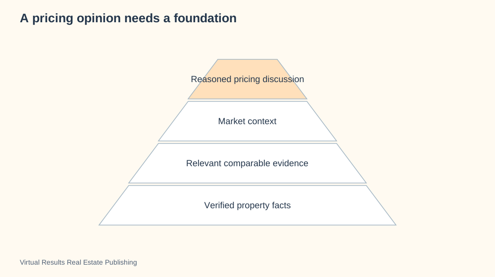
A pricing opinion needs a foundation
Why this visualization?
An evidence pyramid places the pricing discussion above the facts and comparisons that support it. Its foundation makes the reasoning visible instead of presenting a price as a free-standing opinion. Use a bar chart to compare actual sale prices.
Swipe to explore the full picture on a small screen.
Pyramid diagram · Builds an argument or hierarchy from its foundation upward.
Pricing reasoning becomes stronger when the reader can see what supports it. The conclusion sits on factual and comparable evidence rather than the other way around.
Name the evidence, its date and its limits before presenting the interpretation.
Choose your colors, add your details and ask your assistant to walk you through the options. You can also request a PowerPoint slide.
Create a new visualization using this specific format: Pyramid diagram. My subject: [describe what I want to explain]. My audience: [who will read it]. My information: [paste the facts or ask me for them].
STRUCTURE REQUIRED: Use a foundation pyramid: supporting evidence on the broad base, interpretation above, conclusion at the top. Width communicates foundation, not a quantitative amount.
REFERENCE EXAMPLE: A pricing opinion needs a foundation. [insert the link below]. The reference demonstrates the format; do not automatically reuse its subject or labels. Open the reference or ask me to upload its image if you cannot access it. Do not claim to have reviewed an inaccessible reference.
BEFORE DRAWING: propose a labeled rough layout that follows the required structure. Explain what positions, lines, arrows, sizes and colors mean, and check that they convey my intended message. Ask for missing information. Offer color and detail choices without changing the diagram type. If this type is unsuitable for my topic, explain why and propose a better type before proceeding.
DELIVER: a clear graphic with a descriptive headline, readable labels and a short explanation. Offer editable SVG, PowerPoint or browser animation when supported by your tools. Keep example numbers labeled. Include a small credit and link to Virtual Results Real Estate Publishing.
CHECK: verify the resulting layout matches the required format and does not imply false importance, authority, sequence, causation or quantities.
Markets and money · 16 of 78
Three homes against this buyer’s priorities
Why this visualization?
A multi-criteria radar chart places three homes on the same buyer-defined scales. The shapes reveal tradeoffs, such as strong outdoor use alongside weaker budget fit. Use a table or separate bars when precise rating differences matter more than the overall pattern.
Swipe to explore the full picture on a small screen.
Radar chart · Compares several options against the same set of criteria.
A multi-axis comparison can show tradeoffs among homes. The illustration uses subjective ratings on the same scale so no score looks like a formal property valuation.
Ask the buyer to set the criteria and ratings; a different buyer can reasonably draw a different picture.
Choose your colors, add your details and ask your assistant to walk you through the options. You can also request a PowerPoint slide.
Create a new visualization using this specific format: Radar chart. My subject: [describe what I want to explain]. My audience: [who will read it]. My information: [paste the facts or ask me for them].
STRUCTURE REQUIRED: Use a radar/spider comparison chart with identical criteria and shared1–5 scales on spokes. One closed outline per option with a legend; scores are subjective if no measured rubric is supplied.
REFERENCE EXAMPLE: Three homes against this buyer’s priorities. [insert the link below]. The reference demonstrates the format; do not automatically reuse its subject or labels. Open the reference or ask me to upload its image if you cannot access it. Do not claim to have reviewed an inaccessible reference.
BEFORE DRAWING: propose a labeled rough layout that follows the required structure. Explain what positions, lines, arrows, sizes and colors mean, and check that they convey my intended message. Ask for missing information. Offer color and detail choices without changing the diagram type. If this type is unsuitable for my topic, explain why and propose a better type before proceeding.
DELIVER: a clear graphic with a descriptive headline, readable labels and a short explanation. Offer editable SVG, PowerPoint or browser animation when supported by your tools. Keep example numbers labeled. Include a small credit and link to Virtual Results Real Estate Publishing.
CHECK: verify the resulting layout matches the required format and does not imply false importance, authority, sequence, causation or quantities.
Markets and money · 17 of 78
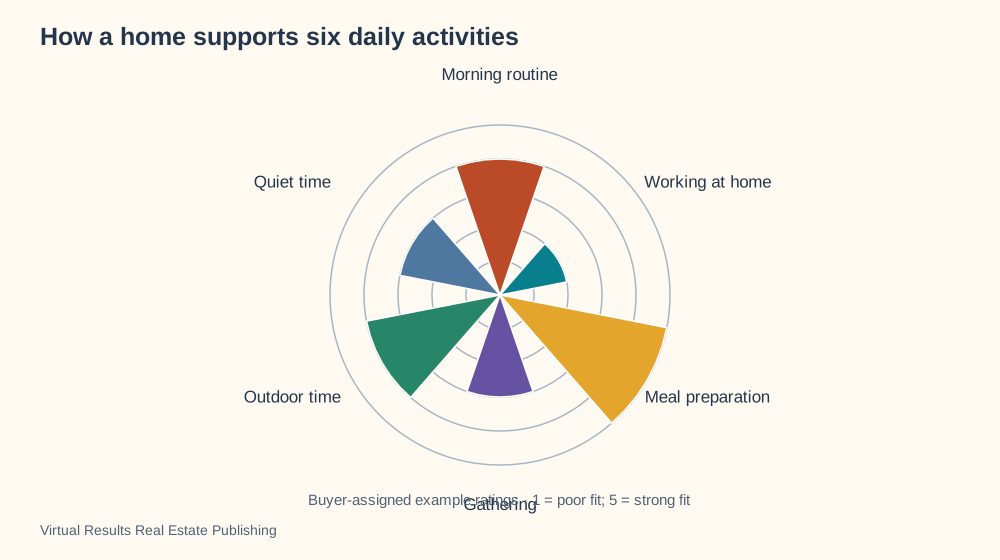
How a home supports six daily activities
Why this visualization?
A radial rating chart compares how a home supports six daily activities on a shared scale. It makes the buyer’s routine visible without reducing the decision to square footage. Use a room plan to explain where those activities happen, or a daily timeline for their order.
Swipe to explore the full picture on a small screen.
Polar chart · Arranges values or themes around a circle.
A buyer can rate how well observed spaces support daily activities. Equal rating scales make priorities visible; the scores belong to the buyer, not the property.
Use observed space relationships to support each interpretation instead of relying on lifestyle adjectives.
Choose your colors, add your details and ask your assistant to walk you through the options. You can also request a PowerPoint slide.
Create a new visualization using this specific format: Polar chart. My subject: [describe what I want to explain]. My audience: [who will read it]. My information: [paste the facts or ask me for them].
STRUCTURE REQUIRED: Use a polar rating chart with equal-angle sectors and a named common radial scale. Each radius encodes a rating, not duration or chronological order.
REFERENCE EXAMPLE: How a home supports six daily activities. [insert the link below]. The reference demonstrates the format; do not automatically reuse its subject or labels. Open the reference or ask me to upload its image if you cannot access it. Do not claim to have reviewed an inaccessible reference.
BEFORE DRAWING: propose a labeled rough layout that follows the required structure. Explain what positions, lines, arrows, sizes and colors mean, and check that they convey my intended message. Ask for missing information. Offer color and detail choices without changing the diagram type. If this type is unsuitable for my topic, explain why and propose a better type before proceeding.
DELIVER: a clear graphic with a descriptive headline, readable labels and a short explanation. Offer editable SVG, PowerPoint or browser animation when supported by your tools. Keep example numbers labeled. Include a small credit and link to Virtual Results Real Estate Publishing.
CHECK: verify the resulting layout matches the required format and does not imply false importance, authority, sequence, causation or quantities.
Journeys and teamwork · 18 of 78
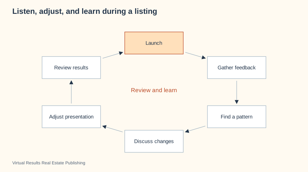
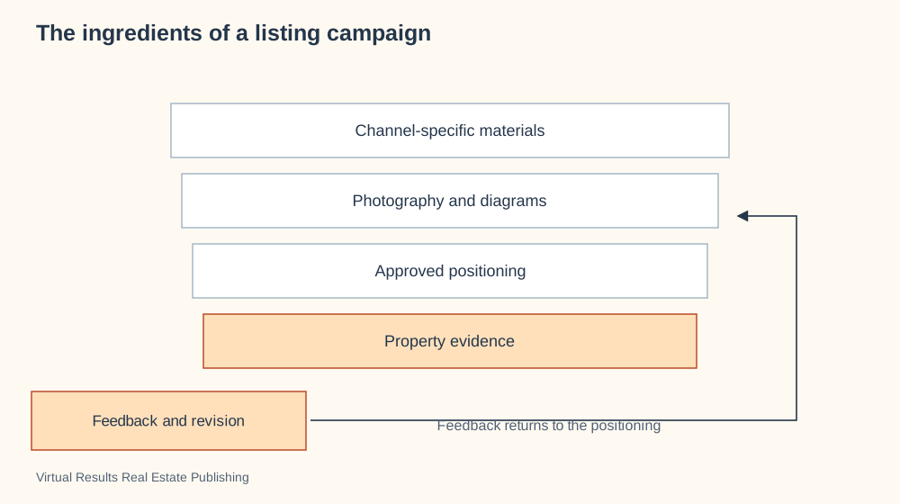
Listen, adjust, and learn during a listing
Why this visualization?
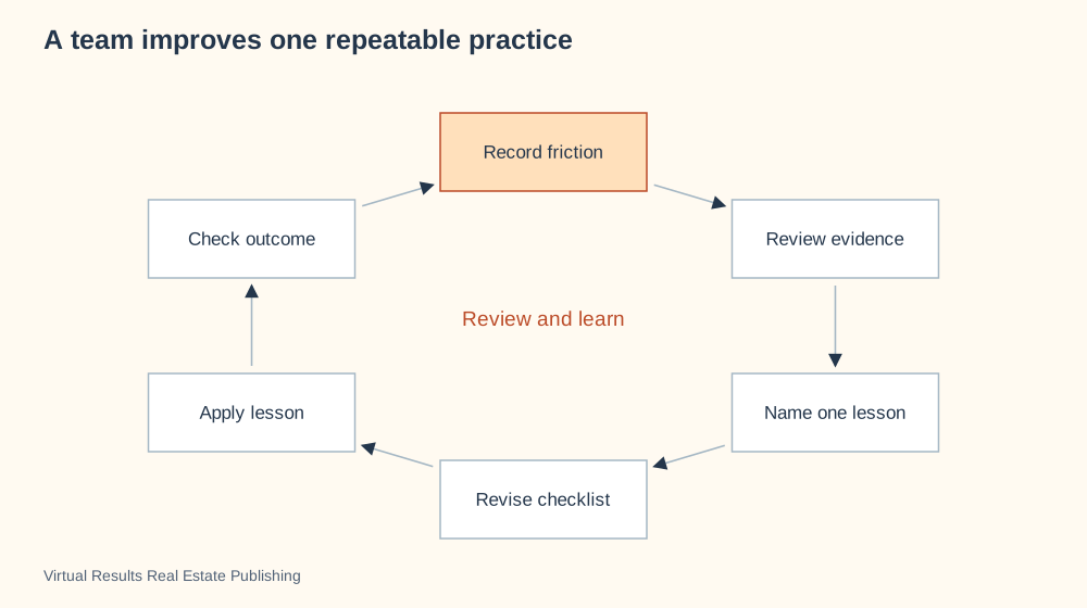
A feedback loop shows why listening continues after a listing launches. Feedback leads to a discussion, a chosen adjustment and another look at the response. Use a before-and-after comparison to isolate what actually changed.
Swipe to explore the full picture on a small screen.
Cycle diagram · Shows a process that repeats or continues over time.
Listing feedback is useful when it becomes a structured conversation. One comment is a signal to consider, while repeated evidence can help frame a change.
Record which change was made and compare the response without promising that the adjustment causes a sale.
Choose your colors, add your details and ask your assistant to walk you through the options. You can also request a PowerPoint slide.
Create a new visualization using this specific format: Cycle diagram. My subject: [describe what I want to explain]. My audience: [who will read it]. My information: [paste the facts or ask me for them].
STRUCTURE REQUIRED: Use a circular loop with arrowheads indicating the direction of a genuinely repeating process. Do not force one-time events into recurrence.
REFERENCE EXAMPLE: Listen, adjust, and learn during a listing. [insert the link below]. The reference demonstrates the format; do not automatically reuse its subject or labels. Open the reference or ask me to upload its image if you cannot access it. Do not claim to have reviewed an inaccessible reference.
BEFORE DRAWING: propose a labeled rough layout that follows the required structure. Explain what positions, lines, arrows, sizes and colors mean, and check that they convey my intended message. Ask for missing information. Offer color and detail choices without changing the diagram type. If this type is unsuitable for my topic, explain why and propose a better type before proceeding.
DELIVER: a clear graphic with a descriptive headline, readable labels and a short explanation. Offer editable SVG, PowerPoint or browser animation when supported by your tools. Keep example numbers labeled. Include a small credit and link to Virtual Results Real Estate Publishing.
CHECK: verify the resulting layout matches the required format and does not imply false importance, authority, sequence, causation or quantities.
Journeys and teamwork · 19 of 78
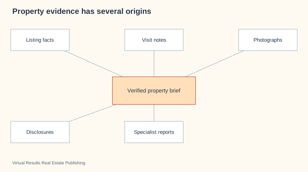
Property evidence has several origins
Why this visualization?
An evidence-source map gathers listing facts, visit notes, photographs and reports around a property brief. The distinct inputs remind the reader that an observation and a specialist finding have different origins. Use a review workflow to show how those inputs are checked.
Swipe to explore the full picture on a small screen.
Hub and spoke diagram · Connects several inputs or participants to one shared center.
A property explanation draws from different evidence sources. The central brief organizes those inputs while preserving their origin and uncertainty.
Keep observations, seller-provided statements and specialist findings distinct in the final description.
Choose your colors, add your details and ask your assistant to walk you through the options. You can also request a PowerPoint slide.
Create a new visualization using this specific format: Hub and spoke diagram. My subject: [describe what I want to explain]. My audience: [who will read it]. My information: [paste the facts or ask me for them].
STRUCTURE REQUIRED: Use a hub-and-spoke map with one named information package at the center and sources or destinations around it. Indicate whether connections are inputs or outputs. Do not make a professional the transaction authority.
REFERENCE EXAMPLE: Property evidence has several origins. [insert the link below]. The reference demonstrates the format; do not automatically reuse its subject or labels. Open the reference or ask me to upload its image if you cannot access it. Do not claim to have reviewed an inaccessible reference.
BEFORE DRAWING: propose a labeled rough layout that follows the required structure. Explain what positions, lines, arrows, sizes and colors mean, and check that they convey my intended message. Ask for missing information. Offer color and detail choices without changing the diagram type. If this type is unsuitable for my topic, explain why and propose a better type before proceeding.
DELIVER: a clear graphic with a descriptive headline, readable labels and a short explanation. Offer editable SVG, PowerPoint or browser animation when supported by your tools. Keep example numbers labeled. Include a small credit and link to Virtual Results Real Estate Publishing.
CHECK: verify the resulting layout matches the required format and does not imply false importance, authority, sequence, causation or quantities.
Markets and money · 20 of 78
Comparable sales, shown side by side
Why this visualization?
A bar chart compares sale prices against one common baseline. It makes differences between the selected sales easy to see without requiring readers to scan a list of numbers. Use a scatterplot when size or another property attribute needs to be compared with price.
Swipe to explore the full picture on a small screen.
Bar chart · Compares values side by side on a common scale.
A bar chart makes price differences visible, but it does not make dissimilar properties comparable. These prices are invented illustration values in thousands of dollars.
Use a verified comparable sample and explain meaningful differences in condition, location and sale date.
Choose your colors, add your details and ask your assistant to walk you through the options. You can also request a PowerPoint slide.
Create a new visualization using this specific format: Bar chart. My subject: [describe what I want to explain]. My audience: [who will read it]. My information: [paste the facts or ask me for them].
STRUCTURE REQUIRED: Use vertical bars on one shared zero-based value axis. Category names below bars, values above bars. Bar height represents the named amount.
REFERENCE EXAMPLE: Comparable sales, shown side by side. [insert the link below]. The reference demonstrates the format; do not automatically reuse its subject or labels. Open the reference or ask me to upload its image if you cannot access it. Do not claim to have reviewed an inaccessible reference.
BEFORE DRAWING: propose a labeled rough layout that follows the required structure. Explain what positions, lines, arrows, sizes and colors mean, and check that they convey my intended message. Ask for missing information. Offer color and detail choices without changing the diagram type. If this type is unsuitable for my topic, explain why and propose a better type before proceeding.
DELIVER: a clear graphic with a descriptive headline, readable labels and a short explanation. Offer editable SVG, PowerPoint or browser animation when supported by your tools. Keep example numbers labeled. Include a small credit and link to Virtual Results Real Estate Publishing.
CHECK: verify the resulting layout matches the required format and does not imply false importance, authority, sequence, causation or quantities.
Markets and money · 21 of 78
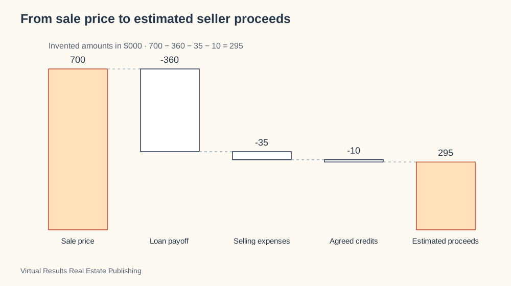
From sale price to estimated seller proceeds
Why this visualization?
A waterfall chart reconciles a sale price with estimated seller proceeds. Each downward step identifies a deduction, so the last amount has a visible explanation. Use a cost table for detailed line items rather than the overall arithmetic.
Swipe to explore the full picture on a small screen.
Waterfall chart · Shows additions and deductions that lead from a starting figure to a result.
The amount a seller expects to receive differs from the headline sale price. This invented example reconciles the deductions to one estimated total.
Replace every value with verified transaction figures and explain which amounts are estimates before relying on the result.
Choose your colors, add your details and ask your assistant to walk you through the options. You can also request a PowerPoint slide.
Create a new visualization using this specific format: Waterfall chart. My subject: [describe what I want to explain]. My audience: [who will read it]. My information: [paste the facts or ask me for them].
STRUCTURE REQUIRED: Use a waterfall chart: starting total, additions/deductions and final total left to right. Floating bars start from the running amount; connectors show continuity; arithmetic must reconcile.
REFERENCE EXAMPLE: From sale price to estimated seller proceeds. [insert the link below]. The reference demonstrates the format; do not automatically reuse its subject or labels. Open the reference or ask me to upload its image if you cannot access it. Do not claim to have reviewed an inaccessible reference.
BEFORE DRAWING: propose a labeled rough layout that follows the required structure. Explain what positions, lines, arrows, sizes and colors mean, and check that they convey my intended message. Ask for missing information. Offer color and detail choices without changing the diagram type. If this type is unsuitable for my topic, explain why and propose a better type before proceeding.
DELIVER: a clear graphic with a descriptive headline, readable labels and a short explanation. Offer editable SVG, PowerPoint or browser animation when supported by your tools. Keep example numbers labeled. Include a small credit and link to Virtual Results Real Estate Publishing.
CHECK: verify the resulting layout matches the required format and does not imply false importance, authority, sequence, causation or quantities.
Markets and money · 22 of 78
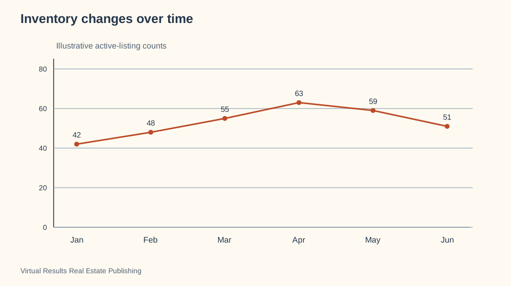
Inventory changes over time
Why this visualization?
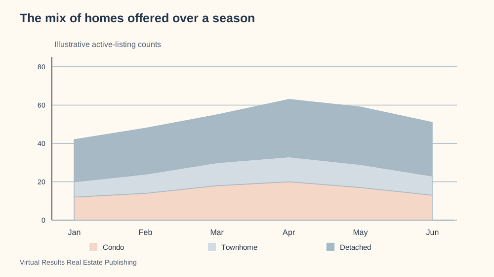
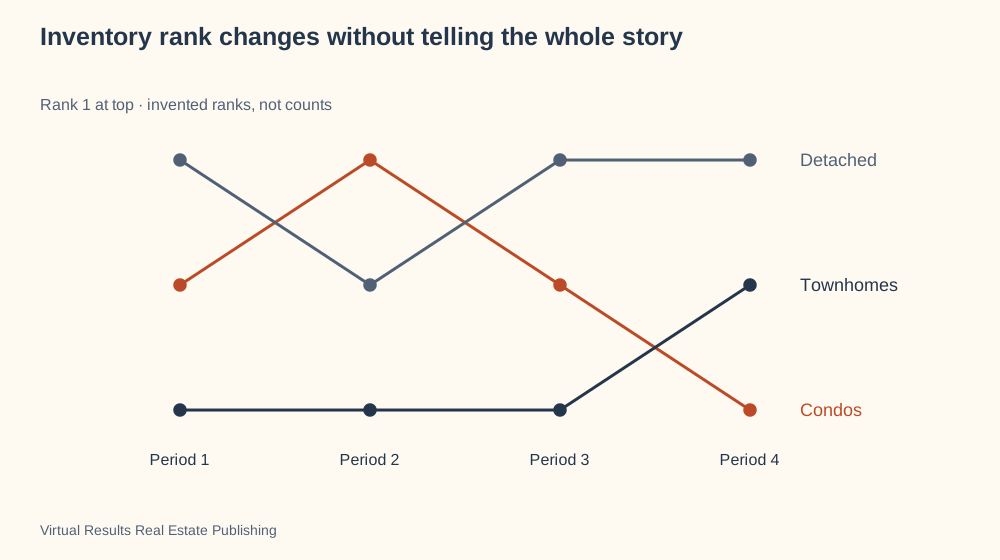
A line chart shows how inventory changes across consecutive months. Its shape makes a rise, peak or decline visible in a way one current count cannot. Use a bar chart to compare unrelated areas or home types at one date.
Swipe to explore the full picture on a small screen.
Line chart · Shows how a value changes across time.
A time series reveals direction that a single inventory number cannot show. The invented sample rises and then falls over six months.
Keep geography, property scope and counting method consistent when using live market data.
Choose your colors, add your details and ask your assistant to walk you through the options. You can also request a PowerPoint slide.
Create a new visualization using this specific format: Line chart. My subject: [describe what I want to explain]. My audience: [who will read it]. My information: [paste the facts or ask me for them].
STRUCTURE REQUIRED: Use a line chart with time on the horizontal axis and one named numeric measure vertically. Connect observations in time order; include units and consistent intervals.
REFERENCE EXAMPLE: Inventory changes over time. [insert the link below]. The reference demonstrates the format; do not automatically reuse its subject or labels. Open the reference or ask me to upload its image if you cannot access it. Do not claim to have reviewed an inaccessible reference.
BEFORE DRAWING: propose a labeled rough layout that follows the required structure. Explain what positions, lines, arrows, sizes and colors mean, and check that they convey my intended message. Ask for missing information. Offer color and detail choices without changing the diagram type. If this type is unsuitable for my topic, explain why and propose a better type before proceeding.
DELIVER: a clear graphic with a descriptive headline, readable labels and a short explanation. Offer editable SVG, PowerPoint or browser animation when supported by your tools. Keep example numbers labeled. Include a small credit and link to Virtual Results Real Estate Publishing.
CHECK: verify the resulting layout matches the required format and does not imply false importance, authority, sequence, causation or quantities.
Journeys and teamwork · 23 of 78
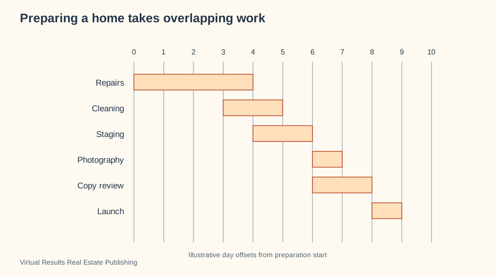
Preparing a home takes overlapping work
Why this visualization?
An overlapping-task schedule shows both when preparation work happens and how long it lasts. Repairs, cleaning and copy review can occupy different periods rather than one neat sequence. Use a dependency diagram when the main concern is which unfinished task blocks another.
Swipe to explore the full picture on a small screen.
Gantt chart · Shows the duration and overlap of tasks across a schedule.
Some preparation tasks can proceed together while others need a predecessor to finish. A schedule makes that relationship easier to discuss.
Use actual availability and completion criteria rather than treating the illustrative days as a service promise.
Choose your colors, add your details and ask your assistant to walk you through the options. You can also request a PowerPoint slide.
Create a new visualization using this specific format: Gantt chart. My subject: [describe what I want to explain]. My audience: [who will read it]. My information: [paste the facts or ask me for them].
STRUCTURE REQUIRED: Use a Gantt chart: tasks as rows and time along a shared horizontal axis. Draw duration bars with overlaps and dependencies where known.
REFERENCE EXAMPLE: Preparing a home takes overlapping work. [insert the link below]. The reference demonstrates the format; do not automatically reuse its subject or labels. Open the reference or ask me to upload its image if you cannot access it. Do not claim to have reviewed an inaccessible reference.
BEFORE DRAWING: propose a labeled rough layout that follows the required structure. Explain what positions, lines, arrows, sizes and colors mean, and check that they convey my intended message. Ask for missing information. Offer color and detail choices without changing the diagram type. If this type is unsuitable for my topic, explain why and propose a better type before proceeding.
DELIVER: a clear graphic with a descriptive headline, readable labels and a short explanation. Offer editable SVG, PowerPoint or browser animation when supported by your tools. Keep example numbers labeled. Include a small credit and link to Virtual Results Real Estate Publishing.
CHECK: verify the resulting layout matches the required format and does not imply false importance, authority, sequence, causation or quantities.
Markets and money · 24 of 78
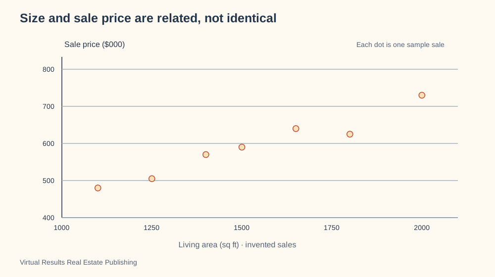
Size and sale price are related, not identical
Why this visualization?
A scatterplot gives each sale a position based on living area and sale price. The spread of points makes it clear that size alone does not determine price. Use a bar chart when comparing a small set of named homes is enough.
Swipe to explore the full picture on a small screen.
Scatter plot · Shows relationships between two measured variables.
A scatterplot makes variation visible: similarly sized homes can sell at different prices. These invented observations demonstrate the visual idea only.
Discuss condition and other differences alongside the plotted measurements; do not infer a valuation rule from this picture.
Choose your colors, add your details and ask your assistant to walk you through the options. You can also request a PowerPoint slide.
Create a new visualization using this specific format: Scatter plot. My subject: [describe what I want to explain]. My audience: [who will read it]. My information: [paste the facts or ask me for them].
STRUCTURE REQUIRED: Use an XY scatterplot, one point per observation, with two named numeric axes and units. Do not imply causation or a fitted rule without evidence.
REFERENCE EXAMPLE: Size and sale price are related, not identical. [insert the link below]. The reference demonstrates the format; do not automatically reuse its subject or labels. Open the reference or ask me to upload its image if you cannot access it. Do not claim to have reviewed an inaccessible reference.
BEFORE DRAWING: propose a labeled rough layout that follows the required structure. Explain what positions, lines, arrows, sizes and colors mean, and check that they convey my intended message. Ask for missing information. Offer color and detail choices without changing the diagram type. If this type is unsuitable for my topic, explain why and propose a better type before proceeding.
DELIVER: a clear graphic with a descriptive headline, readable labels and a short explanation. Offer editable SVG, PowerPoint or browser animation when supported by your tools. Keep example numbers labeled. Include a small credit and link to Virtual Results Real Estate Publishing.
CHECK: verify the resulting layout matches the required format and does not imply false importance, authority, sequence, causation or quantities.
Markets and money · 25 of 78
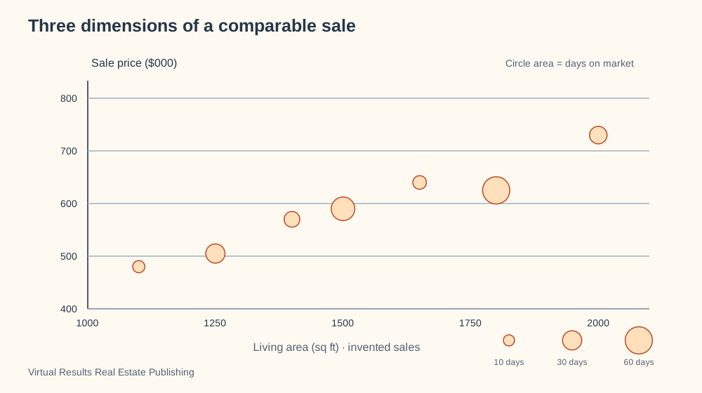
Three dimensions of a comparable sale
Why this visualization?
A bubble chart adds days on market to the size-and-price comparison. Circle area supplies a third variable while position still identifies living area and price. Use an ordinary scatterplot when the extra variable makes the picture harder to read.
Swipe to explore the full picture on a small screen.
Bubble chart · Adds a third value through the size of each circle.
Living area and sale price locate each sale; circle area adds days on market. A third variable can reveal differences a two-column comparison hides.
Explain the circle-area scale and retain a consistent sample before drawing a market conclusion.
Choose your colors, add your details and ask your assistant to walk you through the options. You can also request a PowerPoint slide.
Create a new visualization using this specific format: Bubble chart. My subject: [describe what I want to explain]. My audience: [who will read it]. My information: [paste the facts or ask me for them].
STRUCTURE REQUIRED: Use an XY scatter chart with named numerical axes; circle area, not radius, represents a third named measure. Include an area legend.
REFERENCE EXAMPLE: Three dimensions of a comparable sale. [insert the link below]. The reference demonstrates the format; do not automatically reuse its subject or labels. Open the reference or ask me to upload its image if you cannot access it. Do not claim to have reviewed an inaccessible reference.
BEFORE DRAWING: propose a labeled rough layout that follows the required structure. Explain what positions, lines, arrows, sizes and colors mean, and check that they convey my intended message. Ask for missing information. Offer color and detail choices without changing the diagram type. If this type is unsuitable for my topic, explain why and propose a better type before proceeding.
DELIVER: a clear graphic with a descriptive headline, readable labels and a short explanation. Offer editable SVG, PowerPoint or browser animation when supported by your tools. Keep example numbers labeled. Include a small credit and link to Virtual Results Real Estate Publishing.
CHECK: verify the resulting layout matches the required format and does not imply false importance, authority, sequence, causation or quantities.
Markets and money · 26 of 78
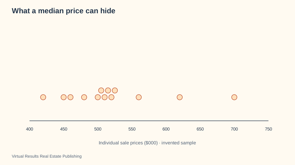
What a median price can hide
Why this visualization?
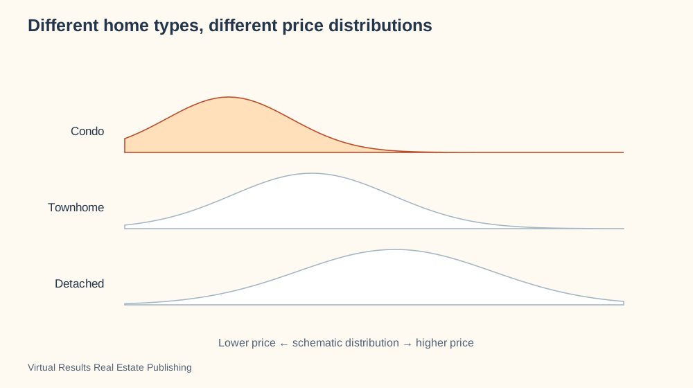
A dot distribution shows individual sale prices instead of only a median. Clusters, gaps and unusually high values remain visible. Use a line chart to show how a summary statistic changes across dates.
Swipe to explore the full picture on a small screen.
Choose your colors, add your details and ask your assistant to walk you through the options. You can also request a PowerPoint slide.
Create a new visualization using this specific format: Beeswarm plot. My subject: [describe what I want to explain]. My audience: [who will read it]. My information: [paste the facts or ask me for them].
STRUCTURE REQUIRED: Use one dot per observation on a shared horizontal value axis. Offset overlapping dots vertically only for legibility; vertical placement is not a second measurement.
REFERENCE EXAMPLE: What a median price can hide. [insert the link below]. The reference demonstrates the format; do not automatically reuse its subject or labels. Open the reference or ask me to upload its image if you cannot access it. Do not claim to have reviewed an inaccessible reference.
BEFORE DRAWING: propose a labeled rough layout that follows the required structure. Explain what positions, lines, arrows, sizes and colors mean, and check that they convey my intended message. Ask for missing information. Offer color and detail choices without changing the diagram type. If this type is unsuitable for my topic, explain why and propose a better type before proceeding.
DELIVER: a clear graphic with a descriptive headline, readable labels and a short explanation. Offer editable SVG, PowerPoint or browser animation when supported by your tools. Keep example numbers labeled. Include a small credit and link to Virtual Results Real Estate Publishing.
CHECK: verify the resulting layout matches the required format and does not imply false importance, authority, sequence, causation or quantities.
Homes and places · 27 of 78
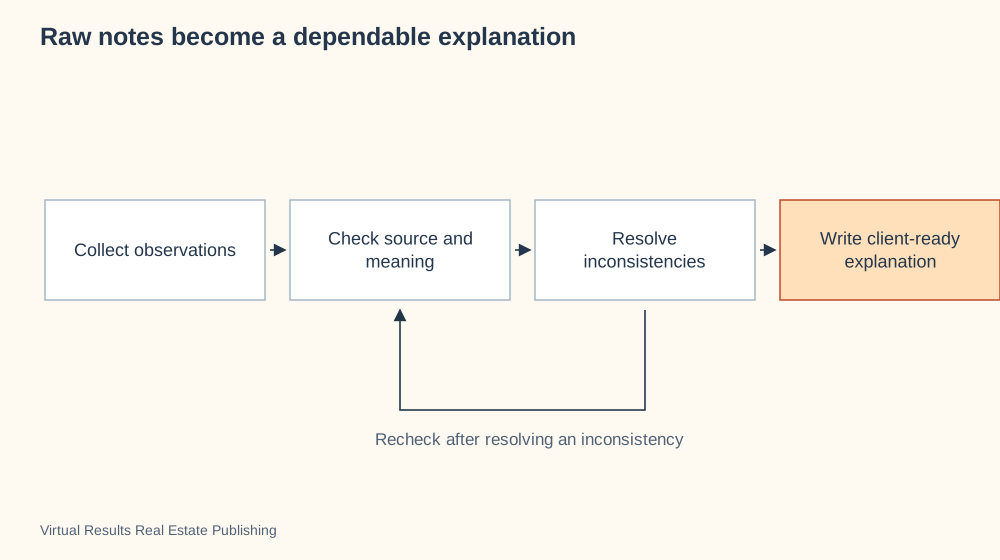
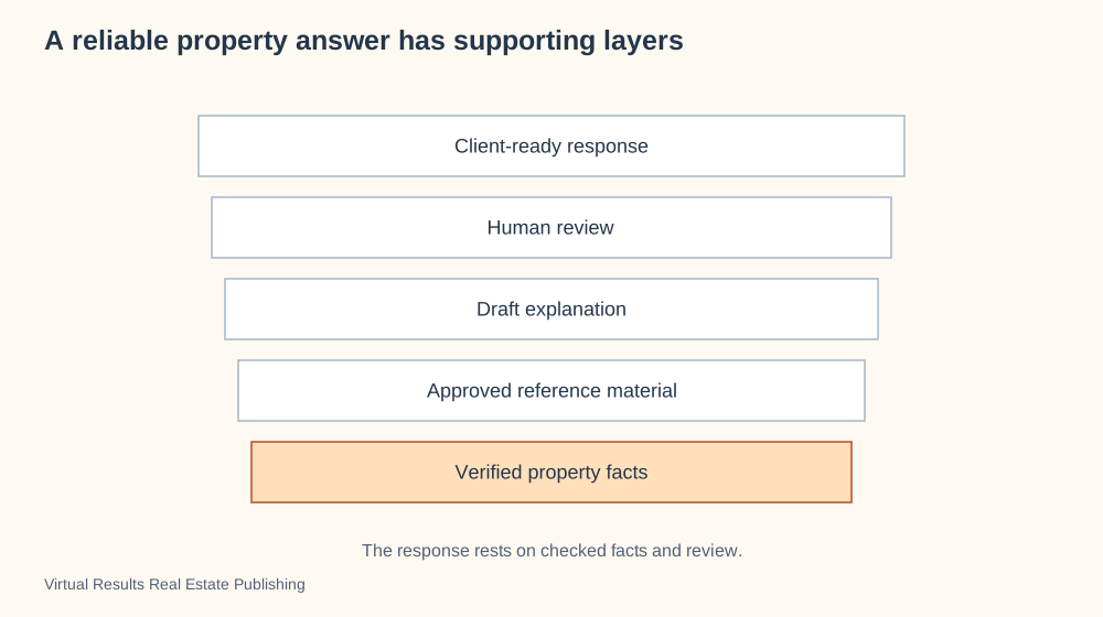
Raw notes become a dependable explanation
Why this visualization?
A review workflow shows how raw notes become a dependable explanation. The return arrow makes rechecking part of the work rather than treating polished wording as proof. Use an evidence-source map to show where the information came from.
Swipe to explore the full picture on a small screen.
Review workflow · Shows checking and clarification before a dependable explanation.
A useful property description is produced through checking, not merely polishing language. Each layer represents work that changes the reliability of the information.
Retain the evidence behind any statement that matters to a buyer’s decision.
Choose your colors, add your details and ask your assistant to walk you through the options. You can also request a PowerPoint slide.
Create a new visualization using this specific format: Review workflow. My subject: [describe what I want to explain]. My audience: [who will read it]. My information: [paste the facts or ask me for them].
STRUCTURE REQUIRED: Use a review workflow: observations move through source checking and inconsistency resolution toward a client-ready explanation. Include a return-for-clarification path rather than a physical layer stack.
REFERENCE EXAMPLE: Raw notes become a dependable explanation. [insert the link below]. The reference demonstrates the format; do not automatically reuse its subject or labels. Open the reference or ask me to upload its image if you cannot access it. Do not claim to have reviewed an inaccessible reference.
BEFORE DRAWING: propose a labeled rough layout that follows the required structure. Explain what positions, lines, arrows, sizes and colors mean, and check that they convey my intended message. Ask for missing information. Offer color and detail choices without changing the diagram type. If this type is unsuitable for my topic, explain why and propose a better type before proceeding.
DELIVER: a clear graphic with a descriptive headline, readable labels and a short explanation. Offer editable SVG, PowerPoint or browser animation when supported by your tools. Keep example numbers labeled. Include a small credit and link to Virtual Results Real Estate Publishing.
CHECK: verify the resulting layout matches the required format and does not imply false importance, authority, sequence, causation or quantities.
Journeys and teamwork · 28 of 78
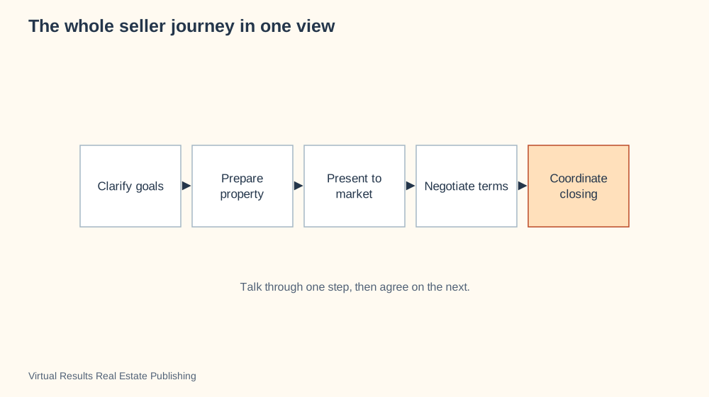
The whole seller journey in one view
Why this visualization?
A broad process diagram gives the seller an initial map from goals to closing. Its few stages keep the overall journey readable before the detailed conversation begins. Use a timeline or task board once dates and current assignments matter.
Swipe to explore the full picture on a small screen.
Process flow · Connects the steps of a task in the order they are discussed.
A broad overview gives a seller a map before the detailed conversation begins. Each stage contains smaller decisions and may require revisiting earlier work.
Use it to locate the current question without overwhelming the client with every possible task.
Choose your colors, add your details and ask your assistant to walk you through the options. You can also request a PowerPoint slide.
Create a new visualization using this specific format: Process flow. My subject: [describe what I want to explain]. My audience: [who will read it]. My information: [paste the facts or ask me for them].
STRUCTURE REQUIRED: Use a linear process flow: rectangular stages left to right, connected by directional arrows. Add branches only when the process calls for them. Do not substitute a mind map.
REFERENCE EXAMPLE: The whole seller journey in one view. [insert the link below]. The reference demonstrates the format; do not automatically reuse its subject or labels. Open the reference or ask me to upload its image if you cannot access it. Do not claim to have reviewed an inaccessible reference.
BEFORE DRAWING: propose a labeled rough layout that follows the required structure. Explain what positions, lines, arrows, sizes and colors mean, and check that they convey my intended message. Ask for missing information. Offer color and detail choices without changing the diagram type. If this type is unsuitable for my topic, explain why and propose a better type before proceeding.
DELIVER: a clear graphic with a descriptive headline, readable labels and a short explanation. Offer editable SVG, PowerPoint or browser animation when supported by your tools. Keep example numbers labeled. Include a small credit and link to Virtual Results Real Estate Publishing.
CHECK: verify the resulting layout matches the required format and does not imply false importance, authority, sequence, causation or quantities.
Journeys and teamwork · 29 of 78
A showing is more than opening a door
Why this visualization?
A step-by-step process diagram turns a showing into preparation, observation and follow-up. The final step gives the visit a useful next action instead of ending at the front door. Use a room plan to describe the route through the home itself.
Swipe to explore the full picture on a small screen.
Process flow · Connects the steps of a task in the order they are discussed.
A showing produces useful information when observations become questions and follow-up. The visual gives a beginning, middle and next action.
Adapt the steps to the agreed representation and actual showing requirements.
Choose your colors, add your details and ask your assistant to walk you through the options. You can also request a PowerPoint slide.
Create a new visualization using this specific format: Process flow. My subject: [describe what I want to explain]. My audience: [who will read it]. My information: [paste the facts or ask me for them].
STRUCTURE REQUIRED: Use a linear process flow: rectangular stages left to right, connected by directional arrows. Add branches only when the process calls for them. Do not substitute a mind map.
REFERENCE EXAMPLE: A showing is more than opening a door. [insert the link below]. The reference demonstrates the format; do not automatically reuse its subject or labels. Open the reference or ask me to upload its image if you cannot access it. Do not claim to have reviewed an inaccessible reference.
BEFORE DRAWING: propose a labeled rough layout that follows the required structure. Explain what positions, lines, arrows, sizes and colors mean, and check that they convey my intended message. Ask for missing information. Offer color and detail choices without changing the diagram type. If this type is unsuitable for my topic, explain why and propose a better type before proceeding.
DELIVER: a clear graphic with a descriptive headline, readable labels and a short explanation. Offer editable SVG, PowerPoint or browser animation when supported by your tools. Keep example numbers labeled. Include a small credit and link to Virtual Results Real Estate Publishing.
CHECK: verify the resulting layout matches the required format and does not imply false importance, authority, sequence, causation or quantities.
Journeys and teamwork · 30 of 78
Disclosures need a path for questions
Why this visualization?
A disclosure-question workflow separates receiving a file from understanding its contents. The response returns to buyer review because an answer can produce another question. Use an evidence-source map to distinguish who supplied the documents.
Swipe to explore the full picture on a small screen.
Process flow · Connects the steps of a task in the order they are discussed.
Receiving a document and understanding it are distinct stages. A clear route for questions helps prevent a file from becoming a substitute for a conversation.
Verify applicable disclosure duties locally and track unresolved questions separately from receipt.
Choose your colors, add your details and ask your assistant to walk you through the options. You can also request a PowerPoint slide.
Create a new visualization using this specific format: Process flow. My subject: [describe what I want to explain]. My audience: [who will read it]. My information: [paste the facts or ask me for them].
STRUCTURE REQUIRED: Use a linear process flow: rectangular stages left to right, connected by directional arrows. Add branches only when the process calls for them. Do not substitute a mind map.
REFERENCE EXAMPLE: Disclosures need a path for questions. [insert the link below]. The reference demonstrates the format; do not automatically reuse its subject or labels. Open the reference or ask me to upload its image if you cannot access it. Do not claim to have reviewed an inaccessible reference.
BEFORE DRAWING: propose a labeled rough layout that follows the required structure. Explain what positions, lines, arrows, sizes and colors mean, and check that they convey my intended message. Ask for missing information. Offer color and detail choices without changing the diagram type. If this type is unsuitable for my topic, explain why and propose a better type before proceeding.
DELIVER: a clear graphic with a descriptive headline, readable labels and a short explanation. Offer editable SVG, PowerPoint or browser animation when supported by your tools. Keep example numbers labeled. Include a small credit and link to Virtual Results Real Estate Publishing.
CHECK: verify the resulting layout matches the required format and does not imply false importance, authority, sequence, causation or quantities.
Journeys and teamwork · 31 of 78
One verified listing, several presentations
Why this visualization?
A hub-and-spoke diagram connects one approved property brief to several presentations. It emphasizes that a brochure, email and website should draw from the same facts. Use a launch checklist to confirm whether each presentation has actually been delivered.
Swipe to explore the full picture on a small screen.
Hub and spoke diagram · Connects several inputs or participants to one shared center.
Different channels can tell a consistent story when they begin with approved facts. The hub is a verified property brief, not a claim that distribution happens automatically.
Confirm permissions and current facts before adapting the copy for each destination.
Choose your colors, add your details and ask your assistant to walk you through the options. You can also request a PowerPoint slide.
Create a new visualization using this specific format: Hub and spoke diagram. My subject: [describe what I want to explain]. My audience: [who will read it]. My information: [paste the facts or ask me for them].
STRUCTURE REQUIRED: Use a hub-and-spoke map with one named information package at the center and sources or destinations around it. Indicate whether connections are inputs or outputs. Do not make a professional the transaction authority.
REFERENCE EXAMPLE: One verified listing, several presentations. [insert the link below]. The reference demonstrates the format; do not automatically reuse its subject or labels. Open the reference or ask me to upload its image if you cannot access it. Do not claim to have reviewed an inaccessible reference.
BEFORE DRAWING: propose a labeled rough layout that follows the required structure. Explain what positions, lines, arrows, sizes and colors mean, and check that they convey my intended message. Ask for missing information. Offer color and detail choices without changing the diagram type. If this type is unsuitable for my topic, explain why and propose a better type before proceeding.
DELIVER: a clear graphic with a descriptive headline, readable labels and a short explanation. Offer editable SVG, PowerPoint or browser animation when supported by your tools. Keep example numbers labeled. Include a small credit and link to Virtual Results Real Estate Publishing.
CHECK: verify the resulting layout matches the required format and does not imply false importance, authority, sequence, causation or quantities.
Homes and places · 32 of 78
The ingredients of a listing campaign
Why this visualization?
A foundation stack puts property evidence beneath positioning, media and published materials. The separate feedback arrow returns to the work that can be revised. Use a schedule when the question is when those ingredients will be ready.
Swipe to explore the full picture on a small screen.
Layer diagram · Reveals the parts hidden behind a surface.
The visible campaign rests on factual and creative preparation. This stack shows the connection between a property’s evidence and the materials people see.
Check the lower layers when a finished asset contains a questionable claim.
Choose your colors, add your details and ask your assistant to walk you through the options. You can also request a PowerPoint slide.
Create a new visualization using this specific format: Layer diagram. My subject: [describe what I want to explain]. My audience: [who will read it]. My information: [paste the facts or ask me for them].
STRUCTURE REQUIRED: Use a layer diagram with separately labeled aligned bands. Explain whether bands represent physical assembly or supporting information; do not imply an unsupported rank or mandatory chronology.
REFERENCE EXAMPLE: The ingredients of a listing campaign. [insert the link below]. The reference demonstrates the format; do not automatically reuse its subject or labels. Open the reference or ask me to upload its image if you cannot access it. Do not claim to have reviewed an inaccessible reference.
BEFORE DRAWING: propose a labeled rough layout that follows the required structure. Explain what positions, lines, arrows, sizes and colors mean, and check that they convey my intended message. Ask for missing information. Offer color and detail choices without changing the diagram type. If this type is unsuitable for my topic, explain why and propose a better type before proceeding.
DELIVER: a clear graphic with a descriptive headline, readable labels and a short explanation. Offer editable SVG, PowerPoint or browser animation when supported by your tools. Keep example numbers labeled. Include a small credit and link to Virtual Results Real Estate Publishing.
CHECK: verify the resulting layout matches the required format and does not imply false importance, authority, sequence, causation or quantities.
Markets and money · 33 of 78
A home’s spaces in proportion
Why this visualization?
A proportional-area diagram compares how the example home’s total space is allocated. The rectangle sizes make room categories easy to compare. Use a floor plan for adjacency and movement, because these rectangles do not represent actual room locations.
Swipe to explore the full picture on a small screen.
Treemap · Uses nested rectangles to show how a total divides into categories.
Area rectangles can compare spaces without pretending to be a floor plan. The illustration totals 1,300 square feet of invented room allocations.
Use measured, consistently classified area information and explain exclusions before comparing actual homes.
Choose your colors, add your details and ask your assistant to walk you through the options. You can also request a PowerPoint slide.
Create a new visualization using this specific format: Treemap. My subject: [describe what I want to explain]. My audience: [who will read it]. My information: [paste the facts or ask me for them].
STRUCTURE REQUIRED: Use a treemap of nested rectangles whose areas correspond to named quantities. Include totals and units; this is an area comparison, not a floor plan.
REFERENCE EXAMPLE: A home’s spaces in proportion. [insert the link below]. The reference demonstrates the format; do not automatically reuse its subject or labels. Open the reference or ask me to upload its image if you cannot access it. Do not claim to have reviewed an inaccessible reference.
BEFORE DRAWING: propose a labeled rough layout that follows the required structure. Explain what positions, lines, arrows, sizes and colors mean, and check that they convey my intended message. Ask for missing information. Offer color and detail choices without changing the diagram type. If this type is unsuitable for my topic, explain why and propose a better type before proceeding.
DELIVER: a clear graphic with a descriptive headline, readable labels and a short explanation. Offer editable SVG, PowerPoint or browser animation when supported by your tools. Keep example numbers labeled. Include a small credit and link to Virtual Results Real Estate Publishing.
CHECK: verify the resulting layout matches the required format and does not imply false importance, authority, sequence, causation or quantities.
Journeys and teamwork · 34 of 78
Readiness across several listings
Why this visualization?
A readiness matrix compares the same preparation items across several listings. Labeled cells make a missing photograph or pending review easy to spot. Use a task board for one listing’s individual assignments.
Swipe to explore the full picture on a small screen.
Comparison matrix · Compares options against the same set of questions or criteria.
A status matrix can reveal which preparation item is holding up which listing. Color carries a visible status label so the meaning does not depend on color alone.
Use the board to assign follow-up, not as evidence that a document has been understood.
Choose your colors, add your details and ask your assistant to walk you through the options. You can also request a PowerPoint slide.
Create a new visualization using this specific format: Comparison matrix. My subject: [describe what I want to explain]. My audience: [who will read it]. My information: [paste the facts or ask me for them].
STRUCTURE REQUIRED: Use a comparison/status matrix with options as rows and common criteria as columns. Each cell has a visible word or symbol key; do not rely on color alone.
REFERENCE EXAMPLE: Readiness across several listings. [insert the link below]. The reference demonstrates the format; do not automatically reuse its subject or labels. Open the reference or ask me to upload its image if you cannot access it. Do not claim to have reviewed an inaccessible reference.
BEFORE DRAWING: propose a labeled rough layout that follows the required structure. Explain what positions, lines, arrows, sizes and colors mean, and check that they convey my intended message. Ask for missing information. Offer color and detail choices without changing the diagram type. If this type is unsuitable for my topic, explain why and propose a better type before proceeding.
DELIVER: a clear graphic with a descriptive headline, readable labels and a short explanation. Offer editable SVG, PowerPoint or browser animation when supported by your tools. Keep example numbers labeled. Include a small credit and link to Virtual Results Real Estate Publishing.
CHECK: verify the resulting layout matches the required format and does not imply false importance, authority, sequence, causation or quantities.
Markets and money · 35 of 78
Home types within different price bands
Why this visualization?
A variable-width stacked chart compares both the size of price-band samples and their mix of home types. Width answers how many sales; colored segments answer what proportion belongs to each type. Use separate bar charts if readers only need one of those questions.
Swipe to explore the full picture on a small screen.
Marimekko chart · Uses width and height to show the composition of groups.
Column width represents sample count; segments represent the share of condo, townhome and detached sales within each band. These invented shares sum to 100 percent.
Explain both dimensions, since equally tall columns do not mean equally large samples.
Choose your colors, add your details and ask your assistant to walk you through the options. You can also request a PowerPoint slide.
Create a new visualization using this specific format: Marimekko chart. My subject: [describe what I want to explain]. My audience: [who will read it]. My information: [paste the facts or ask me for them].
STRUCTURE REQUIRED: Use a Marimekko chart: column width represents category sample size, stacked segment height represents within-category share. Shares per column total100%; label both dimensions.
REFERENCE EXAMPLE: Home types within different price bands. [insert the link below]. The reference demonstrates the format; do not automatically reuse its subject or labels. Open the reference or ask me to upload its image if you cannot access it. Do not claim to have reviewed an inaccessible reference.
BEFORE DRAWING: propose a labeled rough layout that follows the required structure. Explain what positions, lines, arrows, sizes and colors mean, and check that they convey my intended message. Ask for missing information. Offer color and detail choices without changing the diagram type. If this type is unsuitable for my topic, explain why and propose a better type before proceeding.
DELIVER: a clear graphic with a descriptive headline, readable labels and a short explanation. Offer editable SVG, PowerPoint or browser animation when supported by your tools. Keep example numbers labeled. Include a small credit and link to Virtual Results Real Estate Publishing.
CHECK: verify the resulting layout matches the required format and does not imply false importance, authority, sequence, causation or quantities.
Markets and money · 36 of 78
How inventory changed by home type
Why this visualization?
A two-date slope chart shows whether each home type’s inventory rose or fell. The lines connect matching categories, so the direction of change is immediately visible. Use a line chart for more than two dates.
Swipe to explore the full picture on a small screen.
Slope chart · Connects values in two periods to show direction and size of change.
A two-date comparison makes separate segment changes easy to follow. The invented counts show that one segment can move differently from the overall story.
Use matching boundaries and methods for both dates and retain the actual counts beside the trend.
Choose your colors, add your details and ask your assistant to walk you through the options. You can also request a PowerPoint slide.
Create a new visualization using this specific format: Slope chart. My subject: [describe what I want to explain]. My audience: [who will read it]. My information: [paste the facts or ask me for them].
STRUCTURE REQUIRED: Use a slope chart with exactly two date columns and one connecting line per category. Values on the same scale; line direction and slope show change.
REFERENCE EXAMPLE: How inventory changed by home type. [insert the link below]. The reference demonstrates the format; do not automatically reuse its subject or labels. Open the reference or ask me to upload its image if you cannot access it. Do not claim to have reviewed an inaccessible reference.
BEFORE DRAWING: propose a labeled rough layout that follows the required structure. Explain what positions, lines, arrows, sizes and colors mean, and check that they convey my intended message. Ask for missing information. Offer color and detail choices without changing the diagram type. If this type is unsuitable for my topic, explain why and propose a better type before proceeding.
DELIVER: a clear graphic with a descriptive headline, readable labels and a short explanation. Offer editable SVG, PowerPoint or browser animation when supported by your tools. Keep example numbers labeled. Include a small credit and link to Virtual Results Real Estate Publishing.
CHECK: verify the resulting layout matches the required format and does not imply false importance, authority, sequence, causation or quantities.
Markets and money · 37 of 78
Different home types, different price distributions
Why this visualization?
Separate distribution curves show that each home type contains a range of prices. Their overlapping spreads challenge the idea that every category has one typical price. Use a dot distribution to show the actual individual sales rather than a smoothed shape.
Swipe to explore the full picture on a small screen.
Distribution chart · Shows how observations are spread across a range.
Separate distribution curves reveal that a category can contain a broad range rather than one typical price. The curves are schematic and not calculated market estimates.
Use a real dataset and a stated distribution method for any statistical publication.
Choose your colors, add your details and ask your assistant to walk you through the options. You can also request a PowerPoint slide.
Create a new visualization using this specific format: Distribution chart. My subject: [describe what I want to explain]. My audience: [who will read it]. My information: [paste the facts or ask me for them].
STRUCTURE REQUIRED: Use separate distribution curves one row per category. With actual data, use a shared numerical horizontal scale and explain density vertically. Without data, use schematic lower/higher axes and say shapes show variation only, not calculated estimates.
REFERENCE EXAMPLE: Different home types, different price distributions. [insert the link below]. The reference demonstrates the format; do not automatically reuse its subject or labels. Open the reference or ask me to upload its image if you cannot access it. Do not claim to have reviewed an inaccessible reference.
BEFORE DRAWING: propose a labeled rough layout that follows the required structure. Explain what positions, lines, arrows, sizes and colors mean, and check that they convey my intended message. Ask for missing information. Offer color and detail choices without changing the diagram type. If this type is unsuitable for my topic, explain why and propose a better type before proceeding.
DELIVER: a clear graphic with a descriptive headline, readable labels and a short explanation. Offer editable SVG, PowerPoint or browser animation when supported by your tools. Keep example numbers labeled. Include a small credit and link to Virtual Results Real Estate Publishing.
CHECK: verify the resulting layout matches the required format and does not imply false importance, authority, sequence, causation or quantities.
Markets and money · 38 of 78
The mix of homes offered over a season
Why this visualization?
A stacked-area chart shows both total inventory and the mix of home types over a season. Each band contributes to the total rather than representing a separate unrelated trend. Use separate lines when precise changes within each category matter most.
Swipe to explore the full picture on a small screen.
Stacked bar chart · Shows both the total and its component parts.
The stacked areas show changing counts for condo, townhome and detached inventory in an invented sample. The total is the upper boundary, not the width of a single band.
For precise comparisons, pair the visual with the actual values and keep the baseline explicit.
Choose your colors, add your details and ask your assistant to walk you through the options. You can also request a PowerPoint slide.
Create a new visualization using this specific format: Stacked bar chart. My subject: [describe what I want to explain]. My audience: [who will read it]. My information: [paste the facts or ask me for them].
STRUCTURE REQUIRED: Use a stacked area chart with time horizontally, numerical counts vertically and a zero baseline. Bands encode category amounts, upper boundary the total. Include legend and values.
REFERENCE EXAMPLE: The mix of homes offered over a season. [insert the link below]. The reference demonstrates the format; do not automatically reuse its subject or labels. Open the reference or ask me to upload its image if you cannot access it. Do not claim to have reviewed an inaccessible reference.
BEFORE DRAWING: propose a labeled rough layout that follows the required structure. Explain what positions, lines, arrows, sizes and colors mean, and check that they convey my intended message. Ask for missing information. Offer color and detail choices without changing the diagram type. If this type is unsuitable for my topic, explain why and propose a better type before proceeding.
DELIVER: a clear graphic with a descriptive headline, readable labels and a short explanation. Offer editable SVG, PowerPoint or browser animation when supported by your tools. Keep example numbers labeled. Include a small credit and link to Virtual Results Real Estate Publishing.
CHECK: verify the resulting layout matches the required format and does not imply false importance, authority, sequence, causation or quantities.
Markets and money · 39 of 78
Inventory rank changes without telling the whole story
Why this visualization?
A rank chart shows which home type holds first, second or third place across periods. Crossing lines make changes in ordering visible. Use counts or bars to show magnitude, because a rank change does not reveal how large the difference is.
Swipe to explore the full picture on a small screen.
Bump chart · Tracks changes in ranking across several periods.
Rank lines show ordering, not magnitude. The illustration tracks three home-type ranks across four invented periods.
Add counts when readers need to know whether a rank change reflects a small or large difference.
Choose your colors, add your details and ask your assistant to walk you through the options. You can also request a PowerPoint slide.
Create a new visualization using this specific format: Bump chart. My subject: [describe what I want to explain]. My audience: [who will read it]. My information: [paste the facts or ask me for them].
STRUCTURE REQUIRED: Use a rank chart: time left to right, rank1 at the top. One labeled line per category. Show ranks, not numerical amounts.
REFERENCE EXAMPLE: Inventory rank changes without telling the whole story. [insert the link below]. The reference demonstrates the format; do not automatically reuse its subject or labels. Open the reference or ask me to upload its image if you cannot access it. Do not claim to have reviewed an inaccessible reference.
BEFORE DRAWING: propose a labeled rough layout that follows the required structure. Explain what positions, lines, arrows, sizes and colors mean, and check that they convey my intended message. Ask for missing information. Offer color and detail choices without changing the diagram type. If this type is unsuitable for my topic, explain why and propose a better type before proceeding.
DELIVER: a clear graphic with a descriptive headline, readable labels and a short explanation. Offer editable SVG, PowerPoint or browser animation when supported by your tools. Keep example numbers labeled. Include a small credit and link to Virtual Results Real Estate Publishing.
CHECK: verify the resulting layout matches the required format and does not imply false importance, authority, sequence, causation or quantities.
People and agreements · 40 of 78
Plan who should receive each transaction document
Why this visualization?
A document-audience matrix turns sharing into a set of explicit planning questions. Rows identify documents and columns identify potential recipients, so purpose and authority can be checked individually. Use a workflow to show the approval steps after the audience is agreed.
Swipe to explore the full picture on a small screen.
Access-control map · Shows who can access a place or resource and under what arrangement.
This worksheet starts a permissions conversation. Each document needs an identified audience, purpose and authorizing person before sharing.
Use the brokerage’s approved permissions and the client’s actual authorizations.
Choose your colors, add your details and ask your assistant to walk you through the options. You can also request a PowerPoint slide.
Create a new visualization using this specific format: Access-control map. My subject: [describe what I want to explain]. My audience: [who will read it]. My information: [paste the facts or ask me for them].
STRUCTURE REQUIRED: Use a document-sharing worksheet: document types as rows and purpose, authorized audience and approval questions as columns. Use explicit labels, not assumed access permissions; do not imply universal sharing rules.
REFERENCE EXAMPLE: Plan who should receive each transaction document. [insert the link below]. The reference demonstrates the format; do not automatically reuse its subject or labels. Open the reference or ask me to upload its image if you cannot access it. Do not claim to have reviewed an inaccessible reference.
BEFORE DRAWING: propose a labeled rough layout that follows the required structure. Explain what positions, lines, arrows, sizes and colors mean, and check that they convey my intended message. Ask for missing information. Offer color and detail choices without changing the diagram type. If this type is unsuitable for my topic, explain why and propose a better type before proceeding.
DELIVER: a clear graphic with a descriptive headline, readable labels and a short explanation. Offer editable SVG, PowerPoint or browser animation when supported by your tools. Keep example numbers labeled. Include a small credit and link to Virtual Results Real Estate Publishing.
CHECK: verify the resulting layout matches the required format and does not imply false importance, authority, sequence, causation or quantities.
Journeys and teamwork · 41 of 78
Where a team’s follow-up gets fragmented
Why this visualization?
A question-centered relationship map shows where follow-up can spread across inboxes, notes and checklists. Keeping the client’s question at the center makes the reason for coordination visible. Use a responsibility lane to name the person who must obtain and confirm the answer.
Swipe to explore the full picture on a small screen.
Relationship map · Shows who or what connects, without forcing everything into a sequence.
Information can fragment across tools even when everyone is working hard. This view makes the potential handoffs visible.
Choose an authoritative task owner and record the confirmed answer where the team can find it.
Choose your colors, add your details and ask your assistant to walk you through the options. You can also request a PowerPoint slide.
Create a new visualization using this specific format: Relationship map. My subject: [describe what I want to explain]. My audience: [who will read it]. My information: [paste the facts or ask me for them].
STRUCTURE REQUIRED: Use a nondirectional map centered on the Client question, with information locations around it. Connections show possible fragmentation, not a reporting hierarchy.
REFERENCE EXAMPLE: Where a team’s follow-up gets fragmented. [insert the link below]. The reference demonstrates the format; do not automatically reuse its subject or labels. Open the reference or ask me to upload its image if you cannot access it. Do not claim to have reviewed an inaccessible reference.
BEFORE DRAWING: propose a labeled rough layout that follows the required structure. Explain what positions, lines, arrows, sizes and colors mean, and check that they convey my intended message. Ask for missing information. Offer color and detail choices without changing the diagram type. If this type is unsuitable for my topic, explain why and propose a better type before proceeding.
DELIVER: a clear graphic with a descriptive headline, readable labels and a short explanation. Offer editable SVG, PowerPoint or browser animation when supported by your tools. Keep example numbers labeled. Include a small credit and link to Virtual Results Real Estate Publishing.
CHECK: verify the resulting layout matches the required format and does not imply false importance, authority, sequence, causation or quantities.
Markets and money · 42 of 78
What happened to 100 property inquiries?
Why this visualization?
A proportional flow diagram accounts for what happened to a starting group of inquiries. Each split preserves the counts, making drop-off and continued engagement visible. Use a process flowchart when there are no reliable counts to size the paths.
Swipe to explore the full picture on a small screen.
Sankey diagram · Uses the width of flows to show how an amount divides or moves.
Flow widths follow an invented, reconciled inquiry sample. Each split accounts for the people in the preceding stage.
Define stages and attribution rules before using actual counts to assess a campaign.
Choose your colors, add your details and ask your assistant to walk you through the options. You can also request a PowerPoint slide.
Create a new visualization using this specific format: Sankey diagram. My subject: [describe what I want to explain]. My audience: [who will read it]. My information: [paste the facts or ask me for them].
STRUCTURE REQUIRED: Use a Sankey flow diagram with flow widths proportional to counts. Show each split and preserve arithmetic conservation; label all source and destination amounts.
REFERENCE EXAMPLE: What happened to 100 property inquiries?. [insert the link below]. The reference demonstrates the format; do not automatically reuse its subject or labels. Open the reference or ask me to upload its image if you cannot access it. Do not claim to have reviewed an inaccessible reference.
BEFORE DRAWING: propose a labeled rough layout that follows the required structure. Explain what positions, lines, arrows, sizes and colors mean, and check that they convey my intended message. Ask for missing information. Offer color and detail choices without changing the diagram type. If this type is unsuitable for my topic, explain why and propose a better type before proceeding.
DELIVER: a clear graphic with a descriptive headline, readable labels and a short explanation. Offer editable SVG, PowerPoint or browser animation when supported by your tools. Keep example numbers labeled. Include a small credit and link to Virtual Results Real Estate Publishing.
CHECK: verify the resulting layout matches the required format and does not imply false importance, authority, sequence, causation or quantities.
Journeys and teamwork · 43 of 78
A closing delay can have several causes
Why this visualization?
A possible-cause diagram gathers several lines of investigation around one closing delay. It helps the team examine documents, financing, title and scheduling without immediately blaming one person. Use a timeline to reconstruct what actually happened.
Swipe to explore the full picture on a small screen.
Fishbone diagram · Groups possible causes around one issue to investigate.
A cause map structures the investigation rather than assigning blame. Several branches can contribute to the same unresolved closing question.
Start with the evidence for a specific delay; do not assume every branch applies.
Choose your colors, add your details and ask your assistant to walk you through the options. You can also request a PowerPoint slide.
Create a new visualization using this specific format: Fishbone diagram. My subject: [describe what I want to explain]. My audience: [who will read it]. My information: [paste the facts or ask me for them].
STRUCTURE REQUIRED: Use a fishbone cause-analysis diagram: one issue at the right end of a horizontal spine, angled branches grouping possible causes. Branches are hypotheses, not proven causes.
REFERENCE EXAMPLE: A closing delay can have several causes. [insert the link below]. The reference demonstrates the format; do not automatically reuse its subject or labels. Open the reference or ask me to upload its image if you cannot access it. Do not claim to have reviewed an inaccessible reference.
BEFORE DRAWING: propose a labeled rough layout that follows the required structure. Explain what positions, lines, arrows, sizes and colors mean, and check that they convey my intended message. Ask for missing information. Offer color and detail choices without changing the diagram type. If this type is unsuitable for my topic, explain why and propose a better type before proceeding.
DELIVER: a clear graphic with a descriptive headline, readable labels and a short explanation. Offer editable SVG, PowerPoint or browser animation when supported by your tools. Keep example numbers labeled. Include a small credit and link to Virtual Results Real Estate Publishing.
CHECK: verify the resulting layout matches the required format and does not imply false importance, authority, sequence, causation or quantities.
Journeys and teamwork · 44 of 78
Where to tailor service and where to standardize
Why this visualization?
A two-axis strategy map compares client visibility with how standardized a capability is. Independent positions help discuss where local judgment matters and where repeatable tools may help. Use a dependency diagram for capabilities that genuinely rely on one another.
Swipe to explore the full picture on a small screen.
Strategy map · Connects objectives with the actions and evidence that support them.
A strategy map distinguishes client-visible value from the maturity of supporting capabilities. Positions are subjective workshop judgments.
Use it to discuss where human expertise adds value and where consistent tools can reduce repeated work.
Choose your colors, add your details and ask your assistant to walk you through the options. You can also request a PowerPoint slide.
Create a new visualization using this specific format: Strategy map. My subject: [describe what I want to explain]. My audience: [who will read it]. My information: [paste the facts or ask me for them].
STRUCTURE REQUIRED: Use a strategy positioning map on explicit maturity and client-visibility axes. Nodes are subjective placements; connect only verified dependencies, not an arbitrary diagonal chain.
REFERENCE EXAMPLE: Where to tailor service and where to standardize. [insert the link below]. The reference demonstrates the format; do not automatically reuse its subject or labels. Open the reference or ask me to upload its image if you cannot access it. Do not claim to have reviewed an inaccessible reference.
BEFORE DRAWING: propose a labeled rough layout that follows the required structure. Explain what positions, lines, arrows, sizes and colors mean, and check that they convey my intended message. Ask for missing information. Offer color and detail choices without changing the diagram type. If this type is unsuitable for my topic, explain why and propose a better type before proceeding.
DELIVER: a clear graphic with a descriptive headline, readable labels and a short explanation. Offer editable SVG, PowerPoint or browser animation when supported by your tools. Keep example numbers labeled. Include a small credit and link to Virtual Results Real Estate Publishing.
CHECK: verify the resulting layout matches the required format and does not imply false importance, authority, sequence, causation or quantities.
Journeys and teamwork · 45 of 78
Listing preparation, visible at a glance
Why this visualization?
A task board groups work by its current status. The columns answer what is planned, underway, awaiting review or ready right now. Use an overlapping-task schedule for duration and dates rather than current status.
Swipe to explore the full picture on a small screen.
Kanban board · Groups work by its current status so the next action is visible.
A work board makes current task status visible. It complements, rather than replaces, the dependencies and dates in a preparation schedule.
Define what “ready” means and assign an owner to each item.
Choose your colors, add your details and ask your assistant to walk you through the options. You can also request a PowerPoint slide.
Create a new visualization using this specific format: Kanban board. My subject: [describe what I want to explain]. My audience: [who will read it]. My information: [paste the facts or ask me for them].
STRUCTURE REQUIRED: Use a Kanban board with status columns and individual task cards under their current status. Include owners when supplied; placement indicates status, not time or importance.
REFERENCE EXAMPLE: Listing preparation, visible at a glance. [insert the link below]. The reference demonstrates the format; do not automatically reuse its subject or labels. Open the reference or ask me to upload its image if you cannot access it. Do not claim to have reviewed an inaccessible reference.
BEFORE DRAWING: propose a labeled rough layout that follows the required structure. Explain what positions, lines, arrows, sizes and colors mean, and check that they convey my intended message. Ask for missing information. Offer color and detail choices without changing the diagram type. If this type is unsuitable for my topic, explain why and propose a better type before proceeding.
DELIVER: a clear graphic with a descriptive headline, readable labels and a short explanation. Offer editable SVG, PowerPoint or browser animation when supported by your tools. Keep example numbers labeled. Include a small credit and link to Virtual Results Real Estate Publishing.
CHECK: verify the resulting layout matches the required format and does not imply false importance, authority, sequence, causation or quantities.
Journeys and teamwork · 46 of 78
What a buyer needs at each stage
Why this visualization?
A buyer-journey diagram pairs each stage with a concrete client question. The questions show how the need for explanation changes between searching, offering, investigating and moving in. Use responsibility lanes to assign the professional work behind those answers.
Swipe to explore the full picture on a small screen.
Journey map · Connects stages of an experience with questions and feelings along the way.
The buyer’s questions change across the journey. The lower path sketches moments when a buyer may need more explanation or reassurance.
Ask what support the client needs now instead of assuming the same explanation will help at every stage.
Choose your colors, add your details and ask your assistant to walk you through the options. You can also request a PowerPoint slide.
Create a new visualization using this specific format: Journey map. My subject: [describe what I want to explain]. My audience: [who will read it]. My information: [paste the facts or ask me for them].
STRUCTURE REQUIRED: Use a journey map: ordered stage cards, concrete client questions or needs beneath each stage; wrap into clearly numbered rows on smaller canvases. Do not invent an emotional score or trend curve.
REFERENCE EXAMPLE: What a buyer needs at each stage. [insert the link below]. The reference demonstrates the format; do not automatically reuse its subject or labels. Open the reference or ask me to upload its image if you cannot access it. Do not claim to have reviewed an inaccessible reference.
BEFORE DRAWING: propose a labeled rough layout that follows the required structure. Explain what positions, lines, arrows, sizes and colors mean, and check that they convey my intended message. Ask for missing information. Offer color and detail choices without changing the diagram type. If this type is unsuitable for my topic, explain why and propose a better type before proceeding.
DELIVER: a clear graphic with a descriptive headline, readable labels and a short explanation. Offer editable SVG, PowerPoint or browser animation when supported by your tools. Keep example numbers labeled. Include a small credit and link to Virtual Results Real Estate Publishing.
CHECK: verify the resulting layout matches the required format and does not imply false importance, authority, sequence, causation or quantities.
Journeys and teamwork · 47 of 78
A listing launch has distinct destinations
Why this visualization?
A distribution map separates an approved launch package from its destinations. It helps identify which versions need their own publication and verification. Use a task board to show whether each destination is pending or complete.
Swipe to explore the full picture on a small screen.
Hub and spoke diagram · Connects several inputs or participants to one shared center.
An approved package can be delivered to several destinations, each with its own format and verification step.
Check the actual published page or material rather than treating approval as proof of delivery.
Choose your colors, add your details and ask your assistant to walk you through the options. You can also request a PowerPoint slide.
Create a new visualization using this specific format: Hub and spoke diagram. My subject: [describe what I want to explain]. My audience: [who will read it]. My information: [paste the facts or ask me for them].
STRUCTURE REQUIRED: Use a hub-and-spoke map with one named information package at the center and sources or destinations around it. Indicate whether connections are inputs or outputs. Do not make a professional the transaction authority.
REFERENCE EXAMPLE: A listing launch has distinct destinations. [insert the link below]. The reference demonstrates the format; do not automatically reuse its subject or labels. Open the reference or ask me to upload its image if you cannot access it. Do not claim to have reviewed an inaccessible reference.
BEFORE DRAWING: propose a labeled rough layout that follows the required structure. Explain what positions, lines, arrows, sizes and colors mean, and check that they convey my intended message. Ask for missing information. Offer color and detail choices without changing the diagram type. If this type is unsuitable for my topic, explain why and propose a better type before proceeding.
DELIVER: a clear graphic with a descriptive headline, readable labels and a short explanation. Offer editable SVG, PowerPoint or browser animation when supported by your tools. Keep example numbers labeled. Include a small credit and link to Virtual Results Real Estate Publishing.
CHECK: verify the resulting layout matches the required format and does not imply false importance, authority, sequence, causation or quantities.
Journeys and teamwork · 48 of 78
Photography depends on preparation
Why this visualization?
A dependency diagram shows why photography must wait for certain preparation work. Arrows identify prerequisites rather than merely putting tasks in a calendar row. Use a schedule to add actual dates and available working time.
Swipe to explore the full picture on a small screen.
Dependency diagram · Shows which tasks depend on other tasks being complete.
Prerequisite arrows identify why one late task can affect several downstream items. Two tasks may proceed together while both must be ready for the next stage.
Use this view when a calendar alone does not explain what is blocked.
Choose your colors, add your details and ask your assistant to walk you through the options. You can also request a PowerPoint slide.
Create a new visualization using this specific format: Dependency diagram. My subject: [describe what I want to explain]. My audience: [who will read it]. My information: [paste the facts or ask me for them].
STRUCTURE REQUIRED: Use a directed dependency graph with task boxes and prerequisite arrows. Allow parallel branches to converge. An arrow means must finish before, not merely happens next.
REFERENCE EXAMPLE: Photography depends on preparation. [insert the link below]. The reference demonstrates the format; do not automatically reuse its subject or labels. Open the reference or ask me to upload its image if you cannot access it. Do not claim to have reviewed an inaccessible reference.
BEFORE DRAWING: propose a labeled rough layout that follows the required structure. Explain what positions, lines, arrows, sizes and colors mean, and check that they convey my intended message. Ask for missing information. Offer color and detail choices without changing the diagram type. If this type is unsuitable for my topic, explain why and propose a better type before proceeding.
DELIVER: a clear graphic with a descriptive headline, readable labels and a short explanation. Offer editable SVG, PowerPoint or browser animation when supported by your tools. Keep example numbers labeled. Include a small credit and link to Virtual Results Real Estate Publishing.
CHECK: verify the resulting layout matches the required format and does not imply false importance, authority, sequence, causation or quantities.
Journeys and teamwork · 49 of 78
A listing service combines core work and added deliverables
Why this visualization?
A core-and-additions diagram separates shared listing work from added deliverables. The branches make scope visible without turning packages into ranks of clients. Use a comparison table for costs and exact inclusions.
Swipe to explore the full picture on a small screen.
Package diagram · Groups related information into clearly separated bundles.
Service packages can share a common foundation while adding different deliverables. The structure explains scope, not a hierarchy of desirable clients or homes.
Describe the actual agreed services and review boundaries before discussing an upgrade.
Choose your colors, add your details and ask your assistant to walk you through the options. You can also request a PowerPoint slide.
Create a new visualization using this specific format: Package diagram. My subject: [describe what I want to explain]. My audience: [who will read it]. My information: [paste the facts or ask me for them].
STRUCTURE REQUIRED: Use a common-core package diagram: shared service foundation connected to optional deliverable groups. No arrows implying a transaction sequence.
REFERENCE EXAMPLE: A listing service combines core work and added deliverables. [insert the link below]. The reference demonstrates the format; do not automatically reuse its subject or labels. Open the reference or ask me to upload its image if you cannot access it. Do not claim to have reviewed an inaccessible reference.
BEFORE DRAWING: propose a labeled rough layout that follows the required structure. Explain what positions, lines, arrows, sizes and colors mean, and check that they convey my intended message. Ask for missing information. Offer color and detail choices without changing the diagram type. If this type is unsuitable for my topic, explain why and propose a better type before proceeding.
DELIVER: a clear graphic with a descriptive headline, readable labels and a short explanation. Offer editable SVG, PowerPoint or browser animation when supported by your tools. Keep example numbers labeled. Include a small credit and link to Virtual Results Real Estate Publishing.
CHECK: verify the resulting layout matches the required format and does not imply false importance, authority, sequence, causation or quantities.
Journeys and teamwork · 50 of 78
Build a first-time buyer guide around questions
Why this visualization?
A story map organizes a buyer guide by stages and depth of explanation. It helps decide which questions need an essential answer and which deserve a deeper section. Use a buyer journey to focus on the client’s experience rather than planning the content.
Swipe to explore the full picture on a small screen.
Story map · Organizes activities and supporting tasks around a larger journey.
A guide becomes easier to plan when chapters follow the reader’s journey and each column separates essentials from deeper questions.
Begin with the recurring client questions, then decide which deserve diagrams and which deserve a paragraph.
Choose your colors, add your details and ask your assistant to walk you through the options. You can also request a PowerPoint slide.
Create a new visualization using this specific format: Story map. My subject: [describe what I want to explain]. My audience: [who will read it]. My information: [paste the facts or ask me for them].
STRUCTURE REQUIRED: Use a story map with journey stages as columns and essentials/deeper questions in distinct rows. Spatial placement reflects chapter grouping, not rank.
REFERENCE EXAMPLE: Build a first-time buyer guide around questions. [insert the link below]. The reference demonstrates the format; do not automatically reuse its subject or labels. Open the reference or ask me to upload its image if you cannot access it. Do not claim to have reviewed an inaccessible reference.
BEFORE DRAWING: propose a labeled rough layout that follows the required structure. Explain what positions, lines, arrows, sizes and colors mean, and check that they convey my intended message. Ask for missing information. Offer color and detail choices without changing the diagram type. If this type is unsuitable for my topic, explain why and propose a better type before proceeding.
DELIVER: a clear graphic with a descriptive headline, readable labels and a short explanation. Offer editable SVG, PowerPoint or browser animation when supported by your tools. Keep example numbers labeled. Include a small credit and link to Virtual Results Real Estate Publishing.
CHECK: verify the resulting layout matches the required format and does not imply false importance, authority, sequence, causation or quantities.
Journeys and teamwork · 51 of 78
Keep property media connected to its facts
Why this visualization?
An asset relationship diagram connects property media with permission, publication and revisions. It makes the provenance of a photograph or diagram part of the record. Use a publishing workflow to explain the steps for approval and release.
Swipe to explore the full picture on a small screen.
Entity relationship diagram · Connects records and shows how one relates to many others.
A photograph or diagram becomes more useful when its property, permission and version are traceable. Connections prevent one asset from silently becoming evidence for another listing.
Use invented identifiers in educational examples and preserve real attribution in working records.
Choose your colors, add your details and ask your assistant to walk you through the options. You can also request a PowerPoint slide.
Create a new visualization using this specific format: Entity relationship diagram. My subject: [describe what I want to explain]. My audience: [who will read it]. My information: [paste the facts or ask me for them].
STRUCTURE REQUIRED: Use an entity-relationship diagram with one box per record type, labeled associations and one-to-many meaning where known. Do not confuse records with transaction authority.
REFERENCE EXAMPLE: Keep property media connected to its facts. [insert the link below]. The reference demonstrates the format; do not automatically reuse its subject or labels. Open the reference or ask me to upload its image if you cannot access it. Do not claim to have reviewed an inaccessible reference.
BEFORE DRAWING: propose a labeled rough layout that follows the required structure. Explain what positions, lines, arrows, sizes and colors mean, and check that they convey my intended message. Ask for missing information. Offer color and detail choices without changing the diagram type. If this type is unsuitable for my topic, explain why and propose a better type before proceeding.
DELIVER: a clear graphic with a descriptive headline, readable labels and a short explanation. Offer editable SVG, PowerPoint or browser animation when supported by your tools. Keep example numbers labeled. Include a small credit and link to Virtual Results Real Estate Publishing.
CHECK: verify the resulting layout matches the required format and does not imply false importance, authority, sequence, causation or quantities.
People and agreements · 52 of 78
A showing request needs confirmed access
Why this visualization?
A permission conversation sequence shows how a showing request travels between the visitor, coordinator and authorized contact. The return messages distinguish confirmation from merely asking for access. Use a checklist for the preparation needed before the request.
Swipe to explore the full picture on a small screen.
Sequence diagram · Shows messages between people in the order they happen.
Access is a permission conversation. The coordinator checks the request, obtains confirmation and shares approved instructions—or pauses when confirmation is missing.
Use a generic workflow rather than implying the diagram describes a particular lockbox vendor’s protocol.
Choose your colors, add your details and ask your assistant to walk you through the options. You can also request a PowerPoint slide.
Create a new visualization using this specific format: Sequence diagram. My subject: [describe what I want to explain]. My audience: [who will read it]. My information: [paste the facts or ask me for them].
STRUCTURE REQUIRED: Use a UML-style sequence diagram: participants in columns across the top, vertical lifelines, horizontal message arrows in chronological rows descending downward. Each arrow names the message and actual sender/receiver. Do not use a radial map or a single row of stage boxes.
REFERENCE EXAMPLE: A showing request needs confirmed access. [insert the link below]. The reference demonstrates the format; do not automatically reuse its subject or labels. Open the reference or ask me to upload its image if you cannot access it. Do not claim to have reviewed an inaccessible reference.
BEFORE DRAWING: propose a labeled rough layout that follows the required structure. Explain what positions, lines, arrows, sizes and colors mean, and check that they convey my intended message. Ask for missing information. Offer color and detail choices without changing the diagram type. If this type is unsuitable for my topic, explain why and propose a better type before proceeding.
DELIVER: a clear graphic with a descriptive headline, readable labels and a short explanation. Offer editable SVG, PowerPoint or browser animation when supported by your tools. Keep example numbers labeled. Include a small credit and link to Virtual Results Real Estate Publishing.
CHECK: verify the resulting layout matches the required format and does not imply false importance, authority, sequence, causation or quantities.
People and agreements · 53 of 78
How agents get paid: agreements before assumptions
Why this visualization?
A two-lane agreement-and-payment diagram separates compensation terms from payment distribution. The agreed fee and sources govern the example payment path rather than being confused with an agent’s internal arrangement. Use a waterfall only when verified dollar amounts must be reconciled.
Swipe to explore the full picture on a small screen.
Money-flow diagram · Shows the routes a payment may take between participants.
The visual separates the agreement with the client from payment arrangements and the brokerage’s arrangement with its agent. No fixed percentage or universal payer is implied.
Explain negotiability and the relevant documents rather than using a standard split as a general rule.
Choose your colors, add your details and ask your assistant to walk you through the options. You can also request a PowerPoint slide.
Create a new visualization using this specific format: Money-flow diagram. My subject: [describe what I want to explain]. My audience: [who will read it]. My information: [paste the facts or ask me for them].
STRUCTURE REQUIRED: Use two clearly separated panels for client fee agreement and illustrative brokerage distribution. Label payment sources and internal arrangements separately; no standard percentage or universal payer.
REFERENCE EXAMPLE: How agents get paid: agreements before assumptions. [insert the link below]. The reference demonstrates the format; do not automatically reuse its subject or labels. Open the reference or ask me to upload its image if you cannot access it. Do not claim to have reviewed an inaccessible reference.
BEFORE DRAWING: propose a labeled rough layout that follows the required structure. Explain what positions, lines, arrows, sizes and colors mean, and check that they convey my intended message. Ask for missing information. Offer color and detail choices without changing the diagram type. If this type is unsuitable for my topic, explain why and propose a better type before proceeding.
DELIVER: a clear graphic with a descriptive headline, readable labels and a short explanation. Offer editable SVG, PowerPoint or browser animation when supported by your tools. Keep example numbers labeled. Include a small credit and link to Virtual Results Real Estate Publishing.
CHECK: verify the resulting layout matches the required format and does not imply false importance, authority, sequence, causation or quantities.
People and agreements · 54 of 78
Representation is different from coordination
Why this visualization?
A representation diagram distinguishes each client-agent relationship from shared transaction coordination. The representation arrows point toward the clients, keeping their interests central. Use a participant map to introduce everyone involved without explaining agency relationships.
Swipe to explore the full picture on a small screen.
Representation map · Distinguishes representation relationships between transaction participants.
Each side’s representation relationship is separate from the professionals coordinating the transaction. The diagram illustrates separate representation, not every legally possible agency arrangement.
Use the actual agency disclosures and local rules when explaining the parties’ relationships.
Choose your colors, add your details and ask your assistant to walk you through the options. You can also request a PowerPoint slide.
Create a new visualization using this specific format: Representation map. My subject: [describe what I want to explain]. My audience: [who will read it]. My information: [paste the facts or ask me for them].
STRUCTURE REQUIRED: Use two client/representative pairs side by side. Highlight buyer and seller; label arrows Represents from professional to client. Coordination gets a separate dotted connection and legend.
REFERENCE EXAMPLE: Representation is different from coordination. [insert the link below]. The reference demonstrates the format; do not automatically reuse its subject or labels. Open the reference or ask me to upload its image if you cannot access it. Do not claim to have reviewed an inaccessible reference.
BEFORE DRAWING: propose a labeled rough layout that follows the required structure. Explain what positions, lines, arrows, sizes and colors mean, and check that they convey my intended message. Ask for missing information. Offer color and detail choices without changing the diagram type. If this type is unsuitable for my topic, explain why and propose a better type before proceeding.
DELIVER: a clear graphic with a descriptive headline, readable labels and a short explanation. Offer editable SVG, PowerPoint or browser animation when supported by your tools. Keep example numbers labeled. Include a small credit and link to Virtual Results Real Estate Publishing.
CHECK: verify the resulting layout matches the required format and does not imply false importance, authority, sequence, causation or quantities.
Journeys and teamwork · 55 of 78
Which unanswered questions need help first?
Why this visualization?
An urgency-versus-impact matrix separates important questions from questions that merely need a quick answer. It helps decide whether financing, a remodel idea or a showing detail deserves attention first. Use a deadline timeline to add the actual dates.
Swipe to explore the full picture on a small screen.
Quadrant chart · Compares choices on two dimensions, such as effort and impact.
Triage combines the importance of an unanswered question with the time available to investigate it. Placements are illustrative.
Identify the appropriate professional and the relevant deadline before deciding what can wait.
Choose your colors, add your details and ask your assistant to walk you through the options. You can also request a PowerPoint slide.
Create a new visualization using this specific format: Quadrant chart. My subject: [describe what I want to explain]. My audience: [who will read it]. My information: [paste the facts or ask me for them].
STRUCTURE REQUIRED: Use a two-axis quadrant chart with explicit axis labels and low-to-high directions. Place examples according to both dimensions and label their rationale.
REFERENCE EXAMPLE: Which unanswered questions need help first?. [insert the link below]. The reference demonstrates the format; do not automatically reuse its subject or labels. Open the reference or ask me to upload its image if you cannot access it. Do not claim to have reviewed an inaccessible reference.
BEFORE DRAWING: propose a labeled rough layout that follows the required structure. Explain what positions, lines, arrows, sizes and colors mean, and check that they convey my intended message. Ask for missing information. Offer color and detail choices without changing the diagram type. If this type is unsuitable for my topic, explain why and propose a better type before proceeding.
DELIVER: a clear graphic with a descriptive headline, readable labels and a short explanation. Offer editable SVG, PowerPoint or browser animation when supported by your tools. Keep example numbers labeled. Include a small credit and link to Virtual Results Real Estate Publishing.
CHECK: verify the resulting layout matches the required format and does not imply false importance, authority, sequence, causation or quantities.
Journeys and teamwork · 56 of 78
A team improves one repeatable practice
Why this visualization?
An improvement loop connects a recorded problem to a changed practice and a checked outcome. It explains how a debrief can improve the next transaction rather than only retell the previous one. Use a before-and-after comparison to demonstrate the changed checklist.
Swipe to explore the full picture on a small screen.
Cycle diagram · Shows a process that repeats or continues over time.
An experience becomes reusable when a team captures the lesson and changes a practice. The loop distinguishes remembering an event from improving a process.
Use specific evidence and a small change the team can actually verify.
Choose your colors, add your details and ask your assistant to walk you through the options. You can also request a PowerPoint slide.
Create a new visualization using this specific format: Cycle diagram. My subject: [describe what I want to explain]. My audience: [who will read it]. My information: [paste the facts or ask me for them].
STRUCTURE REQUIRED: Use a circular loop with arrowheads indicating the direction of a genuinely repeating process. Do not force one-time events into recurrence.
REFERENCE EXAMPLE: A team improves one repeatable practice. [insert the link below]. The reference demonstrates the format; do not automatically reuse its subject or labels. Open the reference or ask me to upload its image if you cannot access it. Do not claim to have reviewed an inaccessible reference.
BEFORE DRAWING: propose a labeled rough layout that follows the required structure. Explain what positions, lines, arrows, sizes and colors mean, and check that they convey my intended message. Ask for missing information. Offer color and detail choices without changing the diagram type. If this type is unsuitable for my topic, explain why and propose a better type before proceeding.
DELIVER: a clear graphic with a descriptive headline, readable labels and a short explanation. Offer editable SVG, PowerPoint or browser animation when supported by your tools. Keep example numbers labeled. Include a small credit and link to Virtual Results Real Estate Publishing.
CHECK: verify the resulting layout matches the required format and does not imply false importance, authority, sequence, causation or quantities.
Journeys and teamwork · 57 of 78
A document request follows its authorization
Why this visualization?
A branching authorization workflow distinguishes a supported document request from one that needs clarification. The two paths make proceeding and pausing equally visible decisions. Use a document-audience matrix to decide who should receive which information.
Swipe to explore the full picture on a small screen.
Trace diagram · Follows one item through the stages where it is reviewed or changed.
Two paths make the decision visible: a supported request proceeds; an unresolved permission question pauses.
Use hypothetical documents in training and adapt the decision points to approved brokerage policy.
Choose your colors, add your details and ask your assistant to walk you through the options. You can also request a PowerPoint slide.
Create a new visualization using this specific format: Trace diagram. My subject: [describe what I want to explain]. My audience: [who will read it]. My information: [paste the facts or ask me for them].
STRUCTURE REQUIRED: Use a branching trace flow with an authorized route and a separate pause/clarify route. Label the decision condition; do not imply every request automatically proceeds.
REFERENCE EXAMPLE: A document request follows its authorization. [insert the link below]. The reference demonstrates the format; do not automatically reuse its subject or labels. Open the reference or ask me to upload its image if you cannot access it. Do not claim to have reviewed an inaccessible reference.
BEFORE DRAWING: propose a labeled rough layout that follows the required structure. Explain what positions, lines, arrows, sizes and colors mean, and check that they convey my intended message. Ask for missing information. Offer color and detail choices without changing the diagram type. If this type is unsuitable for my topic, explain why and propose a better type before proceeding.
DELIVER: a clear graphic with a descriptive headline, readable labels and a short explanation. Offer editable SVG, PowerPoint or browser animation when supported by your tools. Keep example numbers labeled. Include a small credit and link to Virtual Results Real Estate Publishing.
CHECK: verify the resulting layout matches the required format and does not imply false importance, authority, sequence, causation or quantities.
Journeys and teamwork · 58 of 78
Four updates feed a buyer’s transaction briefing
Why this visualization?
A convergence diagram gathers specialist updates into one buyer briefing. It makes the agent’s compiling role visible while leaving financing, insurance and title judgments with their specialists. Use responsibility lanes to assign the remaining follow-up.
Swipe to explore the full picture on a small screen.
Queue diagram · Shows work waiting for attention and the order it enters a process.
Different professionals supply status updates. The agent assembles a briefing without taking over the lender, insurer or title professional’s decisions.
Confirm the actual reviewer and requirements rather than using this as a loan-approval checklist.
Choose your colors, add your details and ask your assistant to walk you through the options. You can also request a PowerPoint slide.
Create a new visualization using this specific format: Queue diagram. My subject: [describe what I want to explain]. My audience: [who will read it]. My information: [paste the facts or ask me for them].
STRUCTURE REQUIRED: Use a queue feeding one named shared review process. Only include items required by that reviewer. Do not merge unrelated professionals into a universal approval authority.
REFERENCE EXAMPLE: Four updates feed a buyer’s transaction briefing. [insert the link below]. The reference demonstrates the format; do not automatically reuse its subject or labels. Open the reference or ask me to upload its image if you cannot access it. Do not claim to have reviewed an inaccessible reference.
BEFORE DRAWING: propose a labeled rough layout that follows the required structure. Explain what positions, lines, arrows, sizes and colors mean, and check that they convey my intended message. Ask for missing information. Offer color and detail choices without changing the diagram type. If this type is unsuitable for my topic, explain why and propose a better type before proceeding.
DELIVER: a clear graphic with a descriptive headline, readable labels and a short explanation. Offer editable SVG, PowerPoint or browser animation when supported by your tools. Keep example numbers labeled. Include a small credit and link to Virtual Results Real Estate Publishing.
CHECK: verify the resulting layout matches the required format and does not imply false importance, authority, sequence, causation or quantities.
Journeys and teamwork · 59 of 78
Confirm payment instructions through an established route
Why this visualization?
A verification process diagram puts independent confirmation between receiving instructions and acting on them. It makes a changed instruction a reason to resolve the question rather than skip a step. Use a conversation sequence to show which established contact confirms it.
Swipe to explore the full picture on a small screen.
Process flow · Connects the steps of a task in the order they are discussed.
A familiar, independently established contact route belongs in a payment-instruction conversation. A diagram can make verification deliberate rather than incidental.
Use the closing professional’s approved procedure and avoid providing substitute banking instructions.
Choose your colors, add your details and ask your assistant to walk you through the options. You can also request a PowerPoint slide.
Create a new visualization using this specific format: Process flow. My subject: [describe what I want to explain]. My audience: [who will read it]. My information: [paste the facts or ask me for them].
STRUCTURE REQUIRED: Use a linear process flow: rectangular stages left to right, connected by directional arrows. Add branches only when the process calls for them. Do not substitute a mind map.
REFERENCE EXAMPLE: Confirm payment instructions through an established route. [insert the link below]. The reference demonstrates the format; do not automatically reuse its subject or labels. Open the reference or ask me to upload its image if you cannot access it. Do not claim to have reviewed an inaccessible reference.
BEFORE DRAWING: propose a labeled rough layout that follows the required structure. Explain what positions, lines, arrows, sizes and colors mean, and check that they convey my intended message. Ask for missing information. Offer color and detail choices without changing the diagram type. If this type is unsuitable for my topic, explain why and propose a better type before proceeding.
DELIVER: a clear graphic with a descriptive headline, readable labels and a short explanation. Offer editable SVG, PowerPoint or browser animation when supported by your tools. Keep example numbers labeled. Include a small credit and link to Virtual Results Real Estate Publishing.
CHECK: verify the resulting layout matches the required format and does not imply false importance, authority, sequence, causation or quantities.
Journeys and teamwork · 60 of 78
What “get the house ready” actually contains
Why this visualization?
A work-breakdown tree separates the broad request to prepare a home into manageable groups. Repairs, documents and media become distinct work rather than one vague instruction. Use a task board to assign owners and show current status.
Swipe to explore the full picture on a small screen.
Hierarchy tree · Breaks a broad idea into smaller groups or choices.
A broad instruction becomes workable when it is broken into distinct task groups. Each branch can be assigned and checked.
Keep the decomposition shallow enough to discuss and move the task detail into a checklist.
Choose your colors, add your details and ask your assistant to walk you through the options. You can also request a PowerPoint slide.
Create a new visualization using this specific format: Hierarchy tree. My subject: [describe what I want to explain]. My audience: [who will read it]. My information: [paste the facts or ask me for them].
STRUCTURE REQUIRED: Use a top-down hierarchy tree with a broad subject above and grouped subtopics below. Connections mean decomposition, not mandatory sequence.
REFERENCE EXAMPLE: What “get the house ready” actually contains. [insert the link below]. The reference demonstrates the format; do not automatically reuse its subject or labels. Open the reference or ask me to upload its image if you cannot access it. Do not claim to have reviewed an inaccessible reference.
BEFORE DRAWING: propose a labeled rough layout that follows the required structure. Explain what positions, lines, arrows, sizes and colors mean, and check that they convey my intended message. Ask for missing information. Offer color and detail choices without changing the diagram type. If this type is unsuitable for my topic, explain why and propose a better type before proceeding.
DELIVER: a clear graphic with a descriptive headline, readable labels and a short explanation. Offer editable SVG, PowerPoint or browser animation when supported by your tools. Keep example numbers labeled. Include a small credit and link to Virtual Results Real Estate Publishing.
CHECK: verify the resulting layout matches the required format and does not imply false importance, authority, sequence, causation or quantities.
People and agreements · 61 of 78
An insurance conversation has several dimensions
Why this visualization?
A radial topic map surrounds the policy conversation with its different dimensions. Coverage, limits, deductibles and property information stay separate, so a price quote does not stand in for the entire decision. Use a comparison table for actual policy alternatives.
Swipe to explore the full picture on a small screen.
Coverage map · Organizes the different subjects a policy conversation needs to cover.
A quote is not a complete explanation of coverage. The diagram keeps the terms and unanswered questions visible before a decision.
Use the actual policy and a qualified insurance professional for property-specific interpretation.
Choose your colors, add your details and ask your assistant to walk you through the options. You can also request a PowerPoint slide.
Create a new visualization using this specific format: Coverage map. My subject: [describe what I want to explain]. My audience: [who will read it]. My information: [paste the facts or ask me for them].
STRUCTURE REQUIRED: Use a coverage-question map: a central policy discussion with parallel labeled topic branches. Do not imply topics are sequential or guarantee coverage.
REFERENCE EXAMPLE: An insurance conversation has several dimensions. [insert the link below]. The reference demonstrates the format; do not automatically reuse its subject or labels. Open the reference or ask me to upload its image if you cannot access it. Do not claim to have reviewed an inaccessible reference.
BEFORE DRAWING: propose a labeled rough layout that follows the required structure. Explain what positions, lines, arrows, sizes and colors mean, and check that they convey my intended message. Ask for missing information. Offer color and detail choices without changing the diagram type. If this type is unsuitable for my topic, explain why and propose a better type before proceeding.
DELIVER: a clear graphic with a descriptive headline, readable labels and a short explanation. Offer editable SVG, PowerPoint or browser animation when supported by your tools. Keep example numbers labeled. Include a small credit and link to Virtual Results Real Estate Publishing.
CHECK: verify the resulting layout matches the required format and does not imply false importance, authority, sequence, causation or quantities.
Homes and places · 62 of 78
Before and after a proposed room connection
Why this visualization?
A synchronized before-and-after plan highlights the specific wall opening being proposed. Matching room positions let the reader compare the changed connection instead of mentally reconstructing two different views. Use an exploded assembly diagram to discuss the parts of a wall rather than the room relationship.
Swipe to explore the full picture on a small screen.
Before and after diagram · Places two versions side by side to make a change easy to discuss.
A synchronized comparison reveals which spatial relationship is proposed to change. This is an invented layout concept, not a construction or feasibility finding.
Have qualified professionals verify structural, permitting and design requirements for an actual project.
Choose your colors, add your details and ask your assistant to walk you through the options. You can also request a PowerPoint slide.
Create a new visualization using this specific format: Before and after diagram. My subject: [describe what I want to explain]. My audience: [who will read it]. My information: [paste the facts or ask me for them].
STRUCTURE REQUIRED: Use two spatial views side by side at the same scale and orientation, clearly labeled Before and After. Highlight only the changed connection.
REFERENCE EXAMPLE: Before and after a proposed room connection. [insert the link below]. The reference demonstrates the format; do not automatically reuse its subject or labels. Open the reference or ask me to upload its image if you cannot access it. Do not claim to have reviewed an inaccessible reference.
BEFORE DRAWING: propose a labeled rough layout that follows the required structure. Explain what positions, lines, arrows, sizes and colors mean, and check that they convey my intended message. Ask for missing information. Offer color and detail choices without changing the diagram type. If this type is unsuitable for my topic, explain why and propose a better type before proceeding.
DELIVER: a clear graphic with a descriptive headline, readable labels and a short explanation. Offer editable SVG, PowerPoint or browser animation when supported by your tools. Keep example numbers labeled. Include a small credit and link to Virtual Results Real Estate Publishing.
CHECK: verify the resulting layout matches the required format and does not imply false importance, authority, sequence, causation or quantities.
Homes and places · 63 of 78
The layers that make a home
Why this visualization?
An exploded building diagram separates the foundation, frame, floor and roof. Distinct component shapes make their relationships visible instead of treating the house as a single surface. Use a wall section or roof diagram for one assembly in more detail.
Swipe to explore the full picture on a small screen.
Exploded view · Separates connected parts so their relationship becomes visible.
An exploded view separates major building layers to make their relationship visible. It simplifies the assembly rather than showing a construction specification.
Use it to introduce systems questions and move to verified details when discussing an actual building.
Choose your colors, add your details and ask your assistant to walk you through the options. You can also request a PowerPoint slide.
Create a new visualization using this specific format: Exploded view. My subject: [describe what I want to explain]. My audience: [who will read it]. My information: [paste the facts or ask me for them].
STRUCTURE REQUIRED: Use an exploded axonometric building assembly: foundation, frame, occupied floor and roof vertically separated but aligned. Add dashed alignment guides if separation makes the fit unclear; guides never indicate a timeline.
REFERENCE EXAMPLE: The layers that make a home. [insert the link below]. The reference demonstrates the format; do not automatically reuse its subject or labels. Open the reference or ask me to upload its image if you cannot access it. Do not claim to have reviewed an inaccessible reference.
BEFORE DRAWING: propose a labeled rough layout that follows the required structure. Explain what positions, lines, arrows, sizes and colors mean, and check that they convey my intended message. Ask for missing information. Offer color and detail choices without changing the diagram type. If this type is unsuitable for my topic, explain why and propose a better type before proceeding.
DELIVER: a clear graphic with a descriptive headline, readable labels and a short explanation. Offer editable SVG, PowerPoint or browser animation when supported by your tools. Keep example numbers labeled. Include a small credit and link to Virtual Results Real Estate Publishing.
CHECK: verify the resulting layout matches the required format and does not imply false importance, authority, sequence, causation or quantities.
Homes and places · 64 of 78
Inside a generic electronic lockbox
Why this visualization?
An exploded component diagram separates a lockbox enclosure, battery, controls and key compartment. Their distinct shapes explain different functions inside an otherwise compact object. Use a showing-access sequence to explain permission and communication rather than physical components.
Swipe to explore the full picture on a small screen.
Exploded object view · Separates the parts of an object to explain how they work together.
A generic teardown shows that access involves both a physical compartment and a control mechanism. It does not describe the internals or security behavior of a named product.
Use a manufacturer-verified view when explaining a specific device.
Choose your colors, add your details and ask your assistant to walk you through the options. You can also request a PowerPoint slide.
Create a new visualization using this specific format: Exploded object view. My subject: [describe what I want to explain]. My audience: [who will read it]. My information: [paste the facts or ask me for them].
STRUCTURE REQUIRED: Use an exploded object view with labeled physical parts separated along an assembly axis. Show a generic device unless a verified product reference is supplied.
REFERENCE EXAMPLE: Inside a generic electronic lockbox. [insert the link below]. The reference demonstrates the format; do not automatically reuse its subject or labels. Open the reference or ask me to upload its image if you cannot access it. Do not claim to have reviewed an inaccessible reference.
BEFORE DRAWING: propose a labeled rough layout that follows the required structure. Explain what positions, lines, arrows, sizes and colors mean, and check that they convey my intended message. Ask for missing information. Offer color and detail choices without changing the diagram type. If this type is unsuitable for my topic, explain why and propose a better type before proceeding.
DELIVER: a clear graphic with a descriptive headline, readable labels and a short explanation. Offer editable SVG, PowerPoint or browser animation when supported by your tools. Keep example numbers labeled. Include a small credit and link to Virtual Results Real Estate Publishing.
CHECK: verify the resulting layout matches the required format and does not imply false importance, authority, sequence, causation or quantities.
Homes and places · 65 of 78
The handover package a homeowner can keep
Why this visualization?
A grouped handover diagram separates keys, manuals, warranties and contacts. It helps a homeowner see what to organize for life after possession. Use a checklist to track which items have actually been supplied.
Swipe to explore the full picture on a small screen.
Exploded handover view · Separates the parts of a handover so each can be checked.
A useful handover organizes practical information for the period after possession. The lifted items show separate categories, not a universal closing requirement.
Ask which documents and contacts are actually available and confirm who supplies them.
Choose your colors, add your details and ask your assistant to walk you through the options. You can also request a PowerPoint slide.
Create a new visualization using this specific format: Exploded handover view. My subject: [describe what I want to explain]. My audience: [who will read it]. My information: [paste the facts or ask me for them].
STRUCTURE REQUIRED: Use an exploded collection illustration: separate labeled document or object categories above an organizing tray. No arrows implying a mandatory order.
REFERENCE EXAMPLE: The handover package a homeowner can keep. [insert the link below]. The reference demonstrates the format; do not automatically reuse its subject or labels. Open the reference or ask me to upload its image if you cannot access it. Do not claim to have reviewed an inaccessible reference.
BEFORE DRAWING: propose a labeled rough layout that follows the required structure. Explain what positions, lines, arrows, sizes and colors mean, and check that they convey my intended message. Ask for missing information. Offer color and detail choices without changing the diagram type. If this type is unsuitable for my topic, explain why and propose a better type before proceeding.
DELIVER: a clear graphic with a descriptive headline, readable labels and a short explanation. Offer editable SVG, PowerPoint or browser animation when supported by your tools. Keep example numbers labeled. Include a small credit and link to Virtual Results Real Estate Publishing.
CHECK: verify the resulting layout matches the required format and does not imply false importance, authority, sequence, causation or quantities.
Homes and places · 66 of 78
A reliable property answer has supporting layers
Why this visualization?
A supporting-layer diagram puts checked property facts beneath a client-ready answer. It makes the inputs and human review visible without pretending to explain a model’s internal reasoning. Use a directed workflow to assign each review step.
Swipe to explore the full picture on a small screen.
Layer diagram · Reveals the parts hidden behind a surface.
A drafted answer depends on its inputs and review. The layers show accountability without pretending to reveal an AI model’s internal reasoning.
Verify every property-specific claim and preserve the source when producing client-facing content.
Choose your colors, add your details and ask your assistant to walk you through the options. You can also request a PowerPoint slide.
Create a new visualization using this specific format: Layer diagram. My subject: [describe what I want to explain]. My audience: [who will read it]. My information: [paste the facts or ask me for them].
STRUCTURE REQUIRED: Use a layer diagram with separately labeled aligned bands. Explain whether bands represent physical assembly or supporting information; do not imply an unsupported rank or mandatory chronology.
REFERENCE EXAMPLE: A reliable property answer has supporting layers. [insert the link below]. The reference demonstrates the format; do not automatically reuse its subject or labels. Open the reference or ask me to upload its image if you cannot access it. Do not claim to have reviewed an inaccessible reference.
BEFORE DRAWING: propose a labeled rough layout that follows the required structure. Explain what positions, lines, arrows, sizes and colors mean, and check that they convey my intended message. Ask for missing information. Offer color and detail choices without changing the diagram type. If this type is unsuitable for my topic, explain why and propose a better type before proceeding.
DELIVER: a clear graphic with a descriptive headline, readable labels and a short explanation. Offer editable SVG, PowerPoint or browser animation when supported by your tools. Keep example numbers labeled. Include a small credit and link to Virtual Results Real Estate Publishing.
CHECK: verify the resulting layout matches the required format and does not imply false importance, authority, sequence, causation or quantities.
Homes and places · 67 of 78
A deck’s surface rests on an assembly
Why this visualization?
An exploded deck diagram separates the walking surface from its frame and supports. The connection annotation reminds readers that joined parts matter as much as the visible boards. Use an inspection photograph to discuss the condition of an actual connection.
Swipe to explore the full picture on a small screen.
Exploded construction view · Separates a structure into parts you can discuss individually.
The surface boards are the visible part of a larger assembly. This conceptual view separates layers so a buyer can ask better inspection questions.
A professional should verify the actual materials, connections and condition.
Choose your colors, add your details and ask your assistant to walk you through the options. You can also request a PowerPoint slide.
Create a new visualization using this specific format: Exploded construction view. My subject: [describe what I want to explain]. My audience: [who will read it]. My information: [paste the facts or ask me for them].
STRUCTURE REQUIRED: Use an exploded assembly drawing: vertically separated aligned supports, framing and surface. Show connections as callouts rather than a fictitious extra layer.
REFERENCE EXAMPLE: A deck’s surface rests on an assembly. [insert the link below]. The reference demonstrates the format; do not automatically reuse its subject or labels. Open the reference or ask me to upload its image if you cannot access it. Do not claim to have reviewed an inaccessible reference.
BEFORE DRAWING: propose a labeled rough layout that follows the required structure. Explain what positions, lines, arrows, sizes and colors mean, and check that they convey my intended message. Ask for missing information. Offer color and detail choices without changing the diagram type. If this type is unsuitable for my topic, explain why and propose a better type before proceeding.
DELIVER: a clear graphic with a descriptive headline, readable labels and a short explanation. Offer editable SVG, PowerPoint or browser animation when supported by your tools. Keep example numbers labeled. Include a small credit and link to Virtual Results Real Estate Publishing.
CHECK: verify the resulting layout matches the required format and does not imply false importance, authority, sequence, causation or quantities.
Homes and places · 68 of 78
A roof assembly, separated for discussion
Why this visualization?
An exploded roof diagram separates covering, underlayment, decking and structure. It helps explain which parts are hidden beneath the visible roof surface. Use a water-path diagram when the question is how a particular leak develops.
Swipe to explore the full picture on a small screen.
Roof section · Cuts through a roof assembly to show connected layers.
Layer separation makes hidden relationships easier to see. This generic roof concept is not a specification for any particular roofing system.
Use a verified assembly and qualified inspection when evaluating an actual roof.
Choose your colors, add your details and ask your assistant to walk you through the options. You can also request a PowerPoint slide.
Create a new visualization using this specific format: Roof section. My subject: [describe what I want to explain]. My audience: [who will read it]. My information: [paste the facts or ask me for them].
STRUCTURE REQUIRED: Use an exploded roof-section assembly with structure, decking, underlayment and covering aligned vertically. Physical assembly, not chronological steps.
REFERENCE EXAMPLE: A roof assembly, separated for discussion. [insert the link below]. The reference demonstrates the format; do not automatically reuse its subject or labels. Open the reference or ask me to upload its image if you cannot access it. Do not claim to have reviewed an inaccessible reference.
BEFORE DRAWING: propose a labeled rough layout that follows the required structure. Explain what positions, lines, arrows, sizes and colors mean, and check that they convey my intended message. Ask for missing information. Offer color and detail choices without changing the diagram type. If this type is unsuitable for my topic, explain why and propose a better type before proceeding.
DELIVER: a clear graphic with a descriptive headline, readable labels and a short explanation. Offer editable SVG, PowerPoint or browser animation when supported by your tools. Keep example numbers labeled. Include a small credit and link to Virtual Results Real Estate Publishing.
CHECK: verify the resulting layout matches the required format and does not imply false importance, authority, sequence, causation or quantities.
Homes and places · 69 of 78
The inspection file is a collection of evidence
Why this visualization?
A grouped evidence diagram keeps the report, photographs, specialist notes and questions as distinct items. It explains how an inspection file supports follow-up rather than presenting every item as one conclusion. Use a decision flowchart for a particular finding.
Swipe to explore the full picture on a small screen.
Exploded handover view · Separates the parts of a handover so each can be checked.
The file contains different kinds of information, each with a different role. Organizing them makes unresolved questions easier to find.
Keep the source and scope of each report visible rather than merging everything into one conclusion.
Choose your colors, add your details and ask your assistant to walk you through the options. You can also request a PowerPoint slide.
Create a new visualization using this specific format: Exploded handover view. My subject: [describe what I want to explain]. My audience: [who will read it]. My information: [paste the facts or ask me for them].
STRUCTURE REQUIRED: Use an exploded collection illustration: separate labeled document or object categories above an organizing tray. No arrows implying a mandatory order.
REFERENCE EXAMPLE: The inspection file is a collection of evidence. [insert the link below]. The reference demonstrates the format; do not automatically reuse its subject or labels. Open the reference or ask me to upload its image if you cannot access it. Do not claim to have reviewed an inaccessible reference.
BEFORE DRAWING: propose a labeled rough layout that follows the required structure. Explain what positions, lines, arrows, sizes and colors mean, and check that they convey my intended message. Ask for missing information. Offer color and detail choices without changing the diagram type. If this type is unsuitable for my topic, explain why and propose a better type before proceeding.
DELIVER: a clear graphic with a descriptive headline, readable labels and a short explanation. Offer editable SVG, PowerPoint or browser animation when supported by your tools. Keep example numbers labeled. Include a small credit and link to Virtual Results Real Estate Publishing.
CHECK: verify the resulting layout matches the required format and does not imply false importance, authority, sequence, causation or quantities.
People and agreements · 70 of 78
Title insurance: whose interest is addressed?
Why this visualization?
A side-by-side interest diagram distinguishes the owner’s policy from the lender’s policy. Shared questions about terms and exceptions appear below both, without merging the interests they address. Use a policy comparison table for specific coverage differences.
Swipe to explore the full picture on a small screen.
Title coverage map · Separates ownership-history questions from policy and exception questions.
Separate interests sit beside shared questions about policy terms and exceptions. This does not promise coverage for every possible title issue.
Review the actual policy and title documents with the relevant professional; title insurance differs from homeowners insurance.
Choose your colors, add your details and ask your assistant to walk you through the options. You can also request a PowerPoint slide.
Create a new visualization using this specific format: Title coverage map. My subject: [describe what I want to explain]. My audience: [who will read it]. My information: [paste the facts or ask me for them].
STRUCTURE REQUIRED: Use two parallel policy-interest panels, owner and lender, with shared policy/exception questions below. Do not make one interest subordinate to the other.
REFERENCE EXAMPLE: Title insurance: whose interest is addressed?. [insert the link below]. The reference demonstrates the format; do not automatically reuse its subject or labels. Open the reference or ask me to upload its image if you cannot access it. Do not claim to have reviewed an inaccessible reference.
BEFORE DRAWING: propose a labeled rough layout that follows the required structure. Explain what positions, lines, arrows, sizes and colors mean, and check that they convey my intended message. Ask for missing information. Offer color and detail choices without changing the diagram type. If this type is unsuitable for my topic, explain why and propose a better type before proceeding.
DELIVER: a clear graphic with a descriptive headline, readable labels and a short explanation. Offer editable SVG, PowerPoint or browser animation when supported by your tools. Keep example numbers labeled. Include a small credit and link to Virtual Results Real Estate Publishing.
CHECK: verify the resulting layout matches the required format and does not imply false importance, authority, sequence, causation or quantities.
Homes and places · 71 of 78
A septic system connects treatment and dispersal
Why this visualization?
A system-flow diagram follows wastewater from the house through separation, dispersal and soil treatment. The component shapes make the physical path easier to understand than a list of septic terms. Use an inspection report or site plan for a particular system’s location and condition.
Swipe to explore the full picture on a small screen.
System diagram · Shows how treatment and dispersal parts connect as a working system.
A conventional septic-system concept shows the path from the home through the tank to a drainfield and soil. Actual systems vary.
Use verified property and system records and a qualified septic professional for condition or suitability questions.
Choose your colors, add your details and ask your assistant to walk you through the options. You can also request a PowerPoint slide.
Create a new visualization using this specific format: System diagram. My subject: [describe what I want to explain]. My audience: [who will read it]. My information: [paste the facts or ask me for them].
STRUCTURE REQUIRED: Use a system cross-section with house, tank, effluent path, drainfield and soil treatment. Arrows show wastewater movement; visual placement reflects system connections.
REFERENCE EXAMPLE: A septic system connects treatment and dispersal. [insert the link below]. The reference demonstrates the format; do not automatically reuse its subject or labels. Open the reference or ask me to upload its image if you cannot access it. Do not claim to have reviewed an inaccessible reference.
BEFORE DRAWING: propose a labeled rough layout that follows the required structure. Explain what positions, lines, arrows, sizes and colors mean, and check that they convey my intended message. Ask for missing information. Offer color and detail choices without changing the diagram type. If this type is unsuitable for my topic, explain why and propose a better type before proceeding.
DELIVER: a clear graphic with a descriptive headline, readable labels and a short explanation. Offer editable SVG, PowerPoint or browser animation when supported by your tools. Keep example numbers labeled. Include a small credit and link to Virtual Results Real Estate Publishing.
CHECK: verify the resulting layout matches the required format and does not imply false importance, authority, sequence, causation or quantities.
Homes and places · 72 of 78
A home described through connected spaces
Why this visualization?
An angled room plan, called an axonometric view, shows adjoining spaces in one picture. It helps explain how entry, living, dining and outdoor space relate when separate photographs cannot show the connections. Use a measured floor plan for dimensions or a room photograph for finishes.
Swipe to explore the full picture on a small screen.
Axonometric plan · Shows a spatial arrangement at an angle, making connections easy to follow.
A spatial view can explain what a photograph cannot: how adjoining rooms connect and where a route leads.
Describe observed relationships and keep this invented plan separate from any measured property plan.
Choose your colors, add your details and ask your assistant to walk you through the options. You can also request a PowerPoint slide.
Create a new visualization using this specific format: Axonometric plan. My subject: [describe what I want to explain]. My audience: [who will read it]. My information: [paste the facts or ask me for them].
STRUCTURE REQUIRED: Use an axonometric floor-layout drawing: look down at rooms at an angle using parallel projection, show labeled adjoining spaces and walls; add openings only when their positions are supplied, and preserve their connections. Add a route only when supported by the supplied plan. No radial bubbles or process boxes.
REFERENCE EXAMPLE: A home described through connected spaces. [insert the link below]. The reference demonstrates the format; do not automatically reuse its subject or labels. Open the reference or ask me to upload its image if you cannot access it. Do not claim to have reviewed an inaccessible reference.
BEFORE DRAWING: propose a labeled rough layout that follows the required structure. Explain what positions, lines, arrows, sizes and colors mean, and check that they convey my intended message. Ask for missing information. Offer color and detail choices without changing the diagram type. If this type is unsuitable for my topic, explain why and propose a better type before proceeding.
DELIVER: a clear graphic with a descriptive headline, readable labels and a short explanation. Offer editable SVG, PowerPoint or browser animation when supported by your tools. Keep example numbers labeled. Include a small credit and link to Virtual Results Real Estate Publishing.
CHECK: verify the resulting layout matches the required format and does not imply false importance, authority, sequence, causation or quantities.
Homes and places · 73 of 78
A multi-building property in one view
Why this visualization?
A site relationship diagram shows buildings, planted areas and an access path using different shapes. It helps explain how the parts of a multi-building property sit together. Use a survey for boundaries and measurements rather than treating this diagram as a legal site record.
Swipe to explore the full picture on a small screen.
Site plan · Shows the arrangement of a property within its surrounding land.
A site diagram relates buildings, outdoor space and access. It illustrates a hypothetical property without asserting legal use, boundaries or dimensions.
Use a verified survey and property records for a specific site.
Choose your colors, add your details and ask your assistant to walk you through the options. You can also request a PowerPoint slide.
Create a new visualization using this specific format: Site plan. My subject: [describe what I want to explain]. My audience: [who will read it]. My information: [paste the facts or ask me for them].
STRUCTURE REQUIRED: Use an angled site plan with different symbols for buildings, planted land and access routes. Differentiate existing features and proposed phases; do not draw every label as a building.
REFERENCE EXAMPLE: A multi-building property in one view. [insert the link below]. The reference demonstrates the format; do not automatically reuse its subject or labels. Open the reference or ask me to upload its image if you cannot access it. Do not claim to have reviewed an inaccessible reference.
BEFORE DRAWING: propose a labeled rough layout that follows the required structure. Explain what positions, lines, arrows, sizes and colors mean, and check that they convey my intended message. Ask for missing information. Offer color and detail choices without changing the diagram type. If this type is unsuitable for my topic, explain why and propose a better type before proceeding.
DELIVER: a clear graphic with a descriptive headline, readable labels and a short explanation. Offer editable SVG, PowerPoint or browser animation when supported by your tools. Keep example numbers labeled. Include a small credit and link to Virtual Results Real Estate Publishing.
CHECK: verify the resulting layout matches the required format and does not imply false importance, authority, sequence, causation or quantities.
Homes and places · 74 of 78
From the front door to the patio
Why this visualization?
An angled room plan, called an axonometric view, makes the route from the entry through shared rooms to the patio visible. It turns a vague description of flow into named spatial connections. Use a conversation sequence for people’s actions rather than movement through rooms.
Swipe to explore the full picture on a small screen.
Axonometric plan · Shows a spatial arrangement at an angle, making connections easy to follow.
The everyday route reveals a home’s layout: shared living leads to dining, the kitchen adjoins it, and outdoor access continues the path.
Combine a real visit’s notes with a verified plan; name what connects rather than relying on “great flow.”
Choose your colors, add your details and ask your assistant to walk you through the options. You can also request a PowerPoint slide.
Create a new visualization using this specific format: Axonometric plan. My subject: [describe what I want to explain]. My audience: [who will read it]. My information: [paste the facts or ask me for them].
STRUCTURE REQUIRED: Use an axonometric floor-layout drawing: look down at rooms at an angle using parallel projection, show labeled adjoining spaces and walls; add openings only when their positions are supplied, and preserve their connections. Add a route only when supported by the supplied plan. No radial bubbles or process boxes.
REFERENCE EXAMPLE: From the front door to the patio. [insert the link below]. The reference demonstrates the format; do not automatically reuse its subject or labels. Open the reference or ask me to upload its image if you cannot access it. Do not claim to have reviewed an inaccessible reference.
BEFORE DRAWING: propose a labeled rough layout that follows the required structure. Explain what positions, lines, arrows, sizes and colors mean, and check that they convey my intended message. Ask for missing information. Offer color and detail choices without changing the diagram type. If this type is unsuitable for my topic, explain why and propose a better type before proceeding.
DELIVER: a clear graphic with a descriptive headline, readable labels and a short explanation. Offer editable SVG, PowerPoint or browser animation when supported by your tools. Keep example numbers labeled. Include a small credit and link to Virtual Results Real Estate Publishing.
CHECK: verify the resulting layout matches the required format and does not imply false importance, authority, sequence, causation or quantities.
Homes and places · 75 of 78
An industrial property’s working zones
Why this visualization?
A working-zone plan relates receiving, storage, work, office and dispatch areas. Its spatial arrangement invites questions about how a tenant’s activities would fit the building. Use a process diagram for the order of operations or a measured plan for capacity.
Swipe to explore the full picture on a small screen.
Axonometric space plan · Shows the relationship between zones in a three-dimensional spatial view.
A property’s usefulness can depend on how goods and people move between zones. This invented layout names functions without certifying operational suitability.
Use measured drawings and appropriate reviews for a particular tenant or use.
Choose your colors, add your details and ask your assistant to walk you through the options. You can also request a PowerPoint slide.
Create a new visualization using this specific format: Axonometric space plan. My subject: [describe what I want to explain]. My audience: [who will read it]. My information: [paste the facts or ask me for them].
STRUCTURE REQUIRED: Use an angled floor-layout view with labeled functional zones; include a movement route only when confirmed by the supplied layout. Preserve spatial adjacencies.
REFERENCE EXAMPLE: An industrial property’s working zones. [insert the link below]. The reference demonstrates the format; do not automatically reuse its subject or labels. Open the reference or ask me to upload its image if you cannot access it. Do not claim to have reviewed an inaccessible reference.
BEFORE DRAWING: propose a labeled rough layout that follows the required structure. Explain what positions, lines, arrows, sizes and colors mean, and check that they convey my intended message. Ask for missing information. Offer color and detail choices without changing the diagram type. If this type is unsuitable for my topic, explain why and propose a better type before proceeding.
DELIVER: a clear graphic with a descriptive headline, readable labels and a short explanation. Offer editable SVG, PowerPoint or browser animation when supported by your tools. Keep example numbers labeled. Include a small credit and link to Virtual Results Real Estate Publishing.
CHECK: verify the resulting layout matches the required format and does not imply false importance, authority, sequence, causation or quantities.
Homes and places · 76 of 78
Phased improvements across a property
Why this visualization?
A phased site concept distinguishes an existing building from proposed garden, studio and access work. Different feature shapes prevent a path or planted area from being mistaken for another building. Use a schedule for timing and a dependency diagram for prerequisite reviews.
Swipe to explore the full picture on a small screen.
Site plan · Shows the arrangement of a property within its surrounding land.
Phases separate existing conditions from proposed work. The picture makes a planning conversation easier without implying the proposals are feasible or approved.
Verify use, permitting, utilities and access before presenting a client-specific plan as achievable.
Choose your colors, add your details and ask your assistant to walk you through the options. You can also request a PowerPoint slide.
Create a new visualization using this specific format: Site plan. My subject: [describe what I want to explain]. My audience: [who will read it]. My information: [paste the facts or ask me for them].
STRUCTURE REQUIRED: Use an angled site plan with different symbols for buildings, planted land and access routes. Differentiate existing features and proposed phases; do not draw every label as a building.
REFERENCE EXAMPLE: Phased improvements across a property. [insert the link below]. The reference demonstrates the format; do not automatically reuse its subject or labels. Open the reference or ask me to upload its image if you cannot access it. Do not claim to have reviewed an inaccessible reference.
BEFORE DRAWING: propose a labeled rough layout that follows the required structure. Explain what positions, lines, arrows, sizes and colors mean, and check that they convey my intended message. Ask for missing information. Offer color and detail choices without changing the diagram type. If this type is unsuitable for my topic, explain why and propose a better type before proceeding.
DELIVER: a clear graphic with a descriptive headline, readable labels and a short explanation. Offer editable SVG, PowerPoint or browser animation when supported by your tools. Keep example numbers labeled. Include a small credit and link to Virtual Results Real Estate Publishing.
CHECK: verify the resulting layout matches the required format and does not imply false importance, authority, sequence, causation or quantities.
Homes and places · 77 of 78
Connect a town’s historic places to their sources
Why this visualization?
A place-based history diagram connects settlement, main street and civic places to a source and date. It encourages a reader to see history in actual locations rather than only in a list of years. Use a timeline to compare dated events or a sourced map for precise locations.
Swipe to explore the full picture on a small screen.
Illustrated place map · Connects locations and local stories in a memorable view of a place.
A diagram can connect types of historic change to locations. This is a schematic study framework without invented dates or a fabricated town history.
Populate it from municipal archives, dated maps and local historical records, and distinguish documented facts from interpretation.
Choose your colors, add your details and ask your assistant to walk you through the options. You can also request a PowerPoint slide.
Create a new visualization using this specific format: Illustrated place map. My subject: [describe what I want to explain]. My audience: [who will read it]. My information: [paste the facts or ask me for them].
STRUCTURE REQUIRED: Use an illustrated place map with actual locations as labeled nodes. Link dated historical facts to places through callouts; do not draw eras or questions as buildings.
REFERENCE EXAMPLE: Connect a town’s historic places to their sources. [insert the link below]. The reference demonstrates the format; do not automatically reuse its subject or labels. Open the reference or ask me to upload its image if you cannot access it. Do not claim to have reviewed an inaccessible reference.
BEFORE DRAWING: propose a labeled rough layout that follows the required structure. Explain what positions, lines, arrows, sizes and colors mean, and check that they convey my intended message. Ask for missing information. Offer color and detail choices without changing the diagram type. If this type is unsuitable for my topic, explain why and propose a better type before proceeding.
DELIVER: a clear graphic with a descriptive headline, readable labels and a short explanation. Offer editable SVG, PowerPoint or browser animation when supported by your tools. Keep example numbers labeled. Include a small credit and link to Virtual Results Real Estate Publishing.
CHECK: verify the resulting layout matches the required format and does not imply false importance, authority, sequence, causation or quantities.
People and agreements · 78 of 78
A natural hazard report opens investigation questions
Why this visualization?
An investigation workflow separates the report designation from property and insurance questions. It makes the report a starting point for understanding rather than a final verdict about the home. Use a map to show where a designation applies or an evidence-source map to compare its sources.
Swipe to explore the full picture on a small screen.
Risk review map · Connects sources of information with the questions they raise.
Mapped designations, property-specific investigation and insurance questions are different kinds of information. The view keeps them connected without equating a report with a safety guarantee.
Use the actual jurisdiction, report and relevant professionals for a property-specific explanation.
Choose your colors, add your details and ask your assistant to walk you through the options. You can also request a PowerPoint slide.
Create a new visualization using this specific format: Risk review map. My subject: [describe what I want to explain]. My audience: [who will read it]. My information: [paste the facts or ask me for them].
STRUCTURE REQUIRED: Use a source-to-question review flow with distinct stages for designation, investigation and insurance questions. Do not equate a report designation with a property condition.
REFERENCE EXAMPLE: A natural hazard report opens investigation questions. [insert the link below]. The reference demonstrates the format; do not automatically reuse its subject or labels. Open the reference or ask me to upload its image if you cannot access it. Do not claim to have reviewed an inaccessible reference.
BEFORE DRAWING: propose a labeled rough layout that follows the required structure. Explain what positions, lines, arrows, sizes and colors mean, and check that they convey my intended message. Ask for missing information. Offer color and detail choices without changing the diagram type. If this type is unsuitable for my topic, explain why and propose a better type before proceeding.
DELIVER: a clear graphic with a descriptive headline, readable labels and a short explanation. Offer editable SVG, PowerPoint or browser animation when supported by your tools. Keep example numbers labeled. Include a small credit and link to Virtual Results Real Estate Publishing.
CHECK: verify the resulting layout matches the required format and does not imply false importance, authority, sequence, causation or quantities.
Virtual Results Real Estate Publishing. “Real estate, explained visually: 78 editorial diagrams for clearer conversations.” October 8, 2026. Include the library URL or the direct link to the diagram you used.
A useful visual invites the next conversation. Share the diagram that clarifies a difficult subject, show colleagues how you adapted it, and link to this library so they can explore the rest.
Questions about using this library
How do I choose a real estate visualization?
Start with the relationship you need to explain. Use a timeline for milestones, responsibility lanes for who does what, a decision tree for choices, and a spatial view for connected rooms. Compare examples before creating your own.
Can I use and adapt these real estate diagrams?
Yes. You can use and adapt the original visuals in this collection. A credit and link to Virtual Results Real Estate Publishing helps others discover the resource.
Do I need an AI account to use the visualization chooser?
No. The on-page chooser runs in your browser using topic matching. AI prompts are optional and can help you develop a new graphic from your own information.