
An inspection report arrives. Your buyer has read the summary, circled a sentence and sent you a familiar question: “Is this a big deal?”
A cheerful graphic with a house icon will not answer it. A useful picture can help you organize the conversation: start with the finding, identify what remains unclear, decide whether a specialist needs to explain it, and discuss the available next steps. The picture does not make the decision. It makes the decision easier to talk about.
That is where real estate infographics earn their place. They can do considerably more than announce a listing or decorate a market update. They can show relationships, responsibilities, tradeoffs and the way a home works.
Our Real Estate Visualization Library brings together 78 original editorial diagrams built around those everyday conversations. The subjects range from an offer and a listing launch to connected rooms, seller proceeds, insurance questions and town history. You can explore the collection, download the artwork and ask an AI assistant to help make your own version.
What makes a real estate infographic useful?
A useful real estate infographic answers one recognizable question through a visual structure that fits the answer. A timeline explains progression. A comparison chart shows differences. A decision tree makes branches visible. A spatial drawing explains where things connect.
The design starts with that question, rather than a preferred color or a fashionable template. “Who needs to do what before closing?” gives you a much stronger starting point than “We need something for Instagram.”
Try this quick test: cover the caption. Can you tell what relationship the picture is showing? Then read the caption. Does it explain something the picture cannot carry on its own? When both parts have a job, the result feels useful rather than ornamental.
Start with the inspection question
Imagine a buyer reading about staining near a window. This is an illustrative scenario, not a diagnosis of an actual property. The buyer wants a yes-or-no answer, but the useful first question is what the report observed and what still needs explanation.
An inspection finding becomes a decision uses a decision tree to connect a finding with follow-up and discussion. Open it with the buyer and ask, “Which question are we trying to answer right now?”
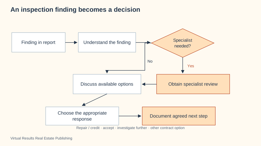
The branches fit because the next move depends on what you learn. A straight timeline would make those alternatives harder to see. The tree leaves out the actual contract dates and the details of a particular condition; add the relevant information when you tailor it to the conversation.
Pro tip: keep the question at the branch short. Put the explanation beneath the drawing so the client can follow the path without reading a paragraph inside every box.
Show what a market number leaves out
A median price is compact enough for a headline. It is also easy to overinterpret. Two groups of sales can have the same middle value and very different spreads.
What a median price can hide makes that spread visible. The library’s numbers are invented examples. They demonstrate the idea; they are not a current market report.
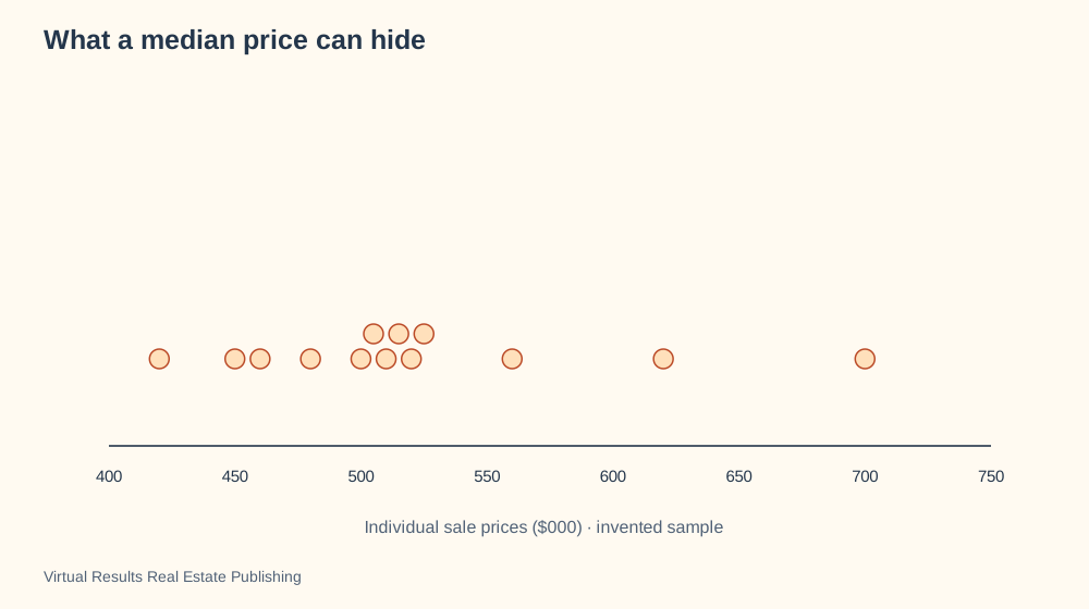
Use a distribution when your question concerns the range of observations. Use a bar chart when you want to compare a few values side by side. Neither format automatically makes different homes comparable. The explanation still needs the sample, period and meaningful property differences.
In a seller meeting, this can turn “Prices are up” into a better discussion: “Which homes are represented in this number, and how does your home relate to them?” That is a conversation worth having before choosing the headline.
Give a home’s layout a story
Photos show the rooms. A spatial diagram can show the route between them.
On your next visit, notice what happens after the front door. Does the entry lead toward the kitchen? Can you see the dining area? Where does the route meet the patio? Those observations can support a description that says something concrete.
From the front door to the patio shows a route through connected spaces. The drawing helps someone remember an arrangement that several separate photographs may not explain.
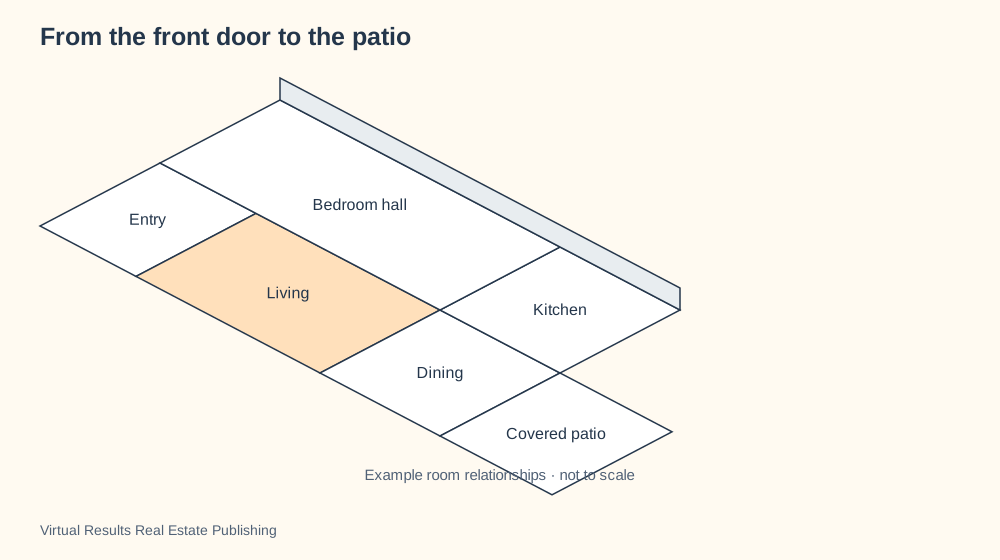
This format fits connection and orientation. It does not replace a measured floor plan. If the question is about dimensions, reach for dimensions. If the question is how the spaces relate, let the drawing show the relationship and let the client describe how they would use it.
Use the same subject in different ways
A purchase can become several useful infographics. A sequence diagram follows offer communications. A timeline shows milestones. A responsibility view separates the work among participants.
You do not have to squeeze all three purposes into one enormous graphic. Choose the question your client has today and open the matching view. Then move to another picture when the conversation changes.
This also creates better content for your website. A diagram about who does what can support an article about coordination. A timeline can support a first-time buyer guide. The visual belongs beside a developed explanation, with a descriptive title and a direct link readers can save.
How to create your own real estate infographic
Choose an example in the library and open its “Make it yours” prompt. Copy it into ChatGPT, Claude or Codex. The prompt asks your assistant to walk through the audience, information, colors, shapes and level of detail before creating the artwork.
Provide the facts you want included. Tell the assistant whether you want a meeting aid, a website illustration or a PowerPoint slide with speaker notes. Ask for a readable first version before adding flourishes.
You can also download an SVG and work with a designer or adapt it in a tool that supports that format. The collection includes a diagram chooser, 32 original real estate icons, browser demos and video examples. The icons help identify a topic; they do not need to carry the entire explanation.
For a process, try the browser demo during a meeting. Pause at the point the client asks about. Motion is useful when it directs attention or reveals a relationship, and a still image is useful when someone needs time to compare the whole picture.
Make the picture a place to begin
The best result may be the question someone asks after looking at it.
Open a diagram with a client and ask what they notice first. Follow the picture together. Make room for the point that needs more explanation. You are using a shared visual to make a complicated subject easier to discuss.
Explore all 78 real estate diagrams, save a favorite and make it your own. If an example helps your article, presentation or client conversation, give us some love: credit Virtual Results Real Estate Publishing and link to the specific diagram. That gives the next reader a useful resource to explore, too.