A little behind-the-scenes from the workbench.
Every so often a client asks for something that sounds like a half-day job and turns out to be a small philosophy exam. This one arrives in some form almost every month:
“Can you put our agents on the site? Just a ‘meet the team’ page. Nothing fancy.”
Simple to ask. Surprisingly deep to do well. Because that one page is quietly carrying more weight than almost anything else on a real estate site. It’s where a nervous seller decides whether you feel like a real, competent human they’d hand the biggest transaction of their life. People form a first impression of a face in about a tenth of a second — and trustworthiness is the trait they read fastest. Your team page is eight or twenty of those snap judgments, stacked in a grid.
So we went down a bit of a rabbit hole on it again recently, and I figured I’d share what we keep bumping into — in case it spares someone else the same bruises.
The page that’s never actually “done”
Most components you build once and forget. A team page is a small living organism. People join. People leave. Someone gets a new title, a better haircut, or finally a headshot that isn’t cropped out of a wedding photo. The Stanford Web Credibility research has been blunt about this for two decades: showing the real people behind your business is one of the strongest trust signals you have — and letting that content go stale is one of the quietest ways to erode it. A roster still listing an agent who left in 2023, or a “follow me” link that goes nowhere, is a small broken promise. Visitors notice the small ones.
So before a single pixel gets designed, the real work is operational:
- Getting the photos. The single hardest input to collect, every time. Some agents send a crisp studio headshot; others send a sunny selfie, a 400-pixel JPEG from 2019, or nothing for three weeks.
- Getting the bios. Ask ten agents for a bio and you’ll get three paragraphs, one sentence, and a “can you just write something?” The ragged lengths show on the page.
- Getting the social and contact details. Everyone wants to be reachable; nobody wants to audit their own links. Half of what you collect will be a dead Facebook URL or a personal cell that shouldn’t be public.
- Keeping all of it current. The day you launch is the most accurate the page will ever be — unless someone owns it. Usually no one does.
None of that is a design problem. It’s the part that makes the design problem hard.
Why the photos fight you
Here’s the one that sinks the most team pages, and it’s worth being precise about. Faces are the most scrutinized things on a web page — we look at them first, longest, and most critically. That’s exactly why a mismatched set reads as disorder before anyone can say why. One portrait shot tight and close, the next from across a room; one on a gray studio sweep, the next in a car; one warm, one fluorescent. The eye scans the row, the rhythm breaks, and the whole firm quietly reads as “ad hoc.”
A few things the research actually supports, which are useful when you’re coaching a team toward photos that hang together:
- Distance and lens matter more than people think. In a controlled study, the same faces shot on a wider lens from close up rated as less attractive and less trustworthy than the same person shot from a comfortable distance. The phone-at-arm’s-length selfie isn’t just casual — it subtly distorts the face. This is the heart of the “everyone roughly the same distance from camera” instinct.
- Shoot at eye level. People filmed at eye level are rated more trustworthy than the same people shot from above or below. The dramatic up-angle “hero” shot photographs as imposing, not approachable — usually the wrong note for someone you want to invite into your kitchen.
- A real, slight smile does real work. The features that make a neutral face read as trustworthy overlap with the features of a subtle smile. And having the subject look into the lens — direct gaze — measurably lifts likeability and trust.
- Consistency is the message. There isn’t a tidy study proving “matched headshots beat mismatched ones,” so we won’t pretend there is. But the credibility and first-impression research points the same direction, and every working photographer will tell you the same thing: lock the variables at capture time — same background, same light, same crop, same height — and new hires shot months later still slot in seamlessly. Plain, light backgrounds are the safe default because they crop cleanly and don’t date.
A caution about overselling the face
It would be easy to turn this into “add photos, get trust, the end.” The honest record is more interesting. One classic study found that adding a contact person’s photo raised trust in an online service. A later, money-on-the-line experiment found no reliable average effect — and that decorative, stock-style “happy people” photos could actually reduce a visitor’s ability to tell a good vendor from a bad one. Some readers clocked the smiling stock faces as manipulation.
The reconciliation we work from: a real, identifiable photo of the actual person you’ll work with — shot at eye level, from a flattering distance, looking at the camera, consistent with their colleagues — supports trust. A generic smiling stranger does not, and can backfire. Which is a long way of saying the stock-photo shortcut is usually worse than an honest gap.
And then there’s the part nobody admits
Sometimes the design isn’t the problem. Sometimes the page is exactly as bad as it is on purpose, lovingly maintained that way. Matthew Inman drew the definitive version of this years ago — how a web design slides, one small override at a time, straight into a place we’ll politely call “hell” — and it still hits a nerve because every shop has lived it. We try to meet that gently: show, don’t lecture, and make the better version easy to say yes to.
So we built a small concept to argue with
Rather than describe a tidy roster, it’s easier to look at one. This isn’t a product or a template for sale — just a recent layout we’ve been kicking around on the bench, the way you’d sketch on a napkin. The portraits are placeholders, chosen specifically to show what a relatively consistent set buys you: same proportions, same framing, same light, names and roles set in the same quiet rhythm. In fact, the composition of these images is pretty varied — but they’re high quality, and that goes a long way.
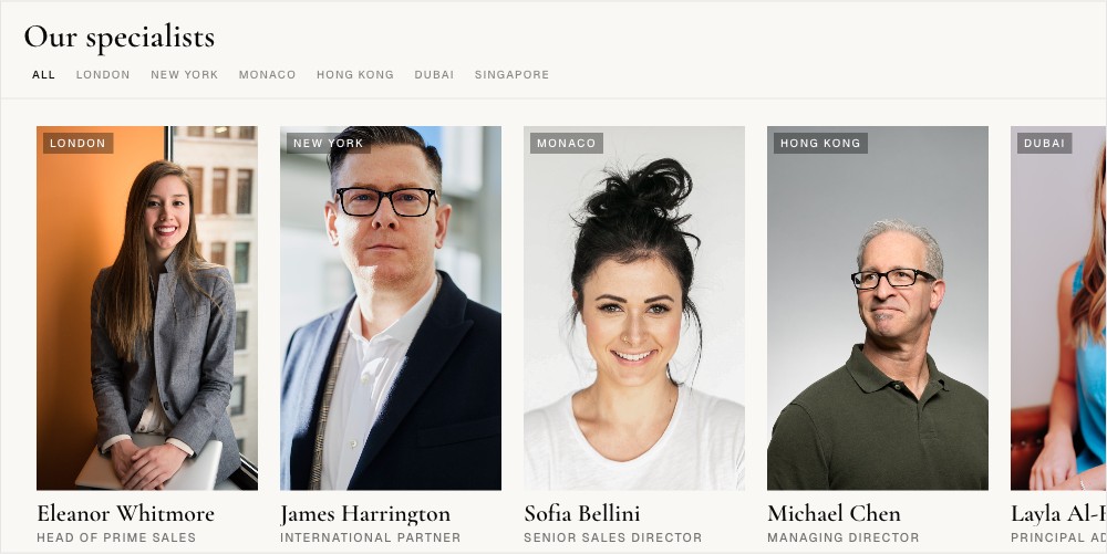
The same underlying data can stretch into a full directory or shrink into a compact module that tucks into a homepage band or a sidebar. There’s a quiet bit of interactivity — filter by market, hover for contact — but the point isn’t the motion. The point is that when the inputs are disciplined, the layout almost takes care of itself.
👉 Poke at the live concept here: virtualresults.com/preview/agent-featured
The realistic version, for a small brokerage
Most teams can’t get everyone in front of one photographer on one afternoon. That’s fine. The fallback that actually works is to unify in software: standardize the crop ratio and head size, push everything to the same neutral background or a single subtle color treatment, and you’ll pull a scattered set most of the way back to coherent. Give every agent the same short bio prompt — role, focus, one human detail — so the lengths match. Write the photo alt text in one consistent pattern. None of it is glamorous. All of it shows.
A “meet the team” page is never really about the page. It’s about whether the people on it look like people you’d trust — assembled with enough care that the care itself becomes part of the message.
If yours has been quietly nagging at you — the mismatched photos, the bios that never came, the roster that no longer matches who’s actually at the desks — that’s exactly the kind of knot we like untangling. Tell us about your team and your site, and we’ll talk through what a good version looks like for you. No source files to download, no homework — just a conversation.