A little behind-the-scenes from the workbench.
Last week a client asked a deceptively simple question:
“Can we put a little ‘contact me’ bar at the top of the site that follows people as they scroll — especially on phones?”
Simple to ask. Surprisingly deep to answer well. Because on a real estate site, that tiny strip across the top is doing a lot of quiet work. It’s the difference between a buyer standing in a driveway, phone in hand, tapping call in one motion — and a buyer who gives up looking for your number and texts the agent on the other sign.
Most of a real estate site’s traffic is on mobile. People browse listings from the couch, from the car, from the open-house parking lot. So “looks fine on desktop” isn’t the bar. The bar is: can someone reach you with one thumb, without thinking?
We went down a bit of a rabbit hole on this one — so we figured I’d share the results in case they spark something for someone else. Consider this me thinking out loud.
What we were actually weighing
A contact header sounds like one component. It’s really a stack of small decisions:
- Loud or quiet? Some brands want an unmissable “CALL OR TEXT NOW.” Luxury and editorial brands want something that whispers — present, but never shouting over the photography.
- Call, text, or both? A surprising number of younger buyers will never call a stranger but will happily text. Offer only a phone number and you lose them. (
sms:links are underused and they just work.) - Words or just an icon? On a narrow phone screen, every pixel competes with the listing photo. Sometimes a single phone icon says everything.
- Should it move? A subtle pulse or slow gradient can pull the eye without being obnoxious. A scrolling marquee is playful but risky. Motion is seasoning, not the meal.
- Does it respect the thumb? Tap targets need to be big enough to hit while walking. That’s an accessibility thing and a conversion thing.
There’s no single right answer — it depends on the brand. So instead of guessing, we built options.
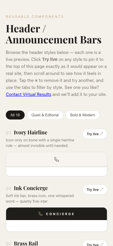
So we made a little playground
Rather than send the client a static PDF of mockups, we built a live page where they can try each header on for size — tap one and it pins itself to the top of the page as a real sticky bar, then you scroll around and feel how it behaves. Way more useful than a screenshot.
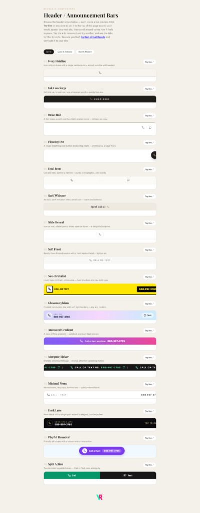
👉 Play with all sixteen here: virtualresults.com/preview/sticky-headers
It’s mobile-friendly (try it on your phone), and there’s a “Try live” button on every style that drops it into the page header so you can experience it instead of just looking at it.
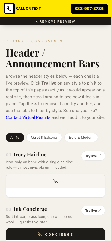
Here’s one of the bolder options — “Neo-Brutalist” — pinned live at the top of a phone screen. You can see how it sits above the content and stays put as you scroll:
A few favorites from the set
We split them into two moods — Quiet & Editorial and Bold & Modern — because different agents have different brands.
On the quiet end:
- Ivory Hairline — just a single phone icon on a warm bone background with one hairline rule. Practically invisible until you need it. Perfect when the photography is the star.
- Dark Luxe — near-black with one gold accent and a “Concierge Line” label. Feels like a five-star hotel.
- Slide Reveal — a phone icon at rest that gently slides open to reveal the word “Call.” A small, delightful surprise.
On the bold end:
- Neo-Brutalist — loud yellow, hard shadows, zero ambiguity. If your brand is high-energy, this converts.
- Split Action — the screen splits cleanly into a green Call half and a dark Text half. No decisions, no hunting — two big tappable targets.
- Marquee Ticker — an endlessly scrolling “Call or text us” message. Playful, eye-catching, full of personality.
A couple of opinions picked up along the way
Since this is a “developing in public” post, here’s what I’d actually tell a client:
- Give people both
callandtext. It costs nothing and captures the people who’d never dial a stranger. - Don’t let the bar eat the hero. On mobile especially, keep it slim. The listing photo is what sells.
- Big tap targets win. A header that’s hard to tap one-handed is a header that doesn’t get tapped.
- Keep it light. Every one of these is plain HTML and CSS — no heavy framework, no JavaScript libraries, nothing to slow the page down. On real estate sites, speed is conversion.
- Match the brand, not the trend. A glassy gradient bar looks amazing on a sleek new-construction site and completely wrong on a rustic-farmhouse brand. The best header is the one that disappears into your brand.
Steal these ideas
That’s the whole point of sharing this. If you’re an agent (or a fellow developer) and one of these sparks an idea — wonderful, that’s a win. Go browse the playground, tap a few, and see what feels right.
And if you’d like one of these (or something custom) actually built into your real estate site — tuned to your colors, your number, your brand — that’s literally what we do all day. Say hello.
More behind-the-build posts coming. This is the stuff that usually stays hidden in the workbench — We think it’s more fun in the open.